ngDialog
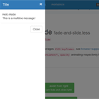
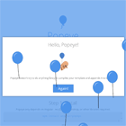
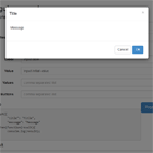
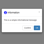
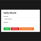
Modal dialogs and popups provider for AngularJS applications.
ngDialog is ~10KB (minified), has minimalistic API, is highly customizable through themes and has only AngularJS as dependency.
Demo
Install
You can download all necessary ngDialog files manually, or install it with bower:
bower install ng-dialogor npm:
npm install ng-dialogUsage
You need only to include ngDialog.js, ngDialog.css and ngDialog-theme-default.css (as minimal setup) to your project and then you can start using the ngDialog provider in your directives, controllers and services. For example:
<link rel="stylesheet" href="lib/ng-dialog/css/ngDialog.min.css"> <link rel="stylesheet" href="lib/ng-dialog/css/ngDialog-theme-default.min.css"> <script src="lib/ng-dialog/js/ngDialog.min.js"></script>Define the className to be the ngDialog-theme-default.
For example in controllers:
var app = angular.module('exampleApp', ['ngDialog']); app.controller('MainCtrl', function ($scope, ngDialog) { $scope.clickToOpen = function () { ngDialog.open({ template: 'popupTmpl.html', className: 'ngdialog-theme-default' }); }; });Collaboration
Your help is appreciated! If you've found a bug or if something is not clear, please raise an issue.
Ideally, if you've found an issue, you will submit a PR that meets our contributor guidelines.
Running Tests
git clone [email protected]:likeastore/ngDialog.git cd ngDialog npm i npm run testAPI
ngDialog service provides easy to use and minimalistic API, but in the same time it's powerful enough. Here is the list of accessible methods that you can use:
===
.open(options)
Method allows to open dialog window, creates new dialog instance on each call. It accepts options object as the only argument.
Options:
template {String}
Dialog template can be loaded through path to external html template or <script> tag with text/ng-template:
<script type="text/ng-template" id="templateId"> <h1>Template heading</h1> <p>Content goes here</p> </script>ngDialog.open({ template: 'templateId' });Also it is possible to use a simple string as template together with plain option.
Pro Tip about templates
It's not always necessary to place your external html template inside <script> tag. You could put these templates into $templateCache like this:
angular.module('dialog.templates').run(['$templateCache', function($templateCache) { $templateCache.put('templateId', 'template content'); }]);Then it would be possible to include the dialog.templates module into the dependencies of your main module and start using this template as templateId.
There is no need to do these actions manually. You could use one of the plugins specifically for these purposes. They are available for different build systems including most popular Gulp / Grunt:
You could find more detailed examples on each of these pages.
plain {Boolean}
If true allows to use plain string as template, default false:
ngDialog.open({ template: '<p>my template</p>', plain: true });controller {String} | {Array} | {Object}
Controller that will be used for the dialog window if necessary. The controller can be specified either by referring it by name or directly inline.
ngDialog.open({ template: 'externalTemplate.html', controller: 'SomeController' });or
ngDialog.open({ template: 'externalTemplate.html', controller: ['$scope', 'otherService', function($scope, otherService) { // controller logic }] });controllerAs {String}
You could optionally specify controllerAs parameter for your controller. Then inside your template it will be possible to refer this controller by the value specified by controllerAs.
Usage of controllerAs syntax is currently recommended by the AngularJS team.
resolve {Object.<String, Function>}
An optional map of dependencies which should be injected into the controller. If any of these dependencies are promises, ngDialog will wait for them all to be resolved or one to be rejected before the controller is instantiated.
If all the promises are resolved successfully, the values of the resolved promises are injected.
The map object is:
key–{String}: a name of a dependency to be injected into the controller.factory-{String | Function}: IfStringthen it is an alias for a service. Otherwise ifFunction, then it is injected using$injector.invokeand the return value is treated as the dependency. If the result is a promise, it is resolved before its value is injected into the controller.
ngDialog.open({ controller: function Ctrl(dep) {/*...*/}, resolve: { dep: function depFactory() { return 'dep value'; } } });scope {Object}
Scope object that will be passed to the dialog. If you use a controller with separate $scope service this object will be passed to the $scope.$parent param:
$scope.value = true; ngDialog.open({ template: 'externalTemplate.html', className: 'ngdialog-theme-plain', scope: $scope });<script type="text/ng-template" id="externalTemplate.html"> <p>External scope: <code>{{value}}</code></p> </script>scope.closeThisDialog(value)
In addition .closeThisDialog(value) method gets injected to passed $scope. This allows you to close the dialog straight from the handler in a popup element, for example:
<div class="dialog-contents"> <input type="text"/> <input type="button" value="OK" ng-click="checkInput() && closeThisDialog('Some value')"/> </div>Any value passed to this function will be attached to the object which resolves on the close promise for this dialog. For dialogs opened with the openConfirm() method the value is used as the reject reason.
data {String | Object | Array}
Any serializable data that you want to be stored in the controller's dialog scope. ($scope.ngDialogData). From version 0.3.6 $scope.ngDialogData keeps references to the objects instead of copying them.
Additionally, you will have the dialog id available as $scope.ngDialogId. If you are using $scope.ngDialogData, it'll be also available under $scope.ngDialogData.ngDialogId.
className {String}
This option allows you to control the dialog's look, you can use built-in themes or create your own styled modals.
This example enables one of the built-in ngDialog themes - ngdialog-theme-default (do not forget to include necessary css files):
ngDialog.open({ template: 'templateId', className: 'ngdialog-theme-default' });Note: If the className is not mentioned, the dialog will not display correctly.
Check themes block to learn more.
appendClassName {String}
Unlike the className property, which overrides any default classes specified through the setDefaults() method (see docs), appendClassName allows for the addition of a class on top of any defaults.
For example, the following would add both the ngdialog-theme-default and ngdialog-custom classes to the dialog opened:
ngDialogProvider.setDefaults({ className: 'ngdialog-theme-default' });ngDialog.open({ template: 'template.html', appendClassName: 'ngdialog-custom' });disableAnimation {Boolean}
If true then animation for the dialog will be disabled, default false.
overlay {Boolean}
If false it allows to hide the overlay div behind the modals, default true.
showClose {Boolean}
If false it allows to hide the close button on modals, default true.
closeByEscape {Boolean}
It allows to close modals by clicking the Esc key, default true.
This will close all open modals if there are several of them opened at the same time.
closeByNavigation {Boolean}
It allows to close modals on state change (history.back, $state.go, etc.), default false. Compatible with ui-router and angular-router. Set this value to true if you want your modal to close when you go back or change state. Set this value to false if you want your modal to stay open when you change state within your app.
This will close all open modals if there are several of them opened at the same time.
closeByDocument {Boolean}
It allows to close modals by clicking on overlay background, default true. If Hammer.js is loaded, it will listen for tap instead of click.
appendTo {String}
Specify your element where to append dialog instance, accepts selector string (e.g. #yourId, .yourClass). If not specified appends dialog to body as default behavior.
cache {Boolean}
Pass false to disable template caching. Useful for developing purposes, default is true.
name {String} | {Number}
Give a name for a dialog instance. It is useful for identifying specific dialog if there are multiple dialog boxes opened.
onOpenCallback {String} | {Function}
Provide either the name of a function or a function to be called after the dialog is opened. This callback can be used instead of the ngdialog.opened event. It provides with a way to register a hook for when the dialog is appended to the DOM and about to be shown to the user.
preCloseCallback {String} | {Function}
Provide either the name of a function or a function to be called before the dialog is closed. If the callback function specified in the option returns false then the dialog will not be closed. Alternatively, if the callback function returns a promise that gets resolved the dialog will be closed.
The preCloseCallback function receives as a parameter value which is the same value sent to .close(id, value).
The primary use case for this feature is a dialog which contains user actions (e.g. editing data) for which you want the ability to confirm whether to discard unsaved changes upon exiting the dialog (e.g. via the escape key).
This example uses an inline function with a window.confirm call in the preCloseCallback function:
ngDialog.open({ preCloseCallback: function(value) { if (confirm('Are you sure you want to close without saving your changes?')) { return true; } return false; } });In another example, a callback function with a nested confirm ngDialog is used:
ngDialog.open({ preCloseCallback: function(value) { var nestedConfirmDialog = ngDialog.openConfirm({ template:'\ <p>Are you sure you want to close the parent dialog?</p>\ <div class="ngdialog-buttons">\ <button type="button" class="ngdialog-button ngdialog-button-secondary" ng-click="closeThisDialog(0)">No</button>\ <button type="button" class="ngdialog-button ngdialog-button-primary" ng-click="confirm(1)">Yes</button>\ </div>', plain: true }); // NOTE: return the promise from openConfirm return nestedConfirmDialog; } });trapFocus {Boolean}
When true, ensures that the focused element remains within the dialog to conform to accessibility recommendations. Default value is true
preserveFocus {Boolean}
When true, closing the dialog restores focus to the element that launched it. Designed to improve keyboard accessibility. Default value is true
ariaAuto {Boolean}
When true, automatically selects appropriate values for any unspecified accessibility attributes. Default value is true
See Accessibility for more information.
ariaRole {String}
Specifies the value for the role attribute that should be applied to the dialog element. Default value is null (unspecified)
See Accessibility for more information.
ariaLabelledById {String}
Specifies the value for the aria-labelledby attribute that should be applied to the dialog element. Default value is null (unspecified)
If specified, the value is not validated against the DOM. See Accessibility for more information.
ariaLabelledBySelector {String}
Specifies the CSS selector for the element to be referenced by the aria-labelledby attribute on the dialog element. Default value is null (unspecified)
If specified, the first matching element is used. See Accessibility for more information.
ariaDescribedById {String}
Specifies the value for the aria-describedby attribute that should be applied to the dialog element. Default value is null (unspecified)
If specified, the value is not validated against the DOM. See Accessibility for more information.
ariaDescribedBySelector {String}
Specifies the CSS selector for the element to be referenced by the aria-describedby attribute on the dialog element. Default value is null (unspecified)
If specified, the first matching element is used. See Accessibility for more information.
width {Number | String}
This option allows you to control the dialog's width. Default value is null (unspecified)
If you provide a Number, 'px' will be appended. To use a custom metric, use a String, e.g. '40%'.
For example, the following will add width: 400px; to the dialog when opened:
ngDialog.open({ template: 'template.html', width: 400 }); In another example, the following will add width: 40%;:
ngDialog.open({ template: 'template.html', width: '40%' }); height {Number | String}
This option allows you to control the dialog's height. Default value is null (unspecified)
If you provide a Number, 'px' will be appended. To use a custom metric, use a String, e.g. '40%'.
For example, the following will add height: 400px; to the dialog when opened:
ngDialog.open({ template: 'template.html', height: 400 }); In another example, the following will add height: 40%;:
ngDialog.open({ template: 'template.html', height: '40%' }); Returns:
The open() method returns an object with some useful properties.
id {String}
This is the ID of the dialog which was just created. It is the ID on the dialog's DOM element.
close(value) {Function}
This is a function which will close the dialog which was opened by the current call to open(). It takes an optional value to pass to the close promise.
closePromise {Promise}
A promise which will resolve when the dialog is closed. It is resolved with an object containing: id - the ID of the closed dialog, value - the value the dialog was closed with, $dialog - the dialog element which at this point has been removed from the DOM and remainingDialogs - the number of dialogs still open.
The value property will be a special string if the dialog is dismissed by one of the built in mechanisms: '$escape', '$closeButton' or '$document'.
This allows you do to something like this:
var dialog = ngDialog.open({ template: 'templateId' }); dialog.closePromise.then(function (data) { console.log(data.id + ' has been dismissed.'); });===
.setDefaults(options)
You're able to set default settings through ngDialogProvider:
var app = angular.module('myApp', ['ngDialog']); app.config(['ngDialogProvider', function (ngDialogProvider) { ngDialogProvider.setDefaults({ className: 'ngdialog-theme-default', plain: true, showClose: true, closeByDocument: true, closeByEscape: true }); }]);===
.openConfirm(options)
Opens a dialog that by default does not close when hitting escape or clicking outside the dialog window. The function returns a promise that is either resolved or rejected depending on the way the dialog was closed.
Options:
The options are the same as the regular .open() method with an extra function added to the scope:
scope.confirm()
In addition to the .closeThisDialog() method. The method .confirm() is also injected to passed $scope. Use this method to close the dialog and resolve the promise that was returned when opening the modal.
The function accepts a single optional parameter which is used as the value of the resolved promise.
<div class="dialog-contents"> Some message <button ng-click="closeThisDialog()">Cancel</button> <button ng-click="confirm()">Confirm</button> </div>Returns:
An Angular promise object that is resolved if the .confirm() function is used to close the dialog, otherwise the promise is rejected. The resolve value and the reject reason is defined by the value passed to the confirm() or closeThisDialog() call respectively.
===
.isOpen(id)
Method accepts dialog's id and returns a Boolean value indicating whether the specified dialog is open.
===
.close(id, value)
Method accepts dialog's id as string argument to close specific dialog window, if id is not specified it will close all currently active modals (same behavior as .closeAll()). Takes an optional value to resolve the dialog promise with (or all dialog promises).
===
.closeAll(value)
Method manages closing all active modals on the page. Takes an optional value to resolve all of the dialog promises with.
===
.getOpenDialogs()
Method that returns array which includes the ids of opened dialogs.
===
.setForceHtmlReload({Boolean})
Adds an additional listener on every $locationChangeSuccess event and gets update version of html into dialog. May be useful in some rare cases when you're dependant on DOM changes, defaults to false. Use it in module's config as provider instance:
var app = angular.module('exampleApp', ['ngDialog']); app.config(function (ngDialogProvider) { ngDialogProvider.setForceHtmlReload(true); });===
.setForceBodyReload({Boolean})
Adds additional listener on every $locationChangeSuccess event and gets updated version of body into dialog. Maybe useful in some rare cases when you're dependant on DOM changes, defaults to false. Use it in module's config as provider instance:
var app = angular.module('exampleApp', ['ngDialog']); app.config(function (ngDialogProvider) { ngDialogProvider.setForceBodyReload(true); });===
.setOpenOnePerName({Boolean})
Default value: false
Define whether or not opening a dialog with the same name more than once simultaneously is allowed. Assigning true prevents opening a second dialog.
Setting it in the ngDialogProvider:
var app = angular.module('exampleApp', ['ngDialog']); app.config(function (ngDialogProvider) { ngDialogProvider.setOpenOnePerName(true); });Make sure to remember to add a 'name' when opening a dialog. ngDialog 'open' and 'openConfirm' functions will return undefined if the dialog was not opened.
Directive
By default the ngDialog module is served with the ngDialog directive which can be used as attribute for buttons, links, etc. Almost all .open() options are available through tag attributes as well, the only difference is that ng-template id or path of template file is required.
Some imaginary button, for example, will look like:
<button type="button" ng-dialog="templateId.html" ng-dialog-class="ngdialog-theme-flat" ng-dialog-controller="ModalCtrl" ng-dialog-close-previous> Open modal text </button>You could optionally use ng-dialog-bind-to-controller to bind scope you've defined via parameter of directive to controller. More information about bindToController is available here.
Directive contains one more additional but very useful option, it's an attribute named ng-dialog-close-previous. It allows you to close previously opened dialogs automatically.
Events
Everytime ngDialog is opened or closed we're broadcasting three events (dispatching events downwards to all child scopes):
-
ngDialog.opened -
ngDialog.closing -
ngDialog.closed
This allows you to register your own listeners, example:
$rootScope.$on('ngDialog.opened', function (e, $dialog) { console.log('ngDialog opened: ' + $dialog.attr('id')); });ngDialog.closing is different than ngDialog.closed in that it is fired immediately when the dialog begins closing, whereas ngDialog.closed is fired after all animations are complete. Both will be fired even when animation end support is not detected.
Additionally we trigger following 2 events related to loading of template for dialog:
-
ngDialog.templateLoading -
ngDialog.templateLoaded
In case you are loading your templates from an external location, you could use above events to show some kind of loader.
Finally, we trigger the following event when adding padding to or removing padding from the body tag to compensate for scrollbar toggling:
ngDialog.setPadding
The ngDialog.setPadding event will communicate the pixel value being added to the body tag so you can add it to any other elements in your layout at the same time (often fixed-position elements will need this).
Themes
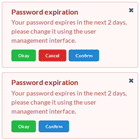
Currently ngDialog contains two default themes that show how easily you can create your own. Check example folder for demonstration purposes.
Accessibility
ngDialog supports accessible keyboard navigation via the trapFocus and preserveFocus options.
The role, aria-labelledby and aria-describedby attributes are also supported, and are rendered as follows.
Dialog role attribute:
options.ariaRole, if specified- "dialog" if
options.ariaAutoistrueand the dialog contains any focusable elements - "alertdialog" is
options.ariaAutoistrueand the dialog does not contain any focusable elements
Dialog aria-labelledby attribute:
options.ariaLabelledById, if specified- If
options.ariaLabelledBySelectoris specified, the first matching element will be found and assigned an id (if required) and that id will be used - If
options.ariaAutoistrue, the first heading element in the dialog (h1-6) will be found and processed as perariaLabelledBySelector
Dialog aria-describedby attribute:
options.ariaDescribedById, if specified- If
options.ariaDescribedBySelectoris specified, the first matching element will be found and assigned an id (if required) and that id will be used - If
options.ariaAutoistrue, the first content element in the dialog (article,section,p) will be found and processed as perariaDescribedBySelector
Dialog Content role attribute:
- Always assigned a value of "document"
CDN
ngDialog is available for public on cdnjs. For example, please use following urls for version 0.4.0.
//cdnjs.cloudflare.com/ajax/libs/ng-dialog/0.4.0/css/ngDialog.min.css //cdnjs.cloudflare.com/ajax/libs/ng-dialog/0.4.0/css/ngDialog-theme-default.min.css //cdnjs.cloudflare.com/ajax/libs/ng-dialog/0.4.0/css/ngDialog-theme-plain.min.css //cdnjs.cloudflare.com/ajax/libs/ng-dialog/0.4.0/js/ngDialog.min.jsReferences
ngDialog default styles are heavily inspired by awesome Hubspot/Vex jQuery modals.
License
MIT Licensed
Copyright (c) 2013-2015, Likeastore.com [email protected]
Permission is hereby granted, free of charge, to any person obtaining a copy of this software and associated documentation files (the "Software"), to deal in the Software without restriction, including without limitation the rights to use, copy, modify, merge, publish, distribute, sublicense, and/or sell copies of the Software, and to permit persons to whom the Software is furnished to do so, subject to the following conditions:
The above copyright notice and this permission notice shall be included in all copies or substantial portions of the Software.
THE SOFTWARE IS PROVIDED "AS IS", WITHOUT WARRANTY OF ANY KIND, EXPRESS OR IMPLIED, INCLUDING BUT NOT LIMITED TO THE WARRANTIES OF MERCHANTABILITY, FITNESS FOR A PARTICULAR PURPOSE AND NONINFRINGEMENT. IN NO EVENT SHALL THE AUTHORS OR COPYRIGHT HOLDERS BE LIABLE FOR ANY CLAIM, DAMAGES OR OTHER LIABILITY, WHETHER IN AN ACTION OF CONTRACT, TORT OR OTHERWISE, ARISING FROM, OUT OF OR IN CONNECTION WITH THE SOFTWARE OR THE USE OR OTHER DEALINGS IN THE SOFTWARE.


