Angular Basic Modal
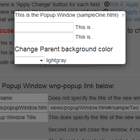
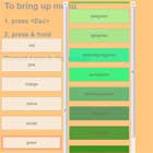
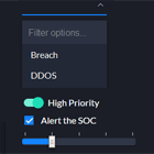
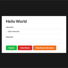
The angular-basic-modal is a lightweight, extendable Angular 2+ (2.3.0 and beyond) modal solution that will programatically create a modal, add it to the DOM, and then delete it from the DOM when the modal is dismissed. The modal returns a promise that indicates how the modal dismissed that can then be used for further processing.
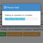
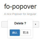
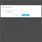
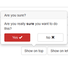
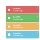
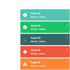
A default modal style is provided that can be extended to create modals with any style sheet, including Bootstrap. A working demo shows the basic modal and two extended version (icon and Bootstrap 3) in action with user adjustable customizations.
How to use?
$ npm i angular-basic-modal --save Integration
The angular-basic-modal should work as-is with webpack/angular-cli. Just add the AngularBasicModalModule:
import { AngularBasicModalModule } from 'angular-basic-modal'; @NgModule({ imports: [ AngularBasicModalModule ], ... }) export class AppModule { }Usage
Basic usage is:
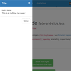
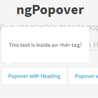
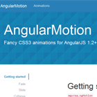
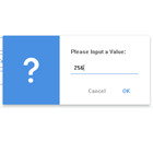
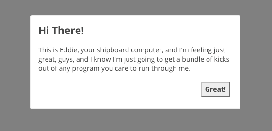
bmc = new BaseModalConfig(); constructor(private modal:BasicModalService) { } ... ngOnInit() { this.bmc.title = 'Hi There!'; this.bmc.message = "This is Eddie, your shipboard computer, and I'm " + "feeling just great, guys, and I know I'm just going to get a " + "bundle of kicks out of any program you care to run through me."; this.bmc.width = 400; this.bmc.height = 160; this.bmc.cancelBtn = 'Great!'; setTimeout( () => { this.modal.show(this.bmc, BaseModal).then( res => { console.log(res); }); }, 1500); }The BaseModalConfig contains the settings for the modal and is injected when the modal is created by calling show(config:BaseModalConfig, modal:Type<BaseModal>) on the BasicModalService. The modal loaded can either be the default BaseModal component or a component extending it. See the IconModal and BootstrapModal component in the demo for examples.
The following parameters are settable on the BaseModalConfig:
- title - HTML or text for the modal's title.
- message - HTML or text for the modal's body.
- blocking - whether or not the modal can be dismissed by clicking the overlay.
- confirmBtn - label of the optional confirm button. The confirmButton is associated with the confirm() function, which may optionally take a string to return via the modal's promise if clicked ( for example click('foo') would return 'foo' ). If no string is given for the confirm() function's parameter, then the confirmBtn label will be returned.
- cancelBtn - label of the cancel button, which is optional if not blocking. The cancelButton is associated with the cancel() function, which may optionally take a string to return via the modal's promise if clicked ( for example: click('bar') ). If no string is given for the cancel() function's parameter, then the cancelBtn label will be returned.
- width/height - (size) For the Bootstrap demo, the
[ngClass]attribute on<div class="modal-dialog">element uses the width to adjust the size according.
Extending
As noted above, the BaseModal can be extended. Here is a Webpack example for a Bootstrap styled modal.
The component:
import { Component } from '@angular/core'; import { BaseModal } from 'angular-basic-modal/base-modal.component'; import { BaseModalConfig } form 'angular-basic-modal/base-modal-config'; @Component({ selector: 'bs-modal', templateUrl: './bootstrap-modal.component.html' }) export class BootstrapModalComponent extends BaseModal { constructor(bmc:BaseModalConfig) { super(bmc); } }The template:
<div class="modal" tabindex="-1" role="dialog" style="display:inherit;" (click)="dismiss('Dismiss')"> <div class="modal-dialog" (click)="$event.stopPropagation()"> <div class="modal-content"> <div class="modal-header"> <button type="button" class="close" data-dismiss="modal" (click)="cancel('Cancel')"> <span>×</span><span class="sr-only">Close</span> </button> <h4 class="modal-title" style="display:inline-block;" id="modal-title" [innerHTML]="title"></h4> </div> <div class="modal-body" [innerHTML]="message"></div> <div class="modal-footer"> <button *ngIf="confirmBtn" type="button" class="btn btn-default" (click)="confirm()"> {{confirmBtn}} </button> <button *ngIf="cancelBtn" type="button" class="btn btn-primary" (click)="cancel()"> {{cancelBtn}} </button> </div> </div> </div> </div> <div class="modal-backdrop fade in"></div>`The demo has an example for SystemJS. Namely the difference is in how BaseModalConfig and BaseModal are imported.
import { BaseModalConfig, BaseModal } from 'angular-basic-modal';License
MIT
Author
- David Czeck @czeckd