jQuery.column v1.0.1
https://github.com/vanderlee/column
Copyright (c) 2011-2015 Martijn W. van der Lee Licensed under the MIT.
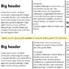
Simulate CSS3-style automatic columnization for the few browsers (IE) that don't support it. It tries to follow CSS3 specification (http://www.w3.org/TR/css3-multicol/) closely.
Requires jQuery 1.4.0 or more recent. Tested upto jQuery 2.1.3.
Syntax
$(<context>).column(<options>);
Arguments
context (required)
This should point to the DOM node(s) that hold the content to be columnized. Typically this is a
options (required)
An array or object containing any of the following options (based on CSS3 options).
width (default 'auto')
This option works like CSS3 column-width. Use it to specify the width of each individual column in pixels or set to 'auto' to use the count option.
count (default 'auto')
Works like CSS3 column-count. Set the number of columns to use. If width is set, count is ignored. If both width and count are set to 'auto' (default), the content will NOT be columnized.
gap (default 'normal')
Like CSS3 column-gap. Set the distance between two columns in pixels. If set to the default 'normal' value, the gap will be 1em, dependant on the context.
rule_color (default '')
Like CSS3 "column-rule-color". Specify the color olf the rule between two columns using any valid CSS color qualifier or name such as black, #ab37e9 or rgba(255,0,0,.5). If no color is specified or the value is set to an empty string, the color will be the same as CSS color option.
rule_style (default 'none')
Like CSS3 column-rule-style. Sets the line-style of the rule. These allowed names are the same as the border-style names. To show the ruler, you need to at least set a visible rule-style such as 'solid' or 'dotted'.
rule_width (default 'medium')
Like CSS3 column-rule-width. Specify the width of the rule line between columns. You can either specify the width in pixels by using an integer number or use any of the border-width names 'thin', 'medium' or 'thick'.
split (default 'word')
jQuery.column works by splitting the content up in parts which may be rearranged over the columns. By default any text at the top DOM level is split at every whitespace. The 'word' mode most closely (though not completely) matches CSS3 splitting. Alternatively you can choose 'sentence', which splits text at punctuation end-marks or create your own method.
Return
Returns the selected DOM elements so you can chain this plug-in like regulaer jQuery.
Examples
$('body').column(); // Doesn't columnize content, since neither "width" // nor "count" is specified. $('body').column({count: 3}); // Spreads the content of <body> over 3 columns. // Columns are stretched to fit the available width. $('body').column({width: 250}); // Spreads the content of <body> over columns of 250px. // Number of columns depends on the available space. $('body').column({ // Columnize with options... width: 'auto', // Default, this line is redundant. count: 4, // Spread over 4 columns. gap: 20, // Space columns 20 pixels apart. rule_style: 'dotted', // Show a dotted rule between columns. rule_width: 'thin', // Set width of rule to 'thin' (usually 1 pixel). rule_color: '#ccc', // Set color of rule to a light gray. split: 'sentence' // Keeps sentences together. });Checklist:
Make sure you set at least one of 'count' or 'width' to enable columnization. Also see:
http://welcome.totheinter.net/2008/07/22/multi-column-layout-with-css-and-jquery/ A similar plug-in which works in a different way with different features
To do:
- Split on hyphens, , and others.
- Configurable splitter, using regex patterns. ('syllables', 'words', 'sentences', 'punctuation', function)
- Add classes to different columns; 'column', 'last-column', 'first-column', use inner-div's so stuff can be layed out with CSS.
- Accept "em" as measurement. Also other measurements: px, % (why?), in, mm(=in), cm(=cm), ex, pt(=in), pc(=in)
- Use $.px() if available (but keep overwriting %)
- Iterative balancing
- Experiment with normalizing... doesn't seem to work well. Is this even wanted?
- Make balancing into strategy pattern.
- Adjust strategy for column width calculation; does not match chrome strategy.
- Postprocess: Top-of-column == h1? margin-top: 0;
- Split strategies for lists and others (different node types).
