jquery.checkradios
A lightweight jQuery Plugin that allows you to use CSS to style checkboxes and radios without using images.
Introduction
This jQuery plugin was designed to allow you to fully customize checkboxes and radios without using standard images and with scalability in mind. Most plugins I have come across use images such as jpegs and pngs to add custom checkbox ticks and radio circles. This plugin instead uses vector based icons/fonts to add in the ticks and circles which allows far greater customisation as well as scalability and ultimately much greater control over the checkboxes and radios using css.
This plugin uses custom icons provided by icomoon (icomoon.io) for its ticks and radios circles built in by default however it is also compatible with other font based icons platforms such as FontAwesome.
Table of Contents
Installation
Javascript
Include jquery.checkradios.min.js anywhere after jQuery, ideally at the bottom of the body tag.
<!-- jQuery - Required to use the jQuery plugin (Obviously) --> <script src="//ajax.googleapis.com/ajax/libs/jquery/1.11.0/jquery.min.js"></script> <!-- Checkradios plugin --> <script src="<PATH-TO-PLUGIN>/jquery-checkradios/js/jquery.checkradios.min.js"></script> CSS
Include the query.checkradios.min.css CSS in the head tag of your page
<!-- The main styles for the checkradios plugin to provide default styles --> <link rel="stylesheet" href="<PATH-TO-PLUGIN>/jquery-checkradios/css/jquery.checkradios.min.css"/> Usage
Basic Setup
To get started simply add the following to your Javascript:
$(document).ready(function(){ $('.checkradios').checkradios(); }); Then add your checkboxes and/or radios within your HTML:
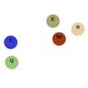
<input type="checkbox" class="checkradios" checked/> <input type="radio" class="checkradios" checked/> This should be the outcome:
Customizing
Custom Styles
You can add custom styles to the check boxes and radios by simply adding a class to the checkbox or radio input and targeting it within the css. All classes added to the input will be applied to the container that the plugin creates to display the new customised checkbox and radio.
To add custom styling, create a css class like this:
.custom-style{ font-size:50px; color:#6CF; border:2px solid #6CF; -webkitbox-shadow:inset 0px 0.1em 0.1em rgba(0,0,0,0.3); -moz-box-shadow:inset 0px 0.1em 0.1em rgba(0,0,0,0.3); box-shadow:inset 0px 0.1em 0.1em rgba(0,0,0,0.3); } Note: Increasing and decreasing the font size is the best way to adjust the size
Then add the style to the inputs:
<input type="checkbox" class="checkradios custom-style" checked/> <input type="radio" class="checkradios custom-style" checked/> When you instantiate the plugin:
$(document).ready(function(){ $('.checkradios').checkradios(); }); This should be the outcome:
Note: You can also customise the styles using the .checkradios-checkbox and .checkradios-radio classes in the main jquery.checkradios.css file. From the jquery.checkradios.css css file you can also target the tick and the circle icons from the .icon-checkradios-checkmark:before and .icon-checkradios-circle:before classes.
Custom Icons
The jquery.checkradios plugin supports all platforms that use class based font icons such as Icomoon and FontAwesome
Using FontAwesome Font Icons
CSS
Include the css for FontAwesome using their CDN:
<link href="//netdna.bootstrapcdn.com/font-awesome/4.0.3/css/font-awesome.css" rel="stylesheet"> <link rel="stylesheet" href="<PATH-TO-PLUGIN>/jquery-checkradios/css/jquery.checkradios.min.css"/> html
<input type="checkbox" class="checkboxes-and-radios" checked/> <input type="radio" class="checkboxes-and-radios" checked/> Javascript
Get the name of the icon you want to use from FontAwesome and add it when instantiating the plugin like this:
$('.checkboxes-and-radios').checkradios({ checkbox: { iconClass:'fa fa-check-circle' }, radio: { iconClass:'fa fa-star' } }); Note: Be sure to also add the "fa" FontAwesome class before the icon name you have chosen.
This should be the outcome:
Using Icomoon Font Icons
Icomoon is slightly trickier to set up as it requires downloading the fonts from their website. I used icomoon icons because I liked the tick and circle icons they have better and so that I could provide the icons so that this plugin worked right out the box without dependencies. Icomoon do offer custom hosted icon sets which you can use in the same way as the FontAwesome however this is slightly trickier than using FontAwesome so therefore I recommend using the FontAwesome method instead.
To setup the icomoon icons do the following:
- First you will have to select the icons you wish to use from Icomoon.
- Once you have selected the icons you wish to use, download them and add the contents to your sites folder.
- Include the style.css file on your page.
- Then in your javascript do the following:
$('.checkboxes-and-radios').checkradios({ checkbox: { iconClass:'the-name-of-your-icomoon-class-for-checkboxes' }, radio: { iconClass:'the-name-of-your-icomoon-class-for-radios' } }); Alternatively you can copy the contents of the style.css provided by icomoon and instead paste it into the jquery.checkradios.css file, replacing the icomoon section at the top (Make sure to set the paths properly to the font files, if overriding the default fonts add your font files to css/fonts within the plugin folder), this would allow you to skip "Step 3" listed above. If choosing to copy and paste into the query.checkradios.css file if you change the names of your icons to .icon-checkradios-checkmark:before and .icon-checkradios-circle:before this will override the default font classes which will allow you to also skip "Step 4" listed above
Callbacks
onchange(bool, jQuery object, jQuery object)
The callback onChange can be triggered each time a checkbox is changed by doing the following:
$('.checkbox-callback').checkradios({ onChange: function(checked, $element, $realElement){ if(checked){ alert('Item was checked'); }else{ alert('Item was unchecked'); } } }); The on change callback will return the items current state checked which is a boolean value where true = checked and false = unchecked along with the check radios container ($element) and the real checkbox element ($realElement)
Settings
Options
By supplying an object as the options the following options are available:
| Option | Description | Example Input | Input Type |
|---|---|---|---|
| checkbox | Object that contains settings for checkboxes | {} | Object |
| checkbox.iconClass | The Class selector for the icon you want to use for checkboxes | fa fa-check | String |
| radio | Object that contains settings for checkboxes | {} | Object |
| radio.iconClass | The Class selector for the icon you want to use for radios | fa fa-circle | String |
Donate
Please help fuel future web development projects and to maintain this one by buying me a coffee.
Credits
Author: Chris McGuckin cosmicwheels
Company: Cosmic Solutions cosmicsolutions.co.uk
Icons: Icons provided by icomoon.io
Support: Stephan Richter
Thanks to Stephan for pointing out and helping to add the triggering of events to help further mimic the checkboxes and radios as well as providing other important bug fixes.
License
Code Copyright 2017 Chris McGuckin
Licensed under the MIT License View License
