Theia Sticky Sidebar
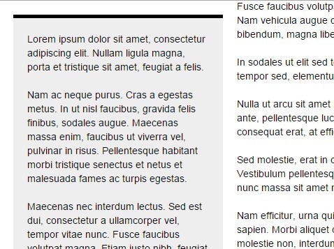
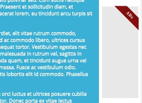
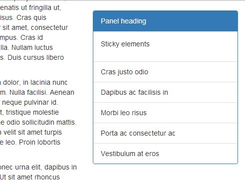
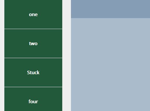
A JavaScript library that glues your website's sidebars (or any vertical column for that matter), making them permanently visible when scrolling up and down. Useful when a sidebar is too tall or too short compared to the rest of the content. Works with virtually any design and supports multiple sidebars.
WordPress
Also available as a premium WordPress plugin that comes with a user-friendly admin panel and supports a plethora of themes out-of-the-box.
Examples
Install
Bower
If you are using Bower as your package manager:
bower install theia-sticky-sidebarNPM
If you are using NPM as your package manager:
npm install theia-sticky-sidebarUsage
Your website's HTML structure has to be similar to this in order to work:
<div class="wrapper"> <div class="content"> <div class="theiaStickySidebar"> ... </div> </div> <div class="sidebar"> <div class="theiaStickySidebar"> ... </div> </div> </div>Note that the inner "theiaStickySidebar" divs are optional, but highly recommended. If you don't supply them yourself, the script will create them for you, but this can be problematic if you're using ads or iframes, since they will be moved around in the DOM and as a result will get reloaded.
Note: Make sure to use <!DOCTYPE html> in your page, otherwise you might run into weird issues.
For the above example, you can use the following JavaScript:
<script type="text/javascript" src="http://code.jquery.com/jquery.min.js"></script> <script type="text/javascript" src="dist/ResizeSensor.min.js"></script> <script type="text/javascript" src="dist/theia-sticky-sidebar.min.js"></script> <script type="text/javascript"> jQuery(document).ready(function() { jQuery('.content, .sidebar').theiaStickySidebar({ // Settings additionalMarginTop: 30 }); }); </script>ResizeSensor
Theia Sticky Sidebar uses the CSS Element Queries library to detect when your sidebars change height, so that it can recalculate their positions. This can happen if you are using an accordion, for example.
You can choose not to include the ResizeSensor.min.js script in your page, in which case Theia Sticky Sidebar will continue to function (possibly even a bit smoother) but will not automatically detect height changes.
Settings
containerSelector
The sidebar's container element. If not specified, it defaults to the sidebar's parent.
additionalMarginTop
An additional top margin in pixels. Defaults to 0.
additionalMarginBottom
An additional bottom margin in pixels. Defaults to 0.
updateSidebarHeight
Updates the sidebar's height. Use this if the background isn't showing properly, for example. Defaults to true.
minWidth
The sidebar returns to normal if its width is below this value. Useful for responsive designs. Defaults to 0.
disableOnResponsiveLayouts
Try to detect responsive layouts automatically and disable the sticky functionality on smaller screens. More exactly, it detects when the container and the sidebar are moved one on top of the other, instead of showing up side-by-side. Defaults to true.
defaultPosition
The sidebar must have a non-static position, as the inner sticky-sidebar uses position: absolute. Defaults to relative.
namespace
Events are binded using a namespace, so that you may unbind them later on without affecting others. Defaults to TSS.
Credits
Stock photos courtesy of Unsplash.com
