jQuery Accessible Carrousel using ARIA
This jQuery plugin will transform a simple list of div’s and hx into a fantastic-shiny carrousel system, using ARIA.
A full demo is here: https://a11y.nicolas-hoffmann.net/carrousel/
Some informations
A robust base
- This carrousel is based on simple
div’s, so your page will be working even without JavaScript! - The code that it produces is valid and semantic.
- It is entirely modular, quite easy to use and customise.
An accessible carrousel
- The order of navigation is simple and logical.
- You can easily navigate with the keyboard through it.
- It is based on ARIA Design Pattern for tabpanels.
Lightweight
- 25kb (development, readable by humans);
- 8kb (minified, readable by machines);
- 2kb minified and gzipped (readable by… mutants‽‽).
Free and no license problem
- No license problem: it uses MIT license, so it’s free, open-source and you can do whatever you want with it, including commercial use. This permission notice shall be included in all copies or substantial portions of it.
- However, it is not prohibited to send me a little “thanks”. ;)
It’s (highly) customisable
- You can style it as you want;
- You can set up transitions… as you want;
- A lot of classes are proposed to customize it easily;
- There is no CSS code injected into HTML, so your DOM is clean, especially for responsive.
===========================
How it works
Basically:
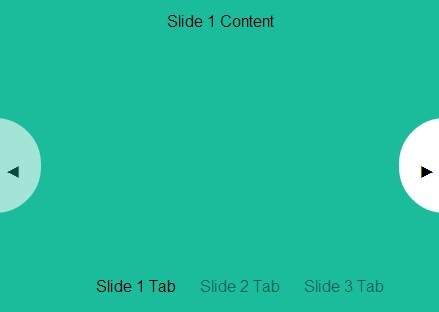
- An ordered list
ol class="js-carrousel__control__list"is inserted before all elements - A div with a button is inserted between carrousel contents and the first control list. It is the “previous” button.
- Another one is inserted after all carrousel contents, for the… “next” button.
- Once the HTML markup is set up in a logical order for keyboard in the DOM, all ARIA attributes are added to make the link between tab buttons and tab contents, to know which one is related to which other.
- Keyboard shortcuts of ARIA Design Pattern for tabpanels are added, and you can easily navigate and use the carrousel.
===========================
Keyboard
Keyboard navigation is supported, based on ARIA DP (http://www.w3.org/TR/2013/WD-wai-aria-practices-20130307/#tabpanel && http://www.oaa-accessibility.org/examplep/tabpanel1/):
If you focus in the carrousel "buttons"
- use Up/Left to see previous carrousel tab,
- use Down/Right to see next carrousel tab
- Use "Home" to see first carrousel tab (wherever you are in tab buttons)
- Use "End" to see last carrousel tab (wherever you are in tab buttons)
If you focus in a carrousel content
- use Ctrl Up/left to Set focus on the carrousel button for the currently displayed carrousel tab
- use Ctrl PageUp to Set focus on the previous carrousel button for the currently displayed carrousel tab
- use Ctrl PageDown to Set focus on the next carrousel button for the currently displayed carrousel tab
New: if you focus on next/prev buttons
- if you activate it, the focus will be put onto next/prev contents, not on control list.
Warning: Ctrl+PageUp/PageDown combination could activate for some browsers a switch of browser tabs. Nothing to do for this, as far as I know (if you have a solution, let me know).
===========================
Demo
A demo page is here: https://a11y.nicolas-hoffmann.net/carrousel/
It can be included for one, two carrousels systems or more in a page.
===========================
How to use it
You may use npm i jquery-accessible-carrousel-aria. Or download it.
<div class="carrousel relative"> <div class="carrousel__container mod--hidden" data-carrousel-btn-previous-img="./arrow_back.png" data-carrousel-btn-next-img="./arrow_next.png" data-carrousel-btn-previous-text="Show previous panel" data-carrousel-btn-next-text="Show next panel" data-carrousel-prefix-classes="news" data-carrousel-span-text-class="invisible" data-carrousel-transition="fade" data-carrousel-existing-hx="h3"> <div class="carrousel__content"> <h3>A first panel</h3> <p>Here the content.</p> </div><!-- --><div class="carrousel__content"> <h3>A second panel</h3> <p>Here the content.</p> </div><!-- --><div class="carrousel__content"> <h3>A third panel</h3> <p>Here the content.</p> </div> </div> </div>Important note: for accessibility purposes (for VoiceOver), the plugin has to give focus to hx (h2, h3, h4, etc.) in tab contents. It is better having hx in each content tab.
- If you have some, it is great, you just have to tell the plugin. In the example above, you tell it via
data-carrousel-existing-hx.
And all these subtitles will be used in theollist. - If you don’t have, nevermind, just tell the plugin which level of
hxto use withdata-carrousel-hx="hx", and it will insert anh3 class="invisible"for you in each tab panel (you can “visually” hide them if needed withinvisibleclass). To specify the titles, use the attributedata-carrousel-span-text="Panel"and the plugin will create titles for each tab content: “Panel 1”, “Panel 2”, etc. And all these subtitles will be used in theollist.
Other attributes are available:
-
data-carrousel-btn-previous-img: the address of the image used for “previous” button. -
data-carrousel-btn-previous-text: the text of the “previous” button, will be put in thealtattribute if there is an image, and in thetitleattribute for the button. -
data-carrousel-btn-next-img: the address of the image used for “next” button. -
data-carrousel-btn-next-text: the text of the “next” button, will be put in thealtattribute if there is an image, and in thetitleattribute for the button. -
data-carrousel-prefix-classes: all the classes added for styling purpose will be prefixed, to simplify creating carrousel reusable styles. -
data-carrousel-span-text-class: in theollist, the text will be wrapped into aspanwith this class. Example,data-carrousel-span-text-class="yipikai":<a … role="tab"><span class="yipikai">A robust base</span></a> -
data-carrousel-transition: the value of this attribute will be added as a class ondiv class="carrousel__container". And CSS will do the magic to animate it, for this page, I’ve created three transitions: “slide”, “fade” and “none”. -
data-carrousel-active-slide: the value of this attribute will activate the number of the specified slide, ex:data-carrousel-active-slide="3".
Enjoy.
