ARIA Tooltips or "Tooltips"
The term "tooltip" can mean different things depending on the designer or developer's intent.
A tooltip traditionally is meant to be used to provide short, non-essential, description to an element. However, "tooltips" are often used to reveal an element's accessible name. Often visually indistinguishable from each other, this script at least aims to allow developers to set whether the "tooltip" is meant to reveal the accessible name for the element, or whether it's meant to provide a description to the element it is associated with.
Rules for a tooltip
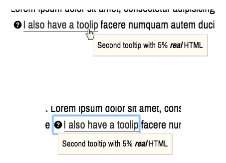
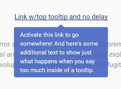
Mouse hover or keyboard focus should reveal the tooltip for the element it is associated with.
An element should only have a single "tooltip" associated with it. This means that a developer can only set a tooltip to either contain the element's accessible name, or a description.
An element with a custom tooltip cannot also have a title attribute to produce a native tooltip. This script will always remove a title attribute from the trigger of the tooltip.
A user should be able to hit the escape key to close a tooltip, regardless of if that tooltip was opened by focus or hover of an element.
Tooltips should be brief in their content. If an element requires a description that necessitates more than a brief explanation, the use of imagery, or more complex markup patterns than a text string (e.g. a list), then a "tooltip" is not the appropriate solution for your UI need.
Tooltips in general are a bit quirky on touch devices, since there's no "hovering". If you have a keyboard setup to work with your touch device, then the tooltips should be revealed when their trigger receives keyboard focus. If you do get a tooltip to display on tap, a touch listener becomes active to allow for a tap anywhere in the current viewport to dismiss the tooltip.
Minimum Required Mark-up
The script requires that the element that should have an associated tooltip be a child of a containing element that the script will search for.
<wrapping-element data-tooltip> <trigger-element data-tooltip-trigger>...</trigger-element> </wrapping-element>Depending on the context in which the "trigger element" (often an interactive control) lives in the DOM, the "wrapping element" should meet the expectations for its parent element's content model.
For instance:
<ul> <li data-tooltip> <trigger-element data-tooltip-trigger>...</trigger-element> </li> </ul> <!-- or --> <div data-tooltip> <trigger-element data-tooltip-trigger>...</trigger-element> </div> <!-- or --> <p data-tooltip> <trigger-element data-tooltip-trigger>...</trigger-element> </p>If the trigger element is meant to exist as a child element in an instance where a block level element were not appropriate (e.g. a paragraph), then the wrapping element should be a span.
<p> ... <span data-tooltip> <trigger-element data-tooltip-trigger>...</trigger-element> </span> ...Customize the script
You may rather use your own data attributes, or classes with this script. As one of the function's parameters, you can pass in your values to overwrite the following:
tipConfig = { baseID: 'tt_', ariaHiddenTip: true, tipWrapperClass: 'tooltip', tipContentClass: 'tooltip__content', tipTypeAttr: 'data-tooltip', tipContentAttr: 'data-tooltip-content', tipSelector: '[data-tooltip-source]', triggerSelector: '[data-tooltip-trigger]' }Attributes
data-tooltip
This attribute is the default hook for the script to search for and find tooltip widgets in the DOM. The attribute an either be set to the empty string, or may accept the token "label", in which it will run the setup for the tooltip to display the accessible name of the trigger element.
data-tooltip-trigger This attribute is required to be placed on the element that will have the tooltip associated with it. This element should be an element that can natively receive keyboard focus, e.g. a button, <a href="...">, or a form control.
data-tooltip-content
This attribute may be used on the widget wrapping element (along with data-tooltip) to define the text string for the generated tooltip.
For example:
<div data-tooltip data-tooltip-content="Deleting an asset is permanent"> <button data-tooltip-trigger> Delete </button> </div>data-tooltip-tip
This selector should be placed on the child element of data-tooltip that is the hard coded fall back for the tooltip, if this script were to not function.
For example:
<div data-tooltip> <button data-tooltip-trigger aria-describedby="foo"> Delete </button> <p data-tooltip-tip id="foo"> Deleting an asset is permanent. </p> </div>Default generated classes and tooltip markup
.tooltip
The outter wrapper of the tooltip content. This class allows for initial positioning of the tooltip.
.tooltip__content
The element that will receive an id to be referenced by the trigger element. If the tooltip acts as a description to the associated element, it will receive the role="tooltip" attribute (not that this role presently does all that much... the aria-describedby from the owning element (trigger) that points to the id of the tooltip is the attribute that is the most important for associating the tooltip with its associated element).
Tooltips, whether a description or accessible name will receive an aria-hidden="true" attribute, this can be modified by setting the ariaHiddenTip config option to false. The aria-hidden="true" will ensure that the tooltip cannot be navigated to by a screen reader's virtual cursor, resulting in a duplicate announcement of the content that was already announced when focusing the element that the tooltip is associated with. This default setting may change depending on future clarification in the ARIA specification about the use of role="tooltip".
License & Such
This script was written by Scott O'Hara.
It has an MIT license.
Do with it what you will :)