ARIA TOOLTIP
About
HTML, CSS and JS tooltip UI-component for scalable projects. User-friendly and accessible: WAI ARIA 1.1 compliant. Go to demo page or check on npm.
- Developed following BEM methodology
- User-friendly and accessible
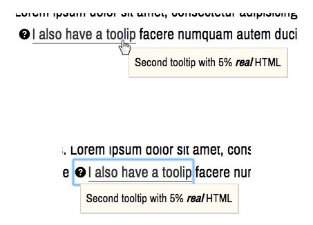
- Smart auto-position function to prevent tooltip from overflowing.
- Only 7KB JS (minified)
- JS plugin runs in strict mode
- Compatible with UMD
Dependencies
jQuery
Developed and tested with jQuery 3.2.1
Cross-browser tests
- Tested on Google Chrome 57 / macOS Sierra 10.
Options
| Name | Default | Type | Description | Required or optional |
|---|---|---|---|---|
| position | top | token | Set where the tooltip should be positioned relative to the element it belongs to. Accepted values: **top, left, right, bottom, topRight, topLeft, bottomRight, bottomLeft, topStart, bottomStart, topEnd, bottomEnd, screenTop, screenBottom, **. (check the section 'Positions' for more details) | optional |
| offsetX | 0 | float | Offset tooltip on the X axis by a given value to adjust distance between tooltip and element (in px). | optional |
| offsetY | 0 | float | Offset tooltip on the Y axis by a given value to adjust distance between tooltip and element (in px). | optional |
| openClass | tooltip_open | string | Class added to tooltip when visible. | optional |
| modifierClass | '' (empty string) | string | Class added to tooltip when visible to modify default aspect. (Some ready-to-use modifier classes are already defined in css/scss). | optional |
| cssTransitions | false | bool | Use css transitions to animate tooltip instead of JS. Check 'Using CSS transitions' for more infos. | default |
| responsive | false | false or array of objects | Enable responsive mode by passing an array of object with settings for different breakpoints. For detailed infos check the section 'responsive mode'. | optional |
| fadeSpeed | 100 | int (>= 0) | Duration of fade-in and fade-out animation. | optional |
| zIndex | 10 | int | Z-index set to tooltip when visible. | optional |
| autoPosition | false | Array of objects or bool false | Enable or disable auto-positioning for tooltip, when author's defined position will lead to tooltip overflow (check the section 'Auto position' for more infos) | optional |
| safeAreaMarginX | 5 | int | when autoPosition is enabled, define a margin on the right and left side of the screen where tooltip should not be placed | optional |
| safeAreaMarginY | 5 | int | when autoPosition is enabled, define a margin on the top and bottom side of the screen where tooltip should not be placed | optional |
Installation
Download the package from GitHub and get the compiled files from the dist folder.
The plugin is also available on npm:
npm install t-aria-tooltip Usage
- Include the JS script aria-tooltip.js - or the minified production script aria-tooltip.min.js - in the head or the body of your HTML file.
- Include the CSS file aria-tooltip.css in the head of your HTML file or include the SCSS files in your project.
- Initialise the widget within an inline script tag, or in an external JS file.
HTML
Use following HTML markup to implement a tooltip:
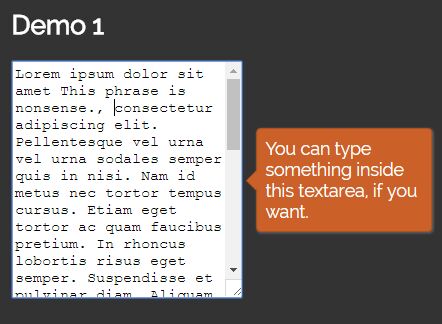
<!-- EXAMPLE 1: BLOCK ELEMENTS --> <input name="example2" type="button" class="has-tooltip" value="button with tooltip" aria-describedby="tt2"> <span class="tooltip" id="tt2">This button is really useful. You can click on it!</span> <!-- EXAMPLE 2: INLINE ELEMENTS --> <p><span class="has-tooltip" aria-describedby="tt3" id="demo3" style="color: #cb6129;">Lorem ipsum dolor sit amet</span> <span class="tooltip" id="tt3">This phrase is nonsense.</span>, consectetur adipiscing elit. Pellentesque vel urna vel urna sodales semper quis in nisi. Nam id metus nec tortor tempus cursus. Etiam eget tortor ac quam faucibus pretium. In rhoncus lobortis risus eget semper. Suspendisse et pulvinar diam. Aliquam dictum ex nulla, et aliquet ante gravida id. Praesent eu tincidunt nunc, ac egestas nibh. Vivamus porttitor, ante eu placerat mollis, lacus neque aliquam arcu, eget elementum metus ante sed odio. Etiam libero diam, interdum sed pharetra nec, maximus pellentesque turpis. Suspendisse ex velit, sagittis efficitur tristique non, porttitor non nibh. Fusce placerat orci in enim aliquam, ut vestibulum turpis interdum.</p>IMPORTANT: Do not forget to set an id on the tooltip and expose the relation between the tooltip and the element it belongs to by setting the attribute aria-describedby.
JS: Initialisation
Initialise the plugin as follows:
$('.has-tooltip').ariaTooltip({ option1: value1, option2: value2 });Methods:
The plugin supports following methods: show and hide.
Show
To show a tooltip, call ariaTooltip and pass 'show' as parameter:
$('#my-element').ariaTooltip('show');Hide
To hide a tooltip call ariaTooltip and pass 'hide' as parameter:
$('#my-element').ariaTooltip('hide');Positions
A tooltip can be positioned in 12 different positions relative to the element it belongs to:
top ------- | ----- ************* ------- left |-- * Element * --| right ----- ************* ------- | --------- bottom ======================================= | topStart --------- | ************* * Element * ************* | --------- | bottomStart ======================================= topEnd | --------- | ************* * Element * ************* | ----------- bottomEnd | ======================================= topLeft | | topRight -------- ----------- \ / ************* * Element * ************* / \ -------------- ------------- bottomRight | | bottomRight It is also possible to position the tooltip on the top (screenTop) and the bottom (screenBottom) of the viewport. When using screenTop and screenBottom the tooltip will span the whole width of the viewport.
Responsive mode
The plugin supports an advanced responsive mode. This mode gives authors better control over the aspect and functionality of the tooltips on different devices. The responsive mode is enabled through the option 'responsive'. This option accepts an array of objects with the options for different screen widths (see code below).
$('.has-tooltip').ariaTooltip({ responsive: [ { breakpoint: 1, position: 'screenBottom', modifierClass: 'tooltip_screen-bottom' }, { breakpoint: 768, position: 'top', modifierClass: 'tooltip_top', translateY: -0.75 }, { breakpoint: 992, position: 'right', modifierClass: 'tooltip_right', translateX: 0.75 } ] });The option 'breakpoint' sets the minimum screen width (in px) and is allowed only in responsive mode, e.g. as a property of an object of the 'responsive' array. Except for 'breakpoint' and 'responsive', all other options are not restricted to a specific mode.
Options that applies to any screen width can and should be set outside of the option 'responsive' to keep code clear and reduce the amount of operations needed for the initialisation of the plugin. Consider following example:
$('.has-tooltip').ariaTooltip({ responsive: [ { breakpoint: 1, position: 'right', [...] }, { breakpoint: 768, position: 'right', [...] }, { breakpoint: 992, position: 'right', [...] } ] });Although this code would perfectly work, it is recommended to set the option 'position' only once:
$('.has-tooltip').ariaTooltip({ position: 'right', //This option is valid for all breakpoints responsive: [ { breakpoint: 1, [...] }, { breakpoint: 768, [...] }, { breakpoint: 992, [...] } ] });When using responsive mode, it is important to cover all screen widths by setting the first 'breakpoint' to 1 or to the minimum screen width possible. Also, for the plugin to work correctly, all the passed objects must be sorted in ascending order by breakpoint, because the plugin does not provide a method to automatically sort the breakpoints.
$('.has-tooltip').ariaTooltip({ responsive: [ { breakpoint: 768, [...] }, { breakpoint: 1, [...] }, { breakpoint: 992, [...] } ] });The code above will cause an error and the plugin wont work correctly!
The correct initialisation code is instead the following:
$('.has-tooltip').ariaTooltip({ responsive: [ { breakpoint: 1, //first breakpoint [...] //options for screens >= 1px width }, { breakpoint: 768, //second breakpoint [...] //options for screens >= 768px width (which is > first breakpoint) }, { breakpoint: 992, //third breakpoint [...] //options for screens >= 992px width (which is > second breakpoint) } ] });Custom events
The plugin triggers following events:
- ariaTooltip.initialised after the tooltip is initialised
- ariaTooltip.updated when the tooltips's responsive options are updated
- ariaTooltip.positioned when the tooltip's position is calculated (occurs on resize)
- ariaTooltip.autoPositioned when auto-positioning occurs (the event is fired before the event
ariaTooltip.positioned) - ariaTooltip.show when the tooltip is shown
- ariaTooltip.hide when the tooltip gets hidden
Example
This events are triggered on window and return the tooltips's data object as arguments.
//listen for ariaTooltip.initialised $(window).on('ariaTooltip.initialised', function(event, tooltip){ //When a tooltip is initialised, perform an action ariaTooltip.element.addClass('aria-tooltip_initialised'); }); //Initialise the tooltip $('.has-tooltip').ariaTabs(); Using CSS transitions
By default the plugin is configured to use JS to show/hide the tooltips. Setting the option cssTransitions to 'true' will disable the JS animations and it is possible to implement show/hide animations directly in the css. In fact, the plugin toggles the class passed along with the option tooltipOpenClass and modifierClasses when a tooltip is toggled.
Auto positioning
The plugin implements a method to check whether there is enough free space around an element for the tooltip to be placed. By default auto positioning is disabled (autoPosition: false). To enable auto positioning pass an array of objects to the option autoPosition, containing the possible alternatives positions and eventually the modifier class (see example below). It is also possible to specify different values for offsetX and offsetY for each array entry (when offsetX and offsetY are not specified for an autoPosition setting, the standard values for offsetX and offsetY will be used instead).
$('.has-tooltip').ariaTooltip({ position: 'top', // the preferred position for the tooltip autoPosition: [ { position: 'right', tooltipModifierClass: 'tooltip_right' }, { position: 'bottom', tooltipModifierClass: 'tooltip_bottom' }, { position: 'left', tooltipModifierClass: 'tooltip_left' }, ], //enable auto positioning and let the script choose between one of this positions //when the default position ('top') will lead to content overflow. [...] // other options });The auto positioning method will use the first position from the autoPosition array which does not lead to content overflow. For this reason, it is important to order the positions from the best to the worst alternative.
If tooltipModifierClass is not set, no modifier class is added to the tooltip.
IMPORTANT: The auto positioning method does not apply if the default position of the tooltip is set to screenTop or screenBottom.
Other recommendations
Do not apply any transformation to the tooltip in CSS. The transform property is used inline on tooltip tags by the plugin to position them correctly
LICENSE
This project is licensed under the terms of the MIT license.
See LICENSE.md for detailed informations.