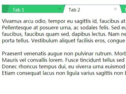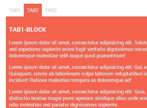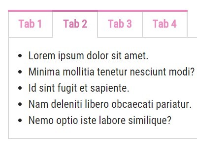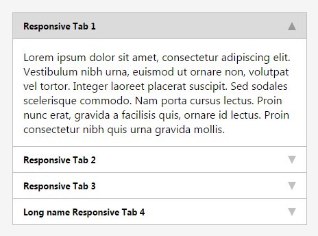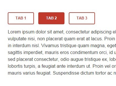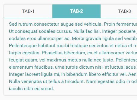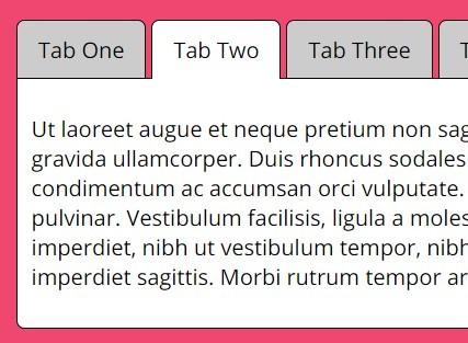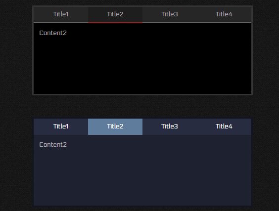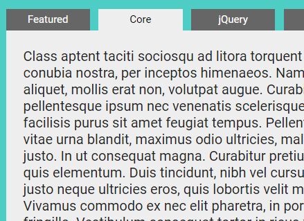
ARIA TABS
HTML, CSS and JS user-friendly and accessible tab-component for scalable projects. WAI ARIA 1.1 compliant. Go to demo page or check on npm.
- Developed following BEM methodology
- User-friendly and accessible
- Only 4KB JS (minified)
- JS plugin runs in strict mode
- Compatible with UMD
Dependencies
jQuery
Developed and tested with jQuery 3.2.1
Cross-browser tests
- Tested on Google Chrome 57 / macOS Sierra 10.
- Tested on Safari for iOS 10.3.x / iPhone 5s.
- Tested on Google Chrome 60 / Windows 10.
Options
| Name | Default | Type | Description |
|---|---|---|---|
| tabGroupIdPrefix | tab-group-- | string | Prefix used to generate the IDs of tab groups |
| navClass | tab-group__tab-nav | string | Class of a the tab nav element (the class is used from the plugin to select the element) |
| listClass | tab-group__tab-ul | string | Class of a the tab-list <ul> element (the class is used from the plugin to select the element) |
| listItemClass | tab-group__tab-li | string | Class of a tab <li> element (the class is used from the plugin to select the elements) |
| btnClass | tab-group__tab-btn | string | Class of a button acting as a tab (the class is used from the plugin to select the elements) |
| panelsContainerClass | tab-group__tabs-cont | string | Class of the element acting as the tab-panel's container (the class is used from the plugin to select the elements) |
| panelClass | tab-group__tabpanel | string | Class of the tab-panels (the class is used from the plugin to select the elements) |
| contentClass | tab-group__tab-content | string | Class of the direct child of each tab-panel, wrapper of the tab-panel content (the class is used from the plugin to select the elements) |
| btnSelectedClass | tab-group__tab-btn_selected | string | Class added to a tab when selected |
| panelSelectedClass | tab-group__tabpanel_selected | string | Class added to a tab-panel when selected |
| contentRole | document | token, array of tokens | Role of tab-panels's content. Accepted values: document, application. For more information see https://www.w3.org/TR/wai-aria-1.1/. To set different roles on each tab-panel's content element, pass an array of tokens. |
| fadeSpeed | 300 | int (>= 0) | Speed of the fade-in animation of a tab-panel. |
| cssTransitions | false | bool | Use css transitions to show and hide a tab-panel instead of jQuery fade animations. Read section 'Using CSS transitions' for more informations. |
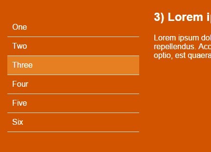
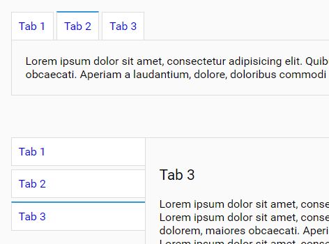
| verticalMode | false | bool | Enable vertical mode for tab-list: set aria-orientation to verticaland enable navigation with up and down arrow keys. (Use css to vertically stack tabs). |
Installation
Download the package from GitHub and get the compiled files from the dist folder.
The plugin is also available on npm:
npm install t-aria-tabs Usage
- Include the JS script aria-tabs.js - or the minified production script aria-tabs.min.js - in the head or the body of your HTML file.
- Include the CSS file aria-tabs.css in the head of your HTML file or include the SCSS files in your project.
- Initialise the widget within an inline script tag, or in an external JS file.
HTML
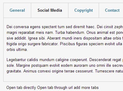
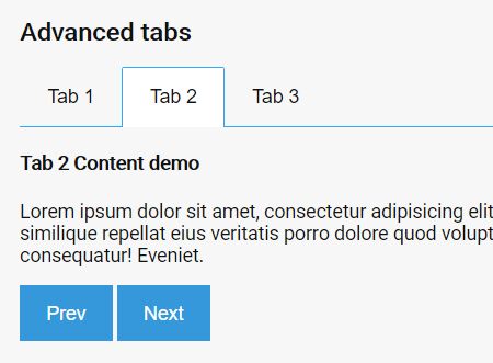
Use following HTML markup to implement a tab widget:
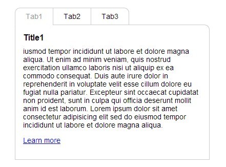
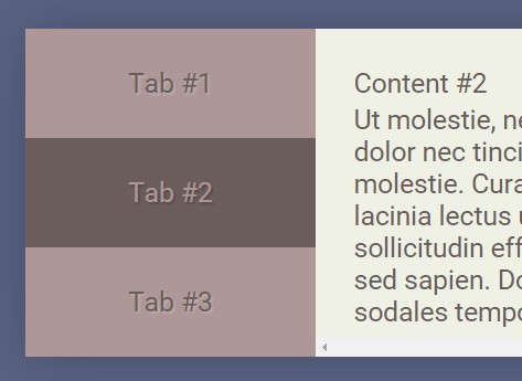
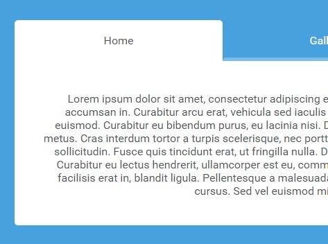
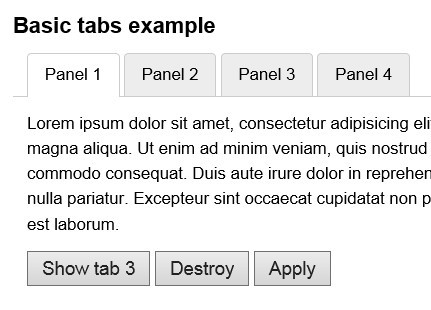
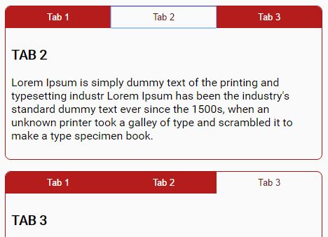
<div class="tab-group"> <!-- TAB NAVIGATION --> <nav class="tab-group__tab-nav"> <ul class="tab-group__tab-ul"> <li class="tab-group__tab-li"> <button type="button" class="tab-group__tab-btn">tab 1</button> </li> <li class="tab-group__tab-li"> <button type="button" class="tab-group__tab-btn">tab 2</button> </li> <li class="tab-group__tab-li"> <button type="button" class="tab-group__tab-btn">tab 3</button> </li> </ul> </nav> <!-- TABPANEL CONTAINER --> <div class="tabs-group__tabs-cont"> <!-- TABPANEL BEGIN --> <div class="tab-group__tabpanel"> <div class="tab-group__tab-content"> <h3>TAB 1</h3> <p>Lorem ipsum dolor sit amet, consectetur adipiscing elit, sed do eiusmod tempor incididunt ut labore et dolore magna aliqua. Ut enim ad minim veniam, quis nostrud exercitation ullamco laboris nisi ut aliquip ex ea commodo consequat. Duis aute irure dolor in reprehenderit in voluptate velit esse cillum dolore eu fugiat nulla pariatur. Excepteur sint occaecat cupidatat non proident, sunt in culpa qui officia deserunt mollit anim id est laborum.</p> <button type="button">Focus test</button> </div> </div> <!-- TABPANEL END --> <!-- TABPANEL BEGIN --> <div class="tab-group__tabpanel"> <div class="tab-group__tab-content"> <h3>TAB 2</h3> <p>Lorem ipsum dolor sit amet, consectetur adipiscing elit, sed do eiusmod tempor incididunt ut labore et dolore magna aliqua. Ut enim ad minim veniam, quis nostrud exercitation ullamco laboris nisi ut aliquip ex ea commodo consequat. Duis aute irure dolor in reprehenderit in voluptate velit esse cillum dolore eu fugiat nulla pariatur. Excepteur sint occaecat cupidatat non proident, sunt in culpa qui officia deserunt mollit anim id est laborum.</p> </div> </div> <!-- TABPANEL END --> <!-- TABPANEL BEGIN --> <div class="tab-group__tabpanel"> <div class="tab-group__tab-content"> <h3>TAB 3</h3> <p>Lorem ipsum dolor sit amet, consectetur adipiscing elit, sed do eiusmod tempor incididunt ut labore et dolore magna aliqua. Ut enim ad minim veniam, quis nostrud exercitation ullamco laboris nisi ut aliquip ex ea commodo consequat. Duis aute irure dolor in reprehenderit in voluptate velit esse cillum dolore eu fugiat nulla pariatur. Excepteur sint occaecat cupidatat non proident, sunt in culpa qui officia deserunt mollit anim id est laborum.</p> </div> </div> <!-- TABPANEL END --> </div> </div>JS: Initialisation
Initialise the plugin as follows:
$('.tab-group').ariaTabs({ option1: value1, option2: value2 });Methods:
Methods can be called on an initialised tabs widget with following syntax:
$('#my-tab-widget').ariaTabs('methodName', methodArgument);The plugin supports following methods: toggle.
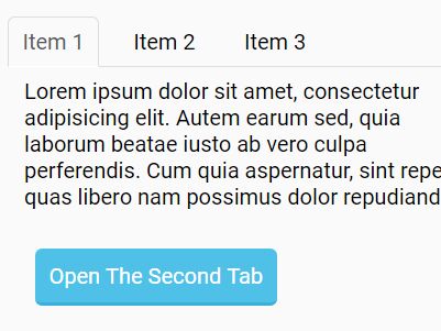
Select
In order to select a tab call ariaTabs and pass 'select' as first argument. The second argument of the function can be the index (starting from 0) of a tab, a jQuery selector, or a jQuery element.
//The following are all valid method's call and lead to the same result $('#my-tab-widget').ariaTabs('select', 1); $('#my-tab-widget').ariaTabs('select', '#my-tab-1'); $('#my-tab-widget').ariaTabs('select', $('#my-tab-1')); Custom events
The plugin triggers following events:
- ariaTabs.initialised after a tab's group is initialised
- ariaTabs.select when a tab get selected
- ariaTabs.deselect when a tab is deselected
ariaTabs.initialised
This event is triggered on window and returns the tabs's group data object as arguments.
//listen for ariaTabs.initialised $(window).on('ariaTabs.initialised', function(event, tabsGroup){ //When a tab's group is initialised, perform an action tabsGroup.element.addClass('aria-tabs_initialised'); }); //Initialise the tab's groups $('.tabs-group').ariaTabs(); ariaTabs.select and ariaTabs.deselect
This events are also triggered on window and returns the tabs's group data object and the index o the selected/deselected tab as arguments.
//listen for ariaTabs.select $(window).on('ariaTabs.select', function(event, tabsGroup, index){ //perform an action console.log(tabsGroup.element + ' ' + index); }); Using CSS transitions
By default the plugin is configured to use the jQuery methods fadeIn(), fadeOut() to show/hide tab-panels. Setting the option cssTransitions to 'true' will disable the JS animations. This will make possible to implement the transitions with css. In fact, the plugin toggles the classes passed along with the options btnSelectedClass and panelSelectedClass every time the widget's status is changed.
LICENSE
Aria tabs is licensed under the terms of the MIT license.
See LICENSE.md for detailed informations.