jQuery Accessible Accordion System, using ARIA
Demo
A demo page is here: https://a11y.nicolas-hoffmann.net/accordion/
It can be included for one, two accordion systems or more in a page.
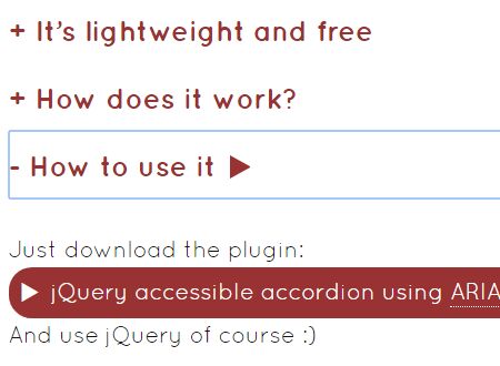
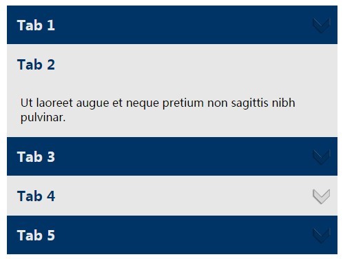
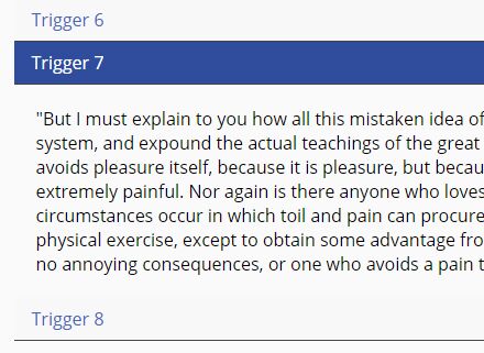
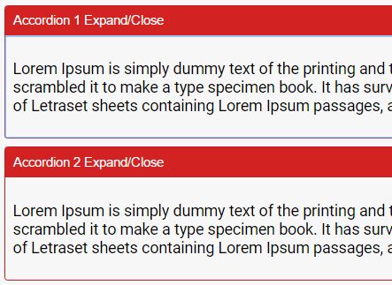
This jQuery plugin will transform a simple list of hx and div’s into a fantastic-shiny accordion system, using ARIA.
<div class="js-accordion" data-accordion-prefix-classes="your-prefix-class"> <div class="js-accordion__panel"> <h2 class="js-accordion__header">First tab</h2> here the content of 1st tab<br><br> <a href="#">pweet</a><br><br> plop </div> <div class="js-accordion__panel" data-accordion-opened="true"> <h2 class="js-accordion__header">Second tab</h2> here the content of 2nd tab<br><br> <a href="#">pweet</a><br><br> plop </div> <div class="js-accordion__panel"> <h2 class="js-accordion__header">Third tab</h2> here the content of 3rd tab<br><br> plop </div> <div class="js-accordion__panel"> <h2 class="js-accordion__header">Fourth tab</h2> here the content of 4th tab<br><br> <a href="#">pweet</a><br><br> plop </div> </div>How it works
Basically:
- each
js-accordion__headeris duplicated toyour-prefix-class__titleinto accordion contents, before being replaced by a buttonyour-prefix-class__header - each
js-accordion__panelgets a classyour-prefix-class__panel - Once the HTML markup is set up, all ARIA attributes are added to make the link between accordion buttons and accordion contents, to know which one is related to which other.
- Keyboard shortcuts of ARIA Design Pattern for accordions are added, and you can easily navigate and use it.
Keyboard
Keyboard navigation is supported, based on ARIA DP (http://www.w3.org/TR/wai-aria-practices/#accordion):
If you focus in the accordion "buttons"
- use Up/Left to put focus on previous accordion button,
- use Down/Right to put focus on next accordion button
- use Home to put focus on first accordion button (wherever you are in accordion buttons)
- use End to put focus on last accordion button (wherever you are in accordion buttons)
And strike space or return on an accordion button to open/close it
All options of the plugin
var defaultConfig = { headersSelector: '.js-accordion__header', panelsSelector: '.js-accordion__panel', buttonsSelector: 'button.js-accordion__header', buttonsGeneratedContent: 'text', // html button: $('<button></button>', { class: 'js-accordion__header', type: 'button' }), buttonSuffixId: '_tab', multiselectable: true, prefixClass: 'accordion', headerSuffixClass: '__title', buttonSuffixClass: '__header', panelSuffixClass: '__panel', direction: 'ltr', // rtl accordionPrefixId: 'accordion' };When calling the plugin, you may set up options as you want. For example:
$(function () { $('.js-accordion').accordion({ buttonsGeneratedContent: 'html' }); });Will call the plugin and generate buttons keeping HTML content in the Hx.
Bonuses
Content opened by default
If you want to have an accordion content opened by default, just add the attribute data-accordion-opened="true" on a js-accordion__panel, example:
<div class="js-accordion__panel" data-accordion-opened="true">Wanna see it animated?
In the demo https://a11y.nicolas-hoffmann.net/accordion/?animated=1 , you can see it animated. I’ve changed the attribute data-accordion-prefix-classes="minimalist-accordion" to animated-accordion, without changing (almost) anything else to the page. Magic? No. :)
The magic is the same used for my jQuery simple and accessible hide-show system animated.
In fact, it is possible using some CSS transitions. You have to keep in mind several things to keep it accessible:
- You can’t animate the
displayproperty, andheightproperty might be complicated too to animate. - So you can’t use
display: none;to hide a content (even for assistive technologies). - You have to set up
visibilitytovisibleorhiddento show/hide a content. - Basically, you should animate
max-height,opacity(if needed), and usevisibilityto hide content to assistive technology.
So here is the CSS code (unprefixed):
.animated-accordion__panel { display: block; overflow: hidden; opacity: 1; transition: visibility 0s ease, max-height 1s ease, opacity 1s ease ; max-height: 100em; /* magic number for max-height = enough height */ visibility: visible; transition-delay: 0s; margin: 0; padding: 0; } /* This is the hidden state */ [aria-hidden=true].animated-accordion__panel { display: block; max-height: 0; opacity: 0; visibility: hidden; transition-delay: 1s, 0s, 0s; margin: 0; padding: 0; }Here is the trick: from “hidden” to “visible” state, visibility is immediately set up to visible, and max-height/opacity are “normally” animated.
From “visible” to “hidden” state, the visibility animation is delayed. So the content will be immediately hidden… at the end of the animation of max-height/opacity.
Other options
The ARIA Design Pattern for accordions (http://www.w3.org/TR/wai-aria-practices/#accordion) allows to have several accordion panels opened at the same time (which is shown by the attribute aria-multiselectable="true"). However, you might need to avoid this for design purposes or client request. To do this, you may set this attribute on the accordion container: data-accordion-multiselectable="none". Example:
<div class="js-accordion" data-accordion-multiselectable="none" …>This option will set up aria-multiselectable="false" and the plugin will allow only one panel to be opened at the same time.
RTL Support
If the accordion is used on a RTL website, the keys will adapt themselves to it. :)
Enjoy.
