Accessible accordions & disclosure widgets
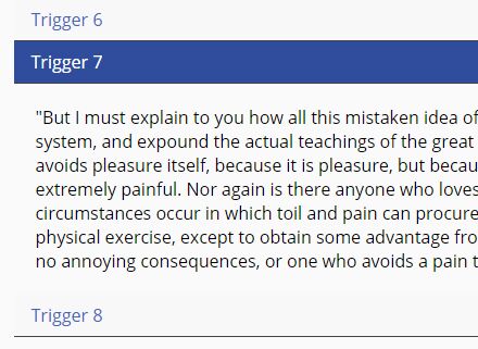
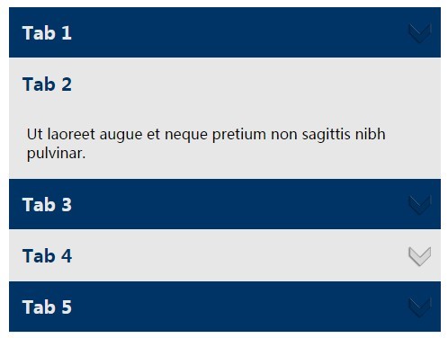
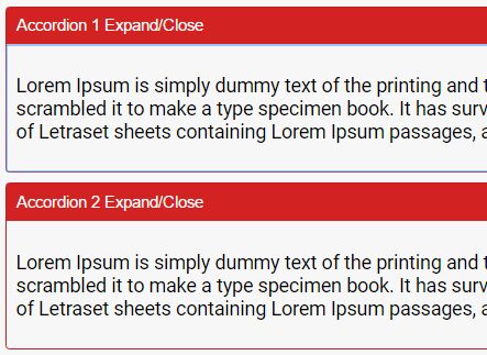
At its essence, an accordion component consists of a series of related disclosure widgets (aka toggle buttons that show/hide their related content). These accordion widgets are visually related to each other, and are grouped siblings in the DOM (as either a series of content sections within a wrapper element, or within a list element). Often accordions are programmatically aware of their siblings' current state, though this is optional behavior.
- UX based on ARIA Authoring Practices
- Accessible accordions demo page
- Accessible accordions blog article
Install
You can get this package on npm:
$ npm i a11y_accordions Clone it:
$ git clone https://github.com/scottaohara/a11y_accordions.git Or download a zip of the repository.
The CSS for this component is included in assets/css/. The classes are added to the accordion markup when the script/page loads. Presently, changing the class names requires a change in the JavaScript file and the CSS. Adjust the styles as necessary for your project.
Minimum Required Mark-up
<div data-aria-accordion> <h3 data-aria-accordion-heading> Heading Here </h3> <div data-aria-accordion-panel> <p> Content here </p> </div> <!-- repeat for as many accordion panels needed --> </div>Under the hood
The data-aria-accordion attribute is the key for initiating the process to convert the minimum markup into a functioning accordion component.
If an id is not pre-set on the accordion wrapper, then one will be auto generated. An ID is necessary to serve as the basis for populating generated IDs onto the child accordion panels. More on why these IDs are needed, later.
When an accordion is identified, the setup script continues to run and identify each heading and panel within the accordion. The different data-aria-accordion- attributes are necessary for the setup process to run and appropriately identify the key elements of the accordion.
During the setup process the following occurs:
- The classes for an accordion, and its child headings and panels will be added, corresponding to the appropriate
data-attributes. - The panels are hidden, and if a default panel was set (see options) an attribute of
aria-hidden="false"will be set to that panel. - The
idof the accordion container is used as the basis to generate unique IDs for each of the panels of the accordion. - a
<button>is dynamically created and inserted into thedata-aria-accordion-headingelement. The previous text of the heading is then inserted into this button. Presently, this strips out any previous HTML tags that were in the heading and only retains the text string. - The
<button>is given the classaccordion__trigger, anaria-controlsattribute, with the value set to the panelidthat appears next in the DOM. Whilearia-controlsis not presently useful in all assistive technologies, JAWS users will be given additional keys to press to begin interacting with the associated content. - Depending on the initial state of the associated panel, e.g. is it set to be opened by default or not, the
<button>will also receive the attributearia-expanded, which will either have the valuetrueorfalse. These value will indicate the current state of their associated panels, to uses of assistive technologies. - If an accordion has the
data-constantattribute set (see options), then the<button>witharia-expanded="true"will also have anaria-disabled="true"set to it.
Options
The following data attributes can be added to an accordion instance to alter the default accordion setup settings. None of the data attributes affect nested accordions, so a parent accordion that requires a consistently open panel would not pass down that requirement to a child accordion.
data-default
- Leave off or set to "none" to not have a panel open by default.
- Set the attribute, with no value, to open the first panel by default. Set the value to the panel number ("1" for the first panel in the DOM, 2 for the second, etc.) to open that specific panel by default.
- Setting a negative number, or 0 will open the first panel by default.
- Setting a number greater than the number of panels of an accordion, will open the last panel by default.
data-constant
By placing this attribute on the accordion wrapper, it will indicate that an accordion panel must always be expanded. An aria-disabled="true" will be set to the button that controls the expanded panel. This attribute will indicate to assistive technologies that the button can not be currently interacted with.
data-transition
Using this attribute on an accordion will add a modifier class to each child accordion panel where CSS transitions can be applied to transition the panel from hidden to revealed state.
data-multi
This attribute requires no value. Setting it will allow multiple accordion panels, of a particular group, to be opened at once.
Keyboard Controls
When focus on the accordion triggers:
- Tab and Shift + Tab, or standard AT navigation keys are used to navigate between accordion triggers and any focusable content within an accordion panel.
- Home moves focus to the first accordion trigger in the group.
- End moves focus to the last accordion trigger in the group.
- Space or Enter open/close the trigger's associated panel.
Note about VoiceOver
When navigating a document by headings, or list items (if an accordion is in a list), VoiceOver will announce the text of the element, the fact it contains a button, and the current state of the button (expanded or collapsed). It will then announce the heading level.
VoiceOver has its own special command to activating actionable elements: Ctrl + Option + Space, where screen readers like JAWS and NVDA do not. If navigating by heading, the Enter or Space keys alone will not toggle the state of the accordion trigger. However the Ctrl + Option + Space keys will activate the trigger. This is not a "bug", but just how VoiceOver works.
If navigating by button element, or using tab to navigate the document, Enter and Space will activate the trigger on their own.
License & Such
This script was written by Scott O'Hara.
It has an MIT license.
Do with it what you will :)
