ARIA DROPDOWN
About
HTML, CSS and JS UI-components for user-friendly and accessible drop-downs: WAI ARIA 1.1 compliant. Go to demo page or check on npm.
- Developed following BEM methodology
- User-friendly and accessible
- Supports nested drop-downs (>= v2.0.0)
- Supports mouse toggling (>= 2.0.0)
- Only 5KB JS (minified)
- JS plugin runs in strict mode
- Compatible with UMD
Dependencies
jQuery
Developed and tested with jQuery 3.2.1
Cross-browser tests
- Tested on Google Chrome 57 / macOS Sierra 10.
- Tested on Google Chrome 60 / Windows 10.
Options
| Name | Default | Type | Description |
|---|---|---|---|
| btnClass | dropdown__btn | string | Class used to select dropdown's buttons. |
| menuClass | dropdown__menu | string | Class used to select dropdown's collapsible region |
| dropdownExpandedClass | dropdown_expanded | string | Class added to dropdown when expanded |
| btnExpandedClass | dropdown__btn_expanded | string | Class added to dropdown's button when dropdown is expanded. |
| menuExpandedClass | dropdown__collapse_expanded | string | Class added to dropdown's collapsible region when expanded. |
| slideSpeed | 300 | int (>= 0) | Slide-up and slide-down animation duration. |
| easing | swing | string | The easing function to use for the dropdown animation. Applies only for jQuery transitions, if cssTransitions is set to true, this option will not have any effect on the transition. Accepted values are swing and linear. For more easing functions a jQuery easing plugin is needed. |
| collapseOnOutsideClick | true | bool | Collapse dropdown, when user clicks on any region of the page which is not part of a dropdown. |
| collapseOnMenuClick | false | bool | Collapse dropdown even when user clicks inside of it. Useful for non-navigational dropdown, like a dropdown in a toolbar, which should collapse automatically after an option has been selected from user. |
| expandOnlyOne | true | bool | Automatically collapse dropdown if another dropdown is expanded by user |
| cssTransitions | false | bool | Use css transitions to expand/collapse drop-downs instead of jQuery slide animation. Read section 'Using CSS transitions' for more informations |
| expandZIndex | 10 | int | Z-index of dropdown during expand animation and while expanded. |
| collapseZIndex | 1 | int | Z-index set to dropdown just before collapsing. |
| mouse | false | bool | Toggle dropdown on mousenter and mouseleave (dropdown remains operable with keyboard) |
| dynamicBtnLabel | false | bool or string (selector) | Define 'dynamic' labels for the dropdown button. Set the text for the expanded and collapsed status of a dropdown by adding the data-ariadropdown-expandlabel and data-ariadropdown-collapselabel attributes to the button and setting this option to true (or pass a selector - like > span - if you want to inject the text in a specific child element of the button). |
Installation
Download the package from GitHub and get the compiled files from the dist folder.
The plugin is also available on npm:
npm install t-aria-dropdown Usage
- Include the JS script dropdown.js - or the minified production script aria-dropdown.min.js - in the head or the body of your HTML file.
- Include the CSS file dropdown.css in the head of your HTML file, or include the SCSS files in your project.
HTML
Use following HTML markup to implement a dropdown:
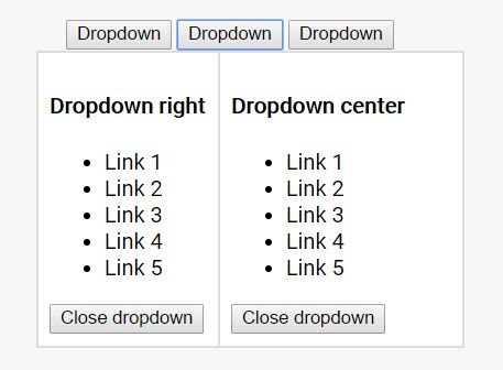
<div class="dropdown"> <button type="button" class="dropdown__btn">Dropdown</button> <div class="dropdown__menu"> <ul> <li>Link 1</li> <li>Link 2</li> <li>Link 3</li> <li>Link 4</li> <li>Link 5</li> </ul> <button type="button" class="dropdown__dismiss-btn">Close dropdown</button> </div> </div>By default the menu is aligned on the left side with the button. Use modifier classes .dropdown__menu_center or .dropdown__menu_right to change menu alignment.
JS: Initialise
Initialise the plugin as follows:
$('.dropdown').ariaDropdown({ option1: value1, option2: value2 });Methods:
Methods can be called on an initialised dropdown using following syntax:
$('#my-dropdown').ariaDropdown('methodName');The plugin supports following methods: slideDown, slideUp, toggle and destroy.
slideDown
The method slideDown expands a dropdown, if currently collapsed
$('#my-dropdown').ariaDropdown('slideDown');slideUp
The method slideUp collapses a dropdown, if currently expanded.
$('#my-dropdown').ariaDropdown('slideUp');toggle
Toggle expands or collapses a dropdown based on the current state of the dropdown.
$('#my-dropdown').ariaDropdown('toggle');destroy
Destroy destroys a dropdown by removing the attributes, classes and event listeners added by the plugin. Also the jQuery data object is removed from the jQuery element's object.
$('#my-dropdown').ariaDropdown('destroy');Custom events
The plugin triggers following events:
- ariaDropdown.initialised after a dropdown is initialised
- ariaDropdown.slideDown when a dropdown is expanded
- ariaDropdown.slideUp when a dropdown is collapsed
- ariaDropdown.destroyed when a dropdown is destroyed
The events are triggered on window and return the dropdown's data object as arguments.
//listen for ariaDropdowns.slideDown $(window).on('ariaDropdown.slideDown', function(event, dropdown){ console.log('The dropdown ' + dropdown.element + ' was expanded'); });Using CSS transitions
By default the plugin is configured to use the jQuery methods slideDown() and slideUp() to expand/collapse drop-downs. Setting the option cssTransitions to 'true' will disable the JS animations. This makes possible to implement the transitions directly with css. In fact, the plugin toggles the classes passed along with the options dropdownExpandedClass, btnExpandedClass and menuExpandedClass, when a dropdown is toggled.
LICENSE
This project is licensed under the terms of the MIT license.
See LICENSE.md for detailed informations.
