Timeliner
Overview
Build a simple, interactive, historical timeline with HTML, CSS, and jQuery. The benefits of this timeline script are that it's (1) simple, (2) able to handle nearly any form of content (including images, video, audio), (3) printer friendly, and highly customizable with just CSS and HTML.
Please drop me a line if you do do something interesting with it. See below for samples from other users.
Demos and Live Implementations
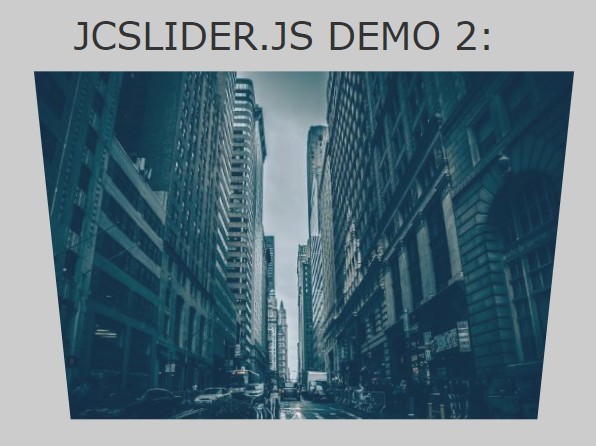
Advanced CSS3 Customization Demo
https://technotarek.com/timeliner/demo-future/timeliner-future.html
Implementation with Custom CSS: Investigating Power
https://investigatingpower.org/civil-rights/
Original Demo
https://www.technotarek.com/timeliner/timeliner.html
Quick Start
Load Plugin and Dependencies
<link rel="stylesheet" href="css/timeliner.css" type="text/css" media="screen"> <script src="https://ajax.googleapis.com/ajax/libs/jquery/3.1.1/jquery.min.js"></script> <script type="text/javascript" src="js/timeliner.min.js"></script>Instantiate
<script> $(document).ready(function() { $.timeliner({}); }); </script>Markup
Using the plugin's defaults and recommended markup, a timeline with two major time markers (1976 and 1984) and a total of three events looks like this:
<div id="timeline" class="timeline-container"> <div class="timeline-wrapper"> <h2 class="timeline-time">1976</h2> <dl class="timeline-series"> <dt class="timeline-event" id="event01"><a>Event</a></dt> <dd class="timeline-event-content" id="event01EX"> <p>Content about the event goes here.</p> </dd> <dt class="timeline-event" id="event02"><a>Another Event</a></dt> <dd class="timeline-event-content" id="event02EX"> <p>Content about the other event.</p> </dd> </dl> </div> <div class="timeline-wrapper"> <h2 class="timeline-time">1984</h2> <dl class="timeline-series"> <dt class="timeline-event" id="event03"><a>Yet Another Event</a></dt> <dd class="timeline-event-content" id="event03EX"> <p>Content about the event goes here.</p> </dd> </dl> </div> <br class="clear"> </div>Emmet snippet:
div#timeline.timeline-container>div.timeline-wrapper>h2.timeline-time+dl.timeline-series>dt.timeline-event#my-event-01+dd.timeline-event-content#my-event-01EX Important Upgrade Notes
Users wishing to upgrade from v1.x to v2.x should note that the default markup for timeliner.js has changed. Specifically, most of the default class names have changed.
- screen.css was divided into two separate files, demo.css and timeliner.css
- "timelineContainer" ==> "timeline-container"
- "timelineMajor" ==> "timeline-wrapper"
- "timelineMajorMarker" ==> "timeline-time"
- "timelineMinor" ==> "timeline-series"
- "timelineEvent" ==> "timeline-event-content"
To resolve these changes, either update your markup and/or use the new customization options introducted with v2.0. For example, you could use the new "timelineSection" option to change the selector from "timeline-wrapper" back to "timelineMajor". Otherwise, simply replace your original timeliner javascript and css files with the 2.x versions.
In addition, note:
-
Each minor marker tag needs a class of timeline-event - The display:none property from the previous timelineEvent (now timeline-event-content) element is no longer necessary
- The expand/collapse element uses new and simplified markup. See the Usage section for details.
-
The license has been changed from a _Creative Commons Attribution-ShareAlike 3.0 Unported License_ to a Creative Commons Attribution-NonCommercial-ShareAlike 4.0 International License. The former continues to apply to version 1.x implementations.
The 2.x changes provide an improved semantic markup. They also help other developers use a custom markup structure. Whereas version 1.x required the use of dl, dt, dd tags, it is now possible to use your own markup in coordination with the plugin's options. Other changes were made for the sake of consistency and to simplify future development.
Requirements
- jQuery
- Optional: Jack Moore's ColorBox jQuery plugin
Detailed Usage Instructions
-
Include timeliner.css (or timeliner.min.css) and timeliner.js (or timeliner.min.js). Optionally, also include responsive.css / responsive.min.css for basic responsive behavior on phones and mobile devices below 480px wide (iPad responsive behavior forthcoming).
-
Wrap your timeline in an element with an ID of "timeline" and CLASS of timeline-container. You can set your own container ID using the plugin's options. If you need to use a customized class value as well, update the CSS accordingly.
<div id="timeline" class="timeline-container"> ... </div>- Separate the major marker content (e.g., content for each century, year, decade etc) into elements with a class of timeline-wrapper. See the options if you need to customize this class value.
<div class="timeline-wrapper"> ... </div>- Wrap the major markers in an element with a class of 'timeline-year'. See the options if you need to customize this class value.
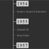
<h2 class="timeline-time">1954</h2>- Separate the individual events into DL elements with a class of "timeline-series". See the options if you need to customize this class value.
<dl class="timeline-series"> ... </dl>- Wrap the title of the individual events in a DT tag surrounding an A tag; give each DT a unique ID and the class of "timeline-event".
<dt class="timeline-event" id="19540517"><a>Brown vs Board of Education</a></dt>- Wrap the full event content in a DD tag; give each DD an ID based on the DT with 'EX' appended and a class of 'timeline-event-content'. See the options to customize these values.
<dd class="timeline-event-content" id="19540517EX"> ... </dd>- Instantiate:
$.timeliner({});- Or, instantiate with multiple timelines:
$.timeliner({timelineContainer: '#timeline'}); $.timeliner({timelineContainer: '#timeline2'});- Or, instantiate with options. Use as many or as few as you like. If you're using multiple timelines on a single page, options can be set on each individual timeline.
$.timeliner({ timelineContainer: '#timeline', // Container for the element holding the entire timeline (e.g. a DIV) // value: ID or class selector // default: #timeline // note: must be unique for each timeline on page timelineSection: '.timeline-wrapper', // Wrapper that contains items under a specific marker (e.g., all of the events under a year on the timeline) // value: class selector // default: .timeline-wrapper // note: changing this selector from the default will require modifications to the CSS file in order to retain default styling timelineSectionMarker: '.timeline-time', // Class selector applied to each major item on the timeline, such as each year // value: class selector // default: .timeline-year timelineTriggerContainer: '.timeline-series', // Class assigned to wrappers surrounding each individual event // value: selector // default: .timeline-series // note: changing this selector from the default will require modifications to the CSS file in order to retain default styling timelineTriggerAnchor: '.timeline-event', // Element that is wrapped around the event's title; when clicked, expands the event and reveals its full contents // value: class selector // default: .timeline-event // note: changing this tag from the default will require modifications to the CSS file in order to retain default styling timelineEventContainer: options['timelineEventContainer'] || 'dt', // Wrapper surrounding a series of events corresponding to the timelineSectionMarker // value: tag or class selector // default: dt // note: When leaving this value at its default, you do not need to apply a class to the dt element if you use the plugins recommended tag structure and markup // note: Change this from the default, perhaps to a class like ".timeline-event", in the case that you do not want to use the plugins recommened markup structure and prefer to use anothe element (e.g, div) instead of a dt tag to mark each event within a series. // note: Changing this value from the default will require modifications to the CSS file in order to retain default styling timelineEXContent: '.timeline-event-content', // Element that contains the event's full content to be displayed when event is expanded, an event's expanded ID should alway be on this item // value: class selector // default: .timeline-event-ex // note: changing this selector from the default will require modifications to the CSS file in order to retain default styling EXContentIdSuffix: 'EX', // ID suffix to identify expanded (aka EX) content // value: string // default: EX oneOpen: false, // sets whether only one item on the timeline can be open at a time. If true, other items will close when one is opened. // value: true | false // default: false // note: does not apply to events identified in startOpen option startState: options['startState'] || 'closed', // sets whether the timeline is initially collapsed, fully expanded, or "flat" mode // value: closed | open | flat // default: closed // note: setting to "open" makes the startOpen option meaningless // note: flat mode initally collapses the entire timeline except for the major markers // note: the flat state is an initial display option only -- the timeline major markers return to normal once they've been opened/displayed startOpen: options['startOpen'] || ['.start-open'], // As of version 2.3, you can simply add the "start-open" class to each timeline-event you want to have open by default; see the demo source code or code sample below // sets the events to display expanded on page load // value: array of IDs of single timelineEvents (e.g., ['#event01'] or ['#event01','#event02']) // default: ['.start-open'] baseSpeed: 200, // sets the base speed for animation of an event // value: numeric // default: 200 speed: 4, // multiplier applied to the base speed that sets the speed at which an event's contents are displayed and hidden // value: numeric // default: 4 fontOpen: '1.2em', // sets the font size of an event after it is opened // value: any valid CSS font-size value, // default: 1.2em fontClosed: '1em', // sets the font size of an event after it is closed // value: any valid CSS font-size value // defaults: 1em expandAllText: '+ expand all', // sets the text of the expandAll selector after the timeline is fully collapsed // value: string // default: + expand all collapseAllText: '- collapse all' //sets the text of the expandAll selector after the timeline is fully expanded // value: string // default: - collapse all });- Add an expand/collapse all events by adding the following inside of the main #timeline. Use the expandAllText and collapseAllText options to customize this button. You may include more than one expand/collapse button per timeline, such as at the top and bottom of your timeline. When the state of one changes, it will update all others.
<button class="timeline-toggle">+ expand all</button>Sample
Using the plugins defaults and recommended markup, a timeline with only one time marker and two events would look like this:
<div id="timeline" class="timeline-container"> <div class="timeline-wrapper"> <h2 class="timeline-time">1976</h2> <dl class="timeline-series"> <dt class="timeline-event" id="event01"><a>Event</a></dt> <dd class="timeline-event-content" id="event01EX"> <p>Content about the event goes here.</p> </dd> <dt class="timeline-event start-open" id="event02"><a>Another Event</a></dt> <dd class="timeline-event-content" id="event02EX"> <p>Content about the other event.</p> </dd> </dl> </div> <br class="clear"> </div>Using the customization options introduced in v2.0, it's possible to customize the tags and class names used by the plugin. For example, the "timeline-time" class applied to the h2 tag can be customized. Perhaps, if you're using the plugin to outline the steps involved in a task (like putting together a piece of furniture), you could use "timeline-step" instead.
In fact, it's possible to use a different markup structure entirely by fully using the v2.0 customization options.
Additional Examples
- https://technotarek.com/timeliner/demo-future/timeliner-future.html
- https://investigatingpower.org/vietnam-war/
- http://www.ncld-youth.info/index.php?id=61
Change Log
v2.3.1 (3/23/2018)
-
Added minified responsive css file.
v2.3 (5/12/2017)
-
Confirmed compatibility with jQuery 3.x. See issue #22.
v2.3 (5/9/2016)
-
Add ability to set .start-open class on events (resolves #17)
v2.2 (10/12/2014)
-
Added new "flat" startState which allows for a fully collapsed timeline upon load
v2.1 (10/10/2014)
- Separated css into two separate files to isolate demo from plugin styles (demo.css and timeliner.css)
- Added minified css file (timeliner.min.css)
-
Support multiple expand/collapse buttons per timeline -
Added new demo files for "Future" theme
v2.0 (10/10/2014)
- Merged customization efforts developed by https://github.com/ascloutier/timeliner
- Merge includes new oneOpen option
- Revised plugin's default selector labels to reflect semantic naming in the case of a traditional timeline
- Fixed issue where major markers would not re-open after one cycle
- Added LESS file for faster CSS revisions and customization
v1.6 (1/7/2013)
- Merged multiple-timeline per page enhancement ( supported by https://github.com/luisalima )
v1.5.1 (10/1/2013)
- Changed click events to use jQuery delegated events via the .on() method ( supported partially by code contributed by https://github.com/gkarka )
v1.5.responsive (7/9/2013)
- Added basic responsive behavior for phone/mobile devices below 480px wide (supported partially by code contributed by Geus Maxime)
v1.5 (6/7/2013)
- startOpen option now accepts multiple timeline events
v1.4.1 (6/7/2013)
- Merged in openStart-fix ( via https://github.com/rs017991 )
v1.4 (4/27/2013)
- Fixed jQuery 1.9 Toggle deprecation ( #0d2755 via https://github.com/Marco129 )
- Customization for expand/collpase all ( #927fac via https://github.com/Marco129 )
- Updated ColorBox plugin for jQuery 1.9
v1.3 (1/25/2013)
- Major js code simplification and optimization
v1.2 (1/24/2013)
- Added in additional instantiation options
- Fixed startOpen bug
v1.1 (1/23/2013)
- Added startOpen option
v1.0 (5/1/2012)
- First release
Accessbility
The original 1.0 version was also fully accessible and 508 compliant as of its original production (mid-2000s). Accessibility technologies have since changed as have coding practices to address accessibility (e.g., the adoption of ARIA). It is recommended that you review your own implementation to ensure accessiblity if that is a requirement of your project. I hope to re-review and update the plugin's native accessiblity at a later date.
Roadmap
- Replace ColorBox plugin with alternative
- Improve responsiveness for a variety of device sizes
- Add easy theming and new visual options
- Revisit accesibility: add in ARIA and keyboard controls
Ideas for v3
http://codepen.io/plasm/pen/oZbXmj
Credits
The content used in the repo and in the demo is from the Investigating Power project (https://investigatingpower.org), a website which I developed on behalf of author and journalist Charles Lewis.
Thanks to on-going development and contributions from the community, timeliner continues to improve. Notable enhancements include basic responsiveness for mobile devices, the ability to add multiple timelines to a single page, and customizable selectors to allow for semantic markup.
The repo is packaged with a version of Jack Moore's ColorBox jQuery plugin (http://www.jacklmoore.com/colorbox). It is for demonstration purposes only. See https://github.com/jackmoore/colorbox for support.
License
What's most important to me is that you let me know if you implement it somewhere so I can take a peek. As of version 2.0, I've changed the license to prohibit commerical usage without my consent. The intent is not to limit a single implementation (e.g,. on a company website), but to prohibit the use and packaging of this plugin within other commercial products (e.g, themes, applications etc).
version 2.x+
Timeliner.js by Tarek Anandan, version 2.x+, is licensed under a Creative Commons Attribution-NonCommercial-ShareAlike 4.0 International License.

version 1.x
Timeliner.js by Tarek Anandan, version 1.x, is licensed under a Creative Commons Attribution-ShareAlike 3.0 Unported License.


