Tabby 

Lightweight, accessible vanilla JS toggle tabs.
Getting Started | Styling | Keyboard Navigation | API | What's New | Browser Compatibility | License
Want to learn how to write your own vanilla JS plugins? Check out my Vanilla JS Pocket Guides or join the Vanilla JS Academy and level-up as a web developer. 🚀
Getting Started
Compiled and production-ready code can be found in the dist directory. The src directory contains development code.
1. Include Tabby on your site.
There are two versions of Tabby: the standalone version, and one that comes preloaded with polyfills for the closest() and matches() methods, which are only supported in newer browsers.
If you're including your own polyfills, use the standalone version. Otherwise, use the version with polyfills.
Tabby also comes with two simple themes/UIs. Feel free to start with one of them and modify it for your needs, or start from scratch and build your own.
Direct Download
You can download the files directly from GitHub.
<link rel="stylesheet" type="text/css" href="path/to/tabby.min.css"> <script src="path/to/tabby.polyfills.min.js"></script>CDN
You can also use the jsDelivr CDN. I recommend linking to a specific version number or version range to prevent major updates from breaking your site. Tabby uses semantic versioning.
<!-- Always get the latest version --> <!-- Not recommended for production sites! --> <link rel="stylesheet" type="text/css" href="https://cdn.jsdelivr.net/gh/cferdinandi/tabby/dist/css/tabby.min.css"> <script src="https://cdn.jsdelivr.net/gh/cferdinandi/tabby/dist/js/tabby.polyfills.min.js"></script> <!-- Get minor updates and patch fixes within a major version --> <link rel="stylesheet" type="text/css" href="https://cdn.jsdelivr.net/gh/cferdinandi/tabby@12/dist/css/tabby.min.css"> <script src="https://cdn.jsdelivr.net/gh/cferdinandi/tabby@12/dist/js/tabby.polyfills.min.js"></script> <!-- Get patch fixes within a minor version --> <link rel="stylesheet" type="text/css" href="https://cdn.jsdelivr.net/gh/cferdinandi/[email protected]/dist/css/tabby.min.css"> <script src="https://cdn.jsdelivr.net/gh/cferdinandi/[email protected]/dist/js/tabby.polyfills.min.js"></script> <!-- Get a specific version --> <link rel="stylesheet" type="text/css" href="https://cdn.jsdelivr.net/gh/cferdinandi/[email protected]/dist/css/tabby.min.css"> <script src="https://cdn.jsdelivr.net/gh/cferdinandi/[email protected]/dist/js/tabby.polyfills.min.js"></script>NPM
You can also use NPM (or your favorite package manager).
npm install tabbyjs2. Add the markup to your HTML.
Tabby progressively enhances a linked list of content into tabbed navigation.
Provide an unordered list of content, with anchor links that point to your content. Give your tab navigation a selector you can target. In this example, it's [data-tabs], but it can be anything you want.
Add the [data-tabby-default] attribute to the tab that should be displayed by default.
<ul data-tabs> <li><a data-tabby-default href="#harry">Harry Potter</a></li> <li><a href="#hermione">Hermione</a></li> <li><a href="#neville">Neville</a></li> </ul> <div id="harry">...</div> <div id="hermione">...</div> <div id="neville">...</div>Note: Tabby automatically adds all of the required roles, attributes, and keyboard interactions needed for proper accessibility.
3. Initialize Tabby.
In the footer of your page, after the content, initialize Tabby by passing in a selector for the navigation menu. And that's it, you're done. Nice work!
<script> var tabs = new Tabby('[data-tabs]'); </script>Styling Tabby
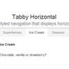
Tabby comes with two simple themes/UIs: standard horizontal tabs, and vertical ones. Use them as-is, modify them to meet your needs, or skip them entirely and build your own from scratch.
Horizontal UI on CodePen → | Veritical UI on CodePen → | No UI on CodePen →
Note: the vertical tab layout does not include a grid. You'll need to supply your own.
You can use the role attributes that are added to the elements to progressively style them.
- The list (
<ul></ul>) has the[role="tablist"]attribute. - Tab links (
<a href="#anchor"></a>) have the[role="tab"]attribute. - Active tab links have the
[aria-selected="true"]attribute. - Tab content has the
[role="tabpanel"]attribute. - Hidden tab content has the
[hidden]attribute.
Keyboard Navigation
Tabby follows accessibility recommendations and expectations for keyboard navigation:
- Arrow keys (left/right and up/down) change the active tab in the navigation.
- The
HomeandEndbuttons activate the first and last tab, respectively. - The
Tabkey shifts focus into the tab content rather than to the next item in the navigation.
API
Tabby includes smart defaults and works right out of the box. But if you want to customize things, it also has a robust API that provides multiple ways for you to adjust the default options and settings.
Options and Settings
You can pass options and callbacks into Tabby when instantiating.
var tabs = new Tabby('[data-tabs]', { idPrefix: 'tabby-toggle_', // The prefix to add to tab element IDs if they don't already have one default: '[data-tabby-default]' // The selector to use for the default tab });Custom Events
Tabby emits a custom event—tabby—when the active tab is changed.
The tabby event is emitted on the tab element and bubbles up. You can listen for them with the addEventListener() method. The event.detail object includes the tab and content elements.
document.addEventListener('tabby', function (event) { var tab = event.target; var content = event.detail.content; }, false);Methods
Tabby also exposes several public methods.
setup()
Sets up the DOM with the required roles and attributes. If you dynamically add navigation items to the DOM after Tabby is instantiated, you can run this method to set them up.
Example
var tabs = new Tabby('data-tabs'); tabs.setup();toggle()
Activate a tab. Accepts the ID of the content to activate, or a tab element, as an argument.
Example
var tabs = new Tabby('data-tabs'); // With a selector tabs.toggle('#harry'); // With an element var neville = document.querySelector('[href*="#neville"]'); tabs.toggle(neville);destroy()
Destroy the current initialization.
Example
var tabs = new Tabby('data-tabs'); tabs.destroy();What's new?
Tabby got a complete rewrite in version 12. It now includes:
- Support for multiple instantiations at once.
- Proper roles and properties for accessibility.
- Keyboard navigation
- Deprecated callbacks in favor of custom events.
Migrating to Tabby 12 from Older Versions
The instantiation method is completely different, but the markup patterns in older versions should work without modification.
Kudos 👏
Special thanks to Dave Rupers A11y Nutrition Cards, which provided a solid foundation for this version.
And major kudos to accessibility specialist Scott O'Hara, who advised me on various aspects of this script throughout its development.
Browser Compatibility
Tabby works in all modern browsers, and IE 9 and above.
Tabby is built with modern JavaScript APIs, and uses progressive enhancement. If the JavaScript file fails to load, or if your site is viewed on older and less capable browsers, anchor links will jump to the content instead.
Polyfills
Support back to IE9 requires polyfills for the closest() and matches(). Without them, support will be spotty across browsers.
Use the included polyfills version of Tabby, or include your own.
[hidden]
Tabby uses the [hidden] attribute to hide tab content. This attribute didn't exist prior to IE11. To push support back to IE9, make sure your stylesheet includes the following style for the [hidden] attribute.
[hidden] { display: none; }License
The code is available under the MIT License.


