Haraka

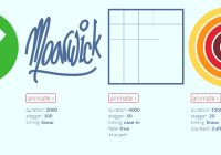
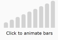
You define the behavior states of the component, and then animate between them.

Usage
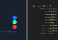
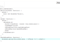
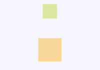
import Behavior from '@exodus/haraka' box = React.createRef() <Behavior ref={this.box} state={[ { opacity: 1 }, // state 0, or just `{}` since the default opacity is 1 { opacity: 0.5 }, // state 1 { rotate: '45deg' } // state 2 { translateX: 10, translateY: 10 } // state 3 { scale: 1.1 } // state 4 ]} /> // .. this.box.current.goTo(1) // animates the opacity of the box from 1 to 0.5 this.box.current.goTo(2) // rotates the faded box 45 degrees this.box.current.goTo(3) // move the tilted faded box right and down by 10 points this.box.current.goTo(4) // scale the shifted tilted faded box by a factor of 1.1 this.box.current.goTo([1, 2, 3, 4]) // plays a sequence of behavior states // or use the declarative API instead of `goTo()` <Behavior currentState={0} /> <Behavior currentState={1} />Install
yarn add @exodus/harakaDefinition
type DefaultConfig = { // goTo() default configuration type?: 'spring' | 'timing', // default = 'spring', `Animated.spring()` or `Animated.timing()` onComplete?: func, // to be executed once animation is completed, inside `.start()` delay?: number, // used to delay the start of the animation (ms) ref?: bool, // this will return the animation reference instead of playing it immediately unmount? bool, // unmount after animation ends // can be useful for animating multiple behaviors with `Animated.sequence()` and `Animated.parallel()` // `onStart` and `onComplete `are ignored when `ref` is enabled ...AnimatedSpringOptions, // excluding toValue, useNativeDriver (see React Native docs), spring type ...AnimatedTimingOptions, // excluding toValue, useNativeDriver (see React Native docs), timing type } type State = { opacity?: number, // [0, 1], default = 1 rotate?: string, // e.g. '45deg', default = '0deg' scale?: number, // default = 1 translateX?: number, // default = 0 translateY?: number, // default = 0 config?: DefaultConfig, // you can pass custom state config here } type StyleProp = { prop: string, default: string | number | null, transform: bool, } type Behavior = { config?: DefaultConfig, clearStyleProps?: bool, // removes all default style props on mount and utilizes whatever in `styleProps` only disabled?: bool, // allows disabling the behavior interactivity through pointerEvents = none state?: State[], // default value is [{}, {}], [{}] can be used for a static behavior nativeDriver?: AnimatedValue, // default = new Animated.Value(0), you can use a custom native driver children?: any, // behavior component can enclose other components or enclose another behavior(s) clamp?: bool, // default = false, prevent animations from exceeding their ranges keys?: number[], // can be used with custom drivers to define custom state keys/indices currentState?: number, // default = 0, use to declaratively toggle animation initialState?: number, // default = 0 skipProps?: string[], // default = [], allows filtering passed props from being included in styles skipStyleProps?: string[], // default = [], allows dropping unused style props style?: object, // style of the behavior view, default = {}, AnimatedViewStyle (see React Native docs) styleProps?: StyleProp[], // default = [], allows adding any type of style props manually unmounted?: bool, // default = false, start behavior in the unmounted state // animation presets (they populate `state` prop which will be ignored): faded?: bool, // default = false, see below for available presets // layout presets (they populate `style` prop): absolute?: bool, // default = false, see below for available presets centered?: bool, // default = false fixed?: bool, // default = false full?: bool, // default = false landing?: bool, // default = false } // animation presets const presets = { faded: [{ opacity: 0 }, { opacity: 1 }], } // layout presets, you can use multiple, along with `style` prop, they have a higher priority over it const layoutPresets = { absolute: { bottom: 0, left: 0, position: 'absolute', right: 0, top: 0 }, centered: { alignSelf: 'center' }, fixed: { position: 'absolute' }, full: { flex: 1 }, landing: { alignItems: 'center', flex: 1, justifyContent: 'center' }, } // methods // animate to a specific behavior state behavior.goTo(index: number | number[], config?: DefaultConfig = {}) behavior.unmount() // useful for removing components that are hidden after animation behavior.mount(state: ?number) // useful for animations that start in a hidden state // use along with `unmounted` prop and `mount()` behavior.key // to retrieve current state key behavior.setNativeProps({} : Props) // gives you the ability to change props without having to re-renderExamples
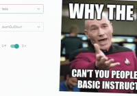
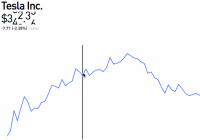
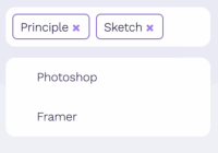
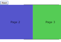
Available here.


