offbeatSlider - a jQuery Slideshow Plugin
Easy to use jQuery plugin to create an image slideshow for a thumbnail preview or for page headers.
Version: 0.9.2
Installation
You can download the latest release here. Just copy the css and js file into your project directory. Then include it like this in your web page:
<!doctype html> <html lang=""> <head> <!-- YOUR HEADER --> <link rel="stylesheet" href="css/offbeat-slider.css"> </head> <body> <!-- YOUR CONTENT --> <!-- jQuery --> <script src="https://code.jquery.com/jquery-1.12.0.min.js"></script> <!-- offbeatSlider Plugin --> <script src="js/offbeat-slider.js"></script> </body> </html>Quick Example
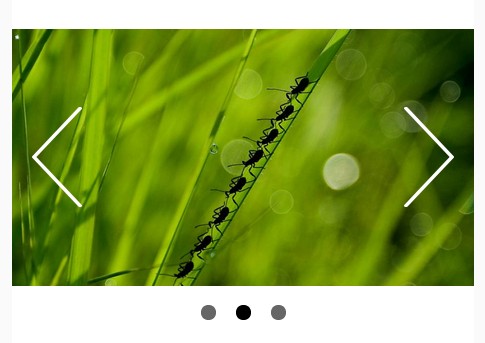
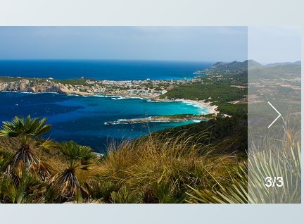
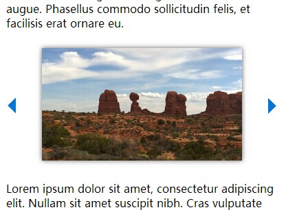
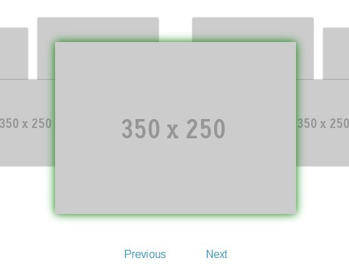
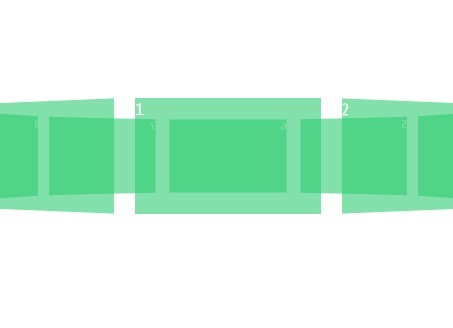
This example shows two different styles for the positioning of the navigation controls and the setting of the start image:

Code:
<!-- Left example --> <div class="ofp-slider" data-slider-index="1"> <img class="ofp-slides" src="img/Hydrangeas.jpg"> <img class="ofp-slides" src="img/Jellyfish.jpg"> <img class="ofp-slides" src="img/Koala.jpg"> <div class="ofp-slider-navigation ofp-center ofp-middle"> <div class="ofp-arrow-left">❮</div> <div class="ofp-arrow-right">❯</div> </div> <div class="ofp-slider-navigation ofp-bottom-middle"> <span class="ofp-slider-dots"></span> <span class="ofp-slider-dots"></span> <span class="ofp-slider-dots"></span> </div> </div> <!-- Right example --> <div class="ofp-slider" data-slider-index="2"> <img class="ofp-slides" src="img/Hydrangeas.jpg"> <img class="ofp-slides" src="img/Jellyfish.jpg"> <img class="ofp-slides" src="img/Koala.jpg"> <div class="ofp-slider-navigation ofp-top-right"> <div class="ofp-arrow-left"> ❰</div> <div class="ofp-arrow-right"> ❱</div> </div> <div class="ofp-slider-navigation ofp-center ofp-bottom-middle"> <span class="ofp-slider-dots"></span> <span class="ofp-slider-dots"></span> <span class="ofp-slider-dots"></span> </div> </div>Basic Usage
HTML
To transform a div into a slide show add the class ofp-slider to a div and append some images as direct child. For each image add the class ofp-slides.
<div class="ofp-slider" data-slider-index="1"> <img class="ofp-slides" src="img/Hydrangeas.jpg"> <img class="ofp-slides" src="img/Jellyfish.jpg"> <img class="ofp-slides" src="img/Koala.jpg"> <div class="ofp-slider-navigation ofp-center ofp-middle"> <div class="ofp-arrow-left">❮</div> <div class="ofp-arrow-right">❯</div> </div> <div class="ofp-slider-navigation ofp-bottom-middle"> <span class="ofp-slider-dots"></span> <span class="ofp-slider-dots"></span> <span class="ofp-slider-dots"></span> </div> </div>The data attribute slider-index specifies the index of the first slide to show.
JavaScript
Next, put this piece of code at the end of your page:
$(".ofp-slider").offbeatSlider({"slideStartIndex": 1});The option slideStartIndex defines the index of the first slide to show for every slide show div if the data attribute slider-index is not defined.
Options
First slide (JavaScript / data-attribute)
JavaScript property slideStartIndex sets the first slide image for all slide show containers if no data-attribute slider-index is specified in the corresponding div with the class ofp-slider.
Animation
You can set the transition animation for each slide in the slide show with these options:
$(".ofp-slider").offbeatSlider({ animate: true, duration: 1000, animation: "normal", easing: "linear" //easein, linear, ... });You can adjust the duration and the easing function. The name for the easing functions are the same as in jQuery. This is the default slider implementation. A simple and beautiful fade-in transition is created.
If you want to use specific CSS3 animations you have to declare the following settings:
$(".ofp-slider").offbeatSlider({ animate: true, animation: "css", animationRight: "swing-in-right-fwd", animationLeft: "swing-in-left-fwd" });The animation property tells the slider to use the animationRight and animationLeft values which are CSS animations for both directions. Those classes have to be available in a css file. The same settings can also be made available in the correspondig div with the data-attributes data-animation-right and data-animation-left:
<div class="ofp-slider" data-animation-right="swing-in-right-fwd" data-animation-left="swing-in-left-fwd"> <!-- more ... --> </div> To create CSS animations you can use animista.
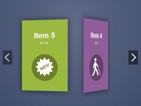
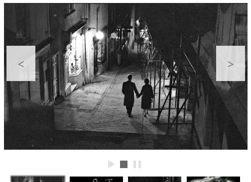
Carousel
Automatically show the available slides in sequence with these options:
$(".ofp-slider").offbeatSlider({ carousel: true, //auto-animate ? carouselDelay: 3000 });The default of the carousel animation is false which means the slides won't be shown automatically one by one.
Customisation
Positioning of navigation controls
Combined Slider dots and arrows as one unit:
<div class="ofp-slider-navigation ofp-center ofp-middle"> <div class="ofp-arrow-left">❮</div> <div class="ofp-arrow-right">❯</div> <span class="ofp-slider-dots"></span> <span class="ofp-slider-dots"></span> <span class="ofp-slider-dots"></span> </div>Both controls will be displayed centered horizontally and vertically within the image.
Separated Use two div-containers with class ofp-slider-navigation:
<div class="ofp-slider-navigation ofp-center ofp-top-middle"> <div class="ofp-arrow-left">❮</div> <div class="ofp-arrow-right">❯</div> </div> <div class="ofp-slider-navigation ofp-center ofp-bottom-middle"> <span class="ofp-slider-dots"></span> <span class="ofp-slider-dots"></span> <span class="ofp-slider-dots"></span> </div>Arrow controls will be displayed at the top and the dots are displayed at the bottom within the image.
Classes for positioning
Any meaningful combination of the listed css classes is possible to position the navigation controls or the image description.
ofp-center ofp-top-left ofp-top-right ofp-bottom-left ofp-bottom-right ofp-middle ofp-left ofp-right ofp-top-middle ofp-bottom-middleText slide
You can have a text-only slide if you add the css class ofp-slides-text next to ofp-slides:
<div class="ofp-slider" data-slider-index="1"> <div class="ofp-slides ofp-slides-text"> I'm a nice text slide </div> <img class="ofp-slides" src="img/Hydrangeas.jpg"> <div class="ofp-slides ofp-slides-text"> I'm the <strong>last</strong> nice text slide </div> <div class="ofp-slider-navigation ofp-top-right"> <div class="ofp-arrow-left">❰</div> <div class="ofp-arrow-right">❱</div> </div> </div>With this piece of code you have 3 slides consisting of a text slide, image slide, and a text slide. The navigation is placed at the top right corner.
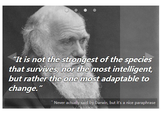
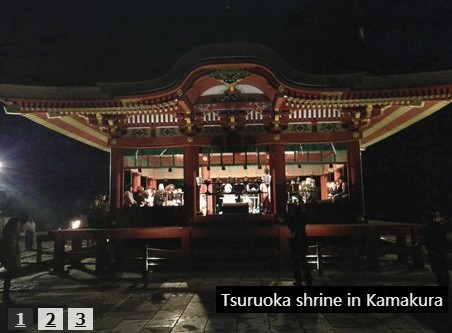
Image slide with description
For that case:
<div class="ofp-slides"> <img src="img/Hydrangeas.jpg"> <p class="ofp-top-middle" style="color: #efefef; font-size: 1em; font-weight: bold;"> Description for the picture </p> </div>For the positioning of the description use the same classes as described in Classes for positioning
Arrow symbols
Use any character within the div-container with class ofp-arrow-left to represent the left arrow and with class ofp-arrow-right for the right arrow.
To change the size of the symbols add the font-size property to the mentioned classes.
Examples
The following table shows some common arrow symbols with their corresponding HTML codes:
| HTML code | Symbol |
|---|---|
❮ | ❮ |
❯ | ❯ |
❰ | ❰ |
❱ | ❱ |
« | « |
» | » |
Further examples
Please look into the test page for further examples.
Websites using offbeatSlider
feel free to send me your website using this component! :)