Simptip [v1.0.4]
A simple CSS tooltip made with Sass
Visit Site, Documentation and some examples
Installation
Install with npm, Yarn or Bower:
npm:
npm install simptip --saveYarn (note that yarn add automatically saves the package to the dependencies in package.json):
yarn add simptipBower:
bower add simptip --saveUsage
I'll explain with an example:
<link rel="stylesheet" type="text/css" href="simptip-mini.css" />or:
<link rel="stylesheet" type="text/css" href="simptip.css" />Then you can do something like this:
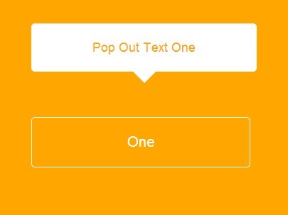
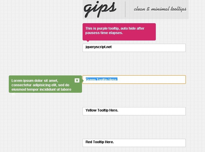
<span class="simptip-position-top" data-tooltip="Tooltip's content"> Text </span>What you see in the data-tooltip attribute is the text content of the tooltips, and the value of class attribute is tooltop's position.
You can use .simptip-position-right , .simptip-position-bottom and .simptip-position-left class for other positions that you would like.
You can also use more features of Simptip by adding these classes:
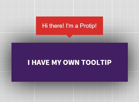
.half-arrow: change tooltip's arrow to half arrow.simptip-smooth: makes soft edge for tooltip.simptip-fade: fades effect for show/hide.simptip-movable: shows movable effect.simptip-multiline: makes multiline body for tooltip.simptip-success: changes color to green spectrum.simptip-info: changes color to blue spectrum.simptip-warning: changes color to orange spectrum.simptip-danger: changes color to red spectrum
Let me know if you use it in your projects.
License
Copyright (c) 2013 @arashmanteghi
Licensed under the MIT license.


