vue-month-picker
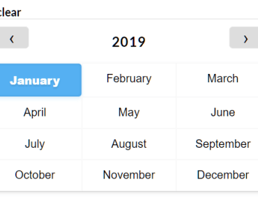
A lightweight month picker for Vue.js with no dependencies.
Install
npm
npm install --save vue-month-pickeryarn
yarn add --save vue-month-pickerUsage
Bundler (Webpack, Rollup)
import Vue from 'vue' import MonthPicker from 'vue-month-picker' import MonthPickerInput from 'vue-month-picker' Vue.use(MonthPicker) Vue.use(MonthPickerInput)Examples
Input
<template> <month-picker-input :no-default="true"></month-picker-input> </template> <script> import MonthPickerInput from 'vue-month-picker' export default { components: { MonthPickerInput } } </script>Inline
<template> <p>{{ date.month }}</p> <month-picker @change="showDate"></month-picker> </template> <script> import MonthPicker from 'vue-month-picker' export default { data() { return { date: { from: null, to: null, month: null, year: null } } }, components: { MonthPicker }, methods: { showDate (date) { this.date = date } } } </script>Api
The MonthPicker and the MonthPickerInput shares the same props and events.
Props
| Prop | Type | Default | Description |
|---|---|---|---|
| lang | String | en | The language of the months. |
| months | Array | [] | Custom months if language is unsupported. |
| default-month | Integer | The default selected month of the month picker. To show the month picker unselected, use the no-default prop. | |
| default-year | Integer | The default year of the month picker. | |
| no-default | Boolean | false | Show the month picker unselected. |
| show-year | Boolean | false | Show the year picker. |
| editable-year | Boolean | false | Year appears as a input field. |
| clearable | Boolean | false | Possible to clear the chosen month. |
| variant | String | default | Color variant. Currently supports default and dark. |
Events
| Event | Returns | Description |
|---|---|---|
| @change | Object | Indicates that the value has been changed. NB, this will fire when a default value has been selected when the month picker is mounted. Use the input event if you want the value the user has selected. |
| @change-year | Number | Indicates that the year has been changed. Will emit the year value. |
| @input | Object | Indicates that the value has been changed by the user. |
| @clear | Indicates that user have cleared the selected value |
Date object
Change and input events returns a date object with the following properties:
from: Start of the month.to: End of the month.month: Selected month.monthIndex: Selected month index.year: Selected year.
Translations
Available languages
| Abbr | Language |
|---|---|
| af | Afrikaans |
| ar | Arabic |
| cs | Czech |
| da | Danish |
| el | Greek |
| en | English |
| es | Spanish |
| et | Estonian |
| fi | Finnish |
| fr | French |
| hi | Hindi |
| hr | Croatian |
| hu | Hungarian |
| id | Indonesian |
| is | Icelandic |
| it | Italian |
| ja | Japanese |
| km | Khmer |
| ko | Korean |
| ku | Kurdish |
| lt | Lithuanian |
| lv | Latvian |
| ms | Malay |
| ne | Nepali |
| nl | Dutch |
| no | Norwegian |
| pa | Panjabi |
| pl | Polish |
| pt | Portuguese |
| ru | Russian |
| sv | Swedish |
| sk | Slovak |
| sl | Slovenian |
| so | Somali |
| sq | Albanian |
| th | Thai |
| tr | Turkish |
| uk | Ukrainian |
| ur | Urdu |
| vi | Vietnamese |
| yi | Yiddish |
| zh | Chinese |
| zu | Zulu |
My language is unsupported
You could add it in the languages.js file and create a pull request. You could also create a issue about the missing language. If you don't want to do that you can use the months property and supply your own array of 12 string values.
Contributing
- Fork it!
- Create your feature branch: git checkout -b my-new-feature
- Commit your changes: git commit -am 'Add some feature'
- Push to the branch: git push origin my-new-feature
- Submit a pull request
Development
Poi was used to develop this component.
poi