Vue-time-ranges-picker
Vue.js component to select the time intervals of the day.
Try it: https://alex-knyazev.github.io/vue-time-ranges-picker/
Npm-module page: https://www.npmjs.com/package/vue-time-ranges-picker
Built with SVG and pointer events.
npm install vue-time-ranges-picker Using
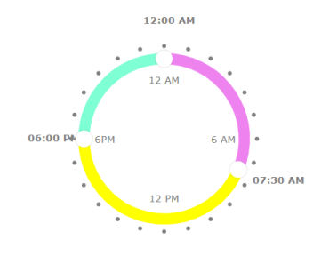
<template> <div> <div class="time-picker-wrapper"> <VueTimeRangesPicker :value="ranges" @change="handleRangesChange" /> </div> </div> </template> <script> import VueTimeRangesPicker from 'vue-time-ranges-picker'; export default { components: { VueTimeRangesPicker }, data() { return { ranges: [ { startTime: '00:00', endTime: '03:00', scaleColor: 'violet', }, { startTime: '03:00', endTime: '06:00', scaleColor: 'yellow', }, { startTime: '06:00', endTime: '00:00', scaleColor: 'aquamarine', } ] } } } </script> <style> .time-picker-wrapper { width: 300px; } </style> If you want to use this component in browser which doesn't support pointer events, then enable polyfill. For example,you can add this script in the header of your html page https://code.jquery.com/pep/0.4.3/pep.js
Props
value :arrayOf(object)
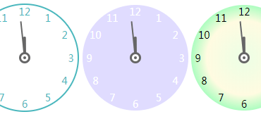
The array which contains default intervals of time with scale color for each of them.
isTwelfthMode :boolean, default: false
Set this value to true if you want to work with picker in twelfth format. If it is true, data should be in twelfth format too.
stepOfMoving :number, default: 0.5
This param controls the minimum hours step for moving.
extraPointerRadius :number, default: 70
The user can't always get directly to the pointer to start the movement. The parameter is used to indicate an additional, invisible radius for the pointer, which, when hit, begins the movement.
viewOptions :object, default:
{ isShowChosenTime: true, isShowQuartersText: true, isShowHoursMarks: true, chosenTimeColor: 'grey', pointerColor: 'white', activePointerColor: 'rgba(240, 240, 240, 0.9)', pointerRadius: 6, activePointerRadius: 5.5, circleStrokeWidth: 8, hoursMarksColor: 'grey', quarterTextColor: 'grey', } Different options for controlling the view of component. You can play with it in demo.
Project setup
Compiles and hot-reloads for development
npm run serve Compiles and minifies for production
npm run build Run your tests
npm run test Lints and fixes files
npm run lint