Shapeshift v2.0
April 16th, 2013: Version 2.0 released. There may be bugs and we are still browser testing. Please report any bugs you find through issues.
Column Grid System + Drag and Drop
Inspired heavily by the jQuery Masonry plugin, Shapeshift is a plugin which will dynamically arrange a collection of elements into a column grid system similar to Pinterest. What sets it apart is the ability to drag and drop items within the grid while still maintaining a logical index position for each item. This allows for the grid to be rendered exactly the same every time Shapeshift is used, as long as the child elements are in the correct order.
Features
-
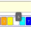
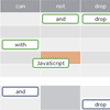
Drag and Drop Rearrange items within a container or even drag items between multiple Shapeshift enabled containers. Dragging elements around will physically change their index position within their parent container. When a page reloads, as long as the child elements are placed in the correct order then the grid will look exactly the same.
-
Works on Touch Devices Shapeshift uses jQuery UI Draggable/Droppable for help with the drag and drop system. Luckily there is already a plugin called jQuery Touch Punch which provides touch support for jQuery UI D/D. It can be found in the vendor folder.
-
Multiwidth Elements A new feature in 2.0 is the ability to add elements that can span across multiple columns as long as their width is correctly set through CSS.
-
Responsive Grid Enabled by default, Shapeshift will listen for window resize events and arrange the elements within it according to the space provided by their parent container.
Documentation
Check out our Wiki for full documentation.
Credits
A big thanks to all of our contributors!
Shapeshift is maintained by We The Media, inc.
Sites Using Shapeshift
Got a project that you are using shapeshift on? Let us know and we will happily throw a link to your page here!
For Contributors
Feel like you've got an idea on how to optimize the code and want to share it? We are totally open to new changes, however this is one of the first publically available plugins that I am offering and therefore do not have an exact process on pull requests. Feel free to fork the project all you want, but be aware any pull requests that are made may take a while to get implemented (if at all).
