react-fader
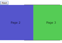
A React Component that fades out its old child, then fades in its new child when its children change. It can also optionally animate its height and/or width from one child's size to the other. Works well with react-router!
Usage
npm install --save react-faderimport React from 'react' import ReactDOM from 'react-dom' import Fader from 'react-fader' ReactDOM.render( <Fader> <h3>Foo</h3> </Fader>, document.getElementById('root') ) // Just change its children to something !==, and it will perform a fade transition. ReactDOM.render( <Fader> <h3>Bar</h3> </Fader>, document.getElementById('root') )Transitioning between child routes with react-router version 4
While it can be done with <Switch>, I recommend using react-router-transition-switch instead:
import {Route, BrowserRouter as Router} from 'react-router-dom' import TransitionSwitch from 'react-router-transition-switch' import Fader from 'react-fader' <Router> <TransitionSwitch component={Fader}> <Route path="/red" component={Red}/> <Route path="/green" component={Green} /> <Route path="/blue" component={Blue} /> </TransitionSwitch> <Router>Props
animateHeight: boolean (default: true)
If truthy, Fader will animate its height to match the height of its children.
animateWidth: boolean (default: true)
If truthy, Fader will animate its width to match the height of its children.
shouldTransition: (oldChildren: any, newChildren: any) => boolean (default: compares keys)
Allows you to determine whether Fader should perform a transition from oldChildren to newChildren. By default, it returns true if oldChildren !== newChildren or their keys are not equal.
fadeOutTransitionDuration: number (default: 200)
The duration of the fade out transition, in milliseconds.
fadeOutTransitionTimingFunction: string (default: 'ease')
The timing function for the fade out transition.
fadeInTransitionDuration: number (default: 200)
The duration of the fade in transition, in milliseconds.
fadeInTransitionTimingFunction: string (default: 'ease')
The timing function for the fade in transition.
sizeTransitionDuration: number (default: 200)
The duration of the size transition, in milliseconds.
sizeTransitionTimingFunction: string (default: 'ease')
The timing function for the size transition.
prefixer: Prefixer
If given, overrides the inline-style-prefixer used to autoprefix inline styles.
className: string
Any extra class names to add to the root element.
style: Object
Extra inline styles to add to the root element.
viewStyle: Object
Extra inline styles to add to the view wrapper elements.
innerViewWrapperStyle: Object
Extra inline styles to add to the inner div between the viewStyle div and your view content element. (The inner div was added to ensure perfect height animation.)


