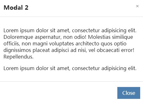
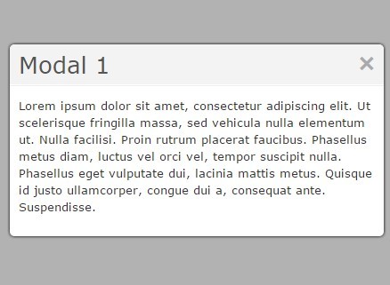
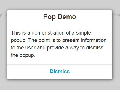
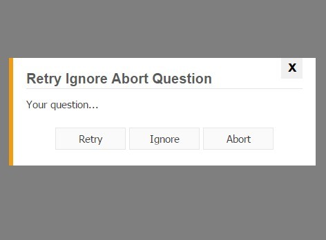
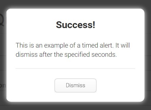
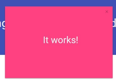
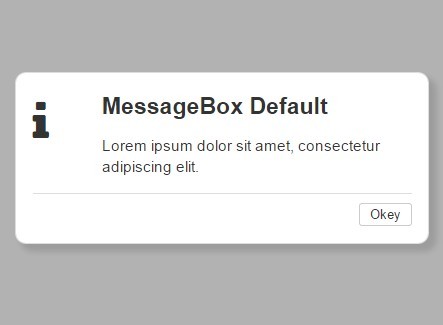
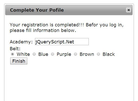
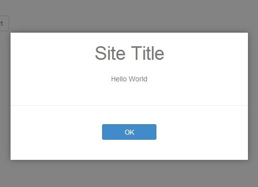
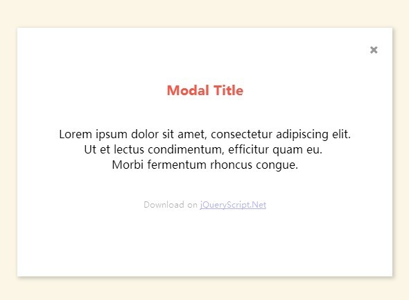
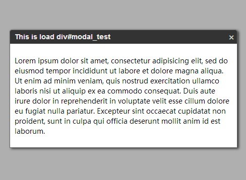
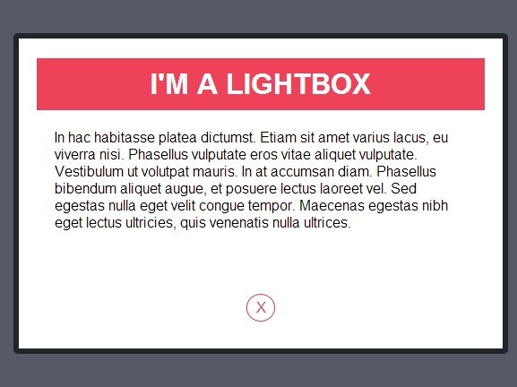
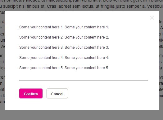
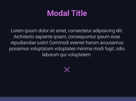
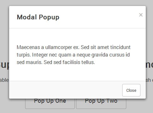
Popelt is a highly configurable jQuery popup plugin to create responsive modal windows & dialog boxes that support both dynamic and static html content.
var MyPopup = new Popelt({ title: 'Pop some cash', content: ''Hey wasup! This is my content.' }).show();
Methods
Method name
Parameters
Description
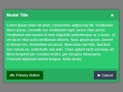
addButton
label [,class] [,clickEvent]
**label** - Name on button
**class** - custom class to give to the button [optional] **clickEvent** - Function to execute on click of button. If not provided, by default triggers popup close [optional] </td> </tr> <tr> <td>setContent</td> <td>content</td> <td> **content** - Body content of the popup Can be HTML or Plain text </td> </tr> <tr> <td>show showPopup </td> <td>-</td> <td>Show the popup</td> </tr> <tr> <td>close closePopup </td> <td>-</td> <td> Close the popup </td> </tr> <tr> <td>addOKButton</td> <td>clickEvent</td> <td> Add a button with "OK" as label **clickEvent** - On click event </td> </tr> <tr> <td>addCloseButton</td> <td>-</td> <td> Add a button with "Close" as label. It will close the popup </td> </tr> <tr> <td>addCancelButton</td> <td>-</td> <td> Add a button with "Cancel" as label. It will close the popup </td> </tr>
Settings / Attributes
Setting
Values
Default
Description
modal
boolean
false
**true** or **false**
title
text
_Not displayed if empty_
content
string / html
Popup body content.
HTML or Text string. <small>_Not displayed if empty_</small> </td> </tr> <tr> <td>width</td> <td>number</td> <td>600</td> <td>Width of the popup. Accepts percent (%) or pixels (px) </td> </tr> <tr> <td>maxHeight</td> <td>number</td> <td></td> <td>Give max height to the content container for longer content. A scrollbar will appear if content overflows. </td> </tr> <tr> <td>offsetTop</td> <td>number</td> <td>vertically centered</td> <td>If the popup needs to appear some pixels away from the top instead of being vertically centered. </td> </tr> <tr> <td>responsive</td> <td>boolean</td> <td>false</td> <td> **true** or **false** Width of the popup will be maximum 100%;</td> </tr> <tr> <td>closeButton</td> <td>boolean</td> <td>true</td> <td>Display the **"×"** close button on top right.</td> </tr> <tr> <td>closeBtnTooltip</td> <td>text</td> <td>"Close"</td> <td>Tooltip for the default **"×"** clsoe button on top right. Give **false** if to hide. </td> </tr> <tr> <td>overlayColor</td> <td>CSS Color</td> <td>black</td> <td>Change color of the overlay background. Accepts CSS color names or hex color codes. </td> </tr> <tr> <td>overlayOpacity</td> <td>0.0 - 1.0</td> <td>0.9</td> <td>Transparency of overlay background. Accepts CSS '_opacity_' values.</td> </tr> <tr> <td>focus</td> <td>boolean</td> <td>false</td> <td>If want to focus on the first '_input_' or '_textarea_' when the popup is opened.</td> </tr> <tr> <td>escClose</td> <td>boolean</td> <td>true</td> <td>Allow popup to close by pressing "Escape" or "Esc" key.</td> </tr> <tr> <td>closeClass</td> <td>string</td> <td>"pop-close"</td> <td>If want any link **<a>** or **button** or any element inside your content to trigger **popup close**, give it this classname.</td> </tr> <tr> <td>fadeSpeed</td> <td>number</td> <td>200</td> <td>Speed of fade animation while closing popup. Accepts jquery speed value for fadeOut.</td> </tr> <tr> <td>buttons</td> <td>Array object</td> <td></td> <td>Syntax: <pre class="code">[{ label [,classname] [,clickEvent]}]</pre> Example:
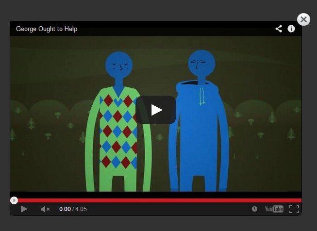
</td> </tr> <tr> <td>contentType</td> <td>**"ajax"** or **"iframe"** or **#elementID**</td> <td></td> <td> You can add dynamic content via AJAX, or embed a video or a webpage using iframe, or take the content from an existing element in the DOM using '#' (for element ID). </td> </tr> <tr> <td>loadUrl</td> <td>string</td> <td></td> <td><small>Applied for contentType AJAX and Iframe.</small> Source URL to load via AJAX or iframe. <small>_Note: Currently do not support cross-domain URL for AJAX_</small> </td> </tr> <tr> <td>iframeHeight</td> <td>number</td> <td>300px</td> <td>Set height for Iframe content. <small>Accepts percent (%) or pixels (px)</small> <small>_Dynamic height coming soon._</small> </td> </tr> <tr> <td>iframeWidth</td> <td>number</td> <td>100%</td> <td>Set width for the Iframe content. <small>Accepts percent (%) or pixels (px)</small> </td> </tr>


