bway-image-slider v1.0.6
Very easy to use and fully responsive jQuery image slider plugin with option for Horizontal or Vertical axis and infinite loop. Includes also touch events, and current/total information.
v1.0.6 - Loader controlable. Since you have .loader-overlay in your container just use loader : true. (we are using some css loaders from the awesome SpinKit project
v1.0.5 - Different objects size allowed in 'x' axis.
v1.0.4 - Allows keyboard controls. keyboard : true.
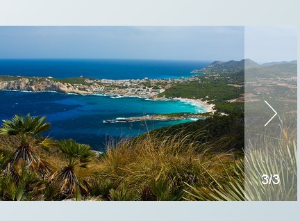
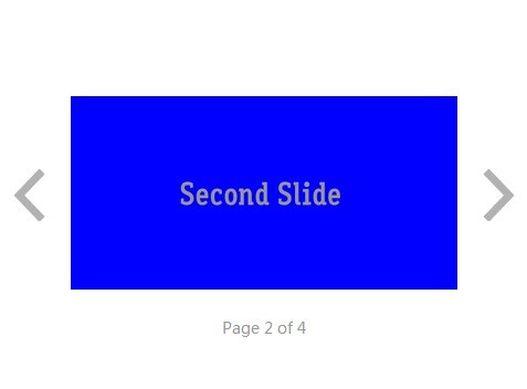
v1.0.3 - Includes image counter. Just needs to include .image-current and .image-total classes.
v1.0.2 - Allows <a> or <img> as list elements.
v1.0.1 - Enables touch actions, using jquery.hammer.js
Requires
jQuery
hammer.js (optional - if touch events are needed)
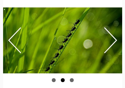
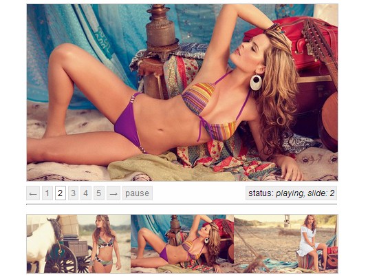
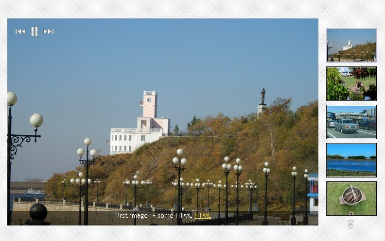
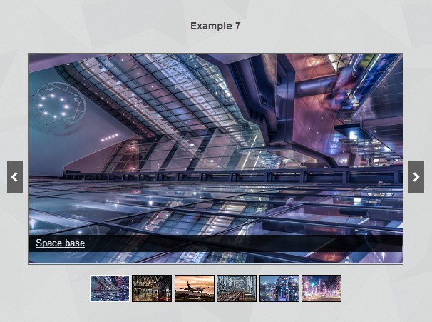
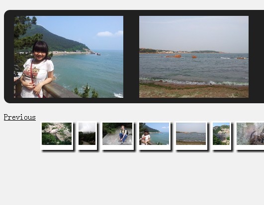
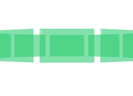
Examples
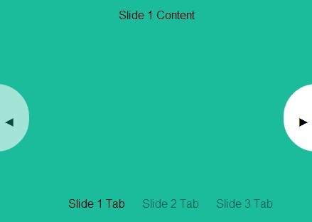
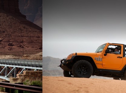
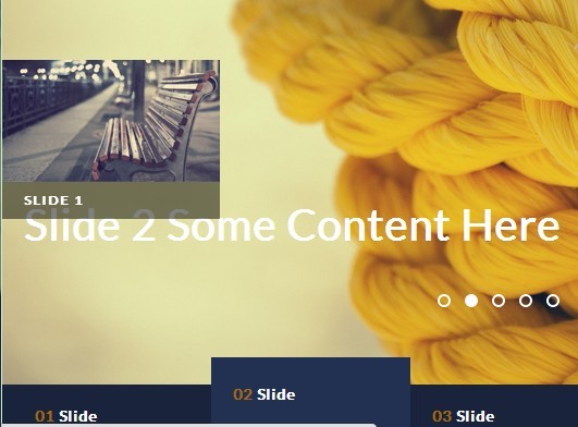
You can check our examples in our product page by clicking here.
Setup...
Load jQuery and include bway-image-slider plugin
<script src="//ajax.googleapis.com/ajax/libs/jquery/1.11.2/jquery.min.js"></script> <script src="jquery.bway.imageslider.min.js"></script> If you want touch events, please load also hammer.js before this plugin, as you see in the lines below:
<script src="//ajax.googleapis.com/ajax/libs/jquery/1.11.2/jquery.min.js"></script> <script src="//cdn.jsdelivr.net/g/[email protected],[email protected]"></script> <script src="jquery.bway.imageslider.min.js"></script> Place your HTML markup
with <img> elements (in this example we are including a loader) for this and other loader code visit the SpinKit project
<div id="your-gallery"> <div class="viewport"> <!-- LOADER (optional) --> <div class="loader-overlay"> <div class="sk-circle"> <div class="sk-circle1 sk-child"></div> <div class="sk-circle2 sk-child"></div> <div class="sk-circle3 sk-child"></div> <div class="sk-circle4 sk-child"></div> <div class="sk-circle5 sk-child"></div> <div class="sk-circle6 sk-child"></div> <div class="sk-circle7 sk-child"></div> <div class="sk-circle8 sk-child"></div> <div class="sk-circle9 sk-child"></div> <div class="sk-circle10 sk-child"></div> <div class="sk-circle11 sk-child"></div> <div class="sk-circle12 sk-child"></div> </div> </div> <!-- end of LOADER (optional) --> <input type="button" class="buttons prev" value="<"> <ul class="overview"> <li><img src="path-to-your-image"></li> <li><img src="path-to-your-image"></li> <li><img src="path-to-your-image"></li> <li><img src="path-to-your-image"></li> </ul> <input type="button" class="buttons next" value=">"> </div> </div> or if you prefer <a> elements (in this example we are NOT including a loader)
<div id="your-gallery"> <div class="viewport"> <input type="button" class="buttons prev" value="<"> <ul class="overview"> <li><a href="#" style="background-image: url(#);"></a></li> <li><a href="#" style="background-image: url(#);"></a></li> <li><a href="#" style="background-image: url(#);"></a></li> <li><a href="#" style="background-image: url(#);"></a></li> </ul> <input type="button" class="buttons next" value=">"> </div> </div> Initialization
Simple initialization:
$('#your-gallery').bwayImageSlider();initializing with some options
$('#your-gallery').bwayImageSlider({ axis : 'y', // default 'x' itemMargin : 14, // margin between items, default 10 speed : 500, // miliseconds, default 1500 loop : true, keyboard : true, loader : true });CSS
The following lines are the css essencial code, you may need more CSS code, but these lines are the most important for this plugin to work. In our example page you can see our full implementation.
#example1 { padding: 0; position: relative; overflow: hidden; } #example1 .viewport { position: relative; width: 100%; height: 150px; /* you can define the height you want */ overflow: hidden; } #example1 .buttons { display: block; position: absolute; line-height: 150px; /* in this case we use some height of viewport */ width: 30px; top: 0; text-align: center; z-index: 1; background-color: #FFF; border: 0; font-family: 'fontawesome'; } #example1 .buttons i { font-size: 18px; color: #000; line-height: 150px; } #example1 .buttons:hover { background-color: #F3F3F3; } #example1 .overview { position: absolute; padding: 0 35px; margin: 0; left: 0; top: 0; } #example1 .overview ul { clear: both; list-style: none; height: 150px; padding: 0; } #example1 li { display: inline-block; float: left; margin: 0 7px; height: 150px; /* if you are using <img> of different proportions, in X axis */ } /* if you are using <a> instead of <img> */ #example1 li a { display: block; width: 220px; height: 150px; margin: 0; } #example1 .buttons.prev { left: 0; /* if you're using 'x' axis */ top: 0; /* if you're using 'y' axis */ } #example1 .buttons.next { right: 0; /* if you're using 'x' axis */ bottom: 0; /* if you're using 'y' axis */ } /* if you are using <img> of different proportions, in X axis */ #example1 li img { display: block; width: auto; height: 100%; margin: 0; } /* COMMON ELEMENTS */ .examples .buttons.inactive { color: rgba(0,0,0,.1); } .examples .buttons.inactive:hover { background-color: #fff !important; } .examples .buttons:active, .examples .buttons:focus { outline: none } /* LOADER */ .loader-overlay { position: absolute; top: 0; right: 0; bottom: 0; left: 0; background-color: rgba(255,255,255,.85); z-index: 10; display: none; } /* one of the options of SpinKit project (you may use anyone from this library, or any other loader you want) */ .sk-cube-grid { position: absolute; width: 40px; height: 40px; top: 50%; left: 50%; margin-top: -20px; margin-left: -20px; } .sk-cube-grid .sk-cube { width: 33%; height: 33%; background-color: #FFF; float: left; -webkit-animation: sk-cubeGridScaleDelay 1.3s infinite ease-in-out; animation: sk-cubeGridScaleDelay 1.3s infinite ease-in-out; } .sk-cube-grid .sk-cube1 { -webkit-animation-delay: 0.2s; animation-delay: 0.2s; } .sk-cube-grid .sk-cube2 { -webkit-animation-delay: 0.3s; animation-delay: 0.3s; } .sk-cube-grid .sk-cube3 { -webkit-animation-delay: 0.4s; animation-delay: 0.4s; } .sk-cube-grid .sk-cube4 { -webkit-animation-delay: 0.1s; animation-delay: 0.1s; } .sk-cube-grid .sk-cube5 { -webkit-animation-delay: 0.2s; animation-delay: 0.2s; } .sk-cube-grid .sk-cube6 { -webkit-animation-delay: 0.3s; animation-delay: 0.3s; } .sk-cube-grid .sk-cube7 { -webkit-animation-delay: 0s; animation-delay: 0s; } .sk-cube-grid .sk-cube8 { -webkit-animation-delay: 0.1s; animation-delay: 0.1s; } .sk-cube-grid .sk-cube9 { -webkit-animation-delay: 0.2s; animation-delay: 0.2s; } @-webkit-keyframes sk-cubeGridScaleDelay { 0%, 70%, 100% { -webkit-transform: scale3D(1, 1, 1); transform: scale3D(1, 1, 1); } 35% { -webkit-transform: scale3D(0, 0, 1); transform: scale3D(0, 0, 1); } } @keyframes sk-cubeGridScaleDelay { 0%, 70%, 100% { -webkit-transform: scale3D(1, 1, 1); transform: scale3D(1, 1, 1); } 35% { -webkit-transform: scale3D(0, 0, 1); transform: scale3D(0, 0, 1); } }