coreSlider
jQuery BEM-style slider plugin
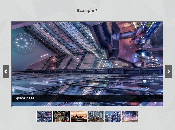
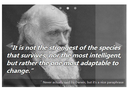
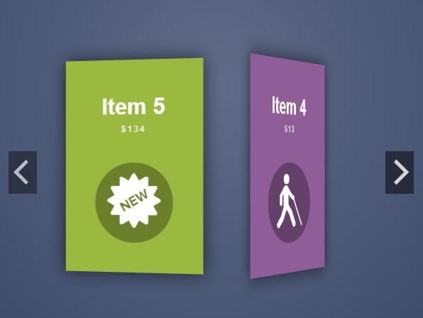
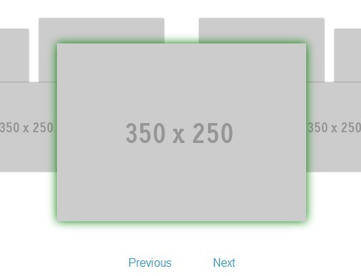
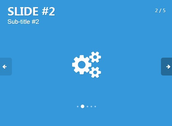
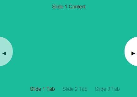
For more information see DEMO
Setup
Add this tags to the <head> of your document (of before the </body> tag). This will link jQuery, slider CSS and JS into your web-page.
<script type="text/javascript" src="http://code.jquery.com/jquery-latest.min.js"></script> <script type="text/javascript" src="coreSlider.js"></script> <link rel="stylesheet" type="text/css" href="coreSlider.css"/>Markup
Very good thins is that there is no restrictions to markup (So, all who loves BEM-style developing will like this :)). You can use any classes and nesting you need (because any tag can be configured on slider initialization) in difference of other plugins, where markup, or classname are hardcoded inside plugin. But there are few things that you must follow:
- Slider must have a 'viewport' (block, that will 'cut off' other slides that are outside of slider area of visibility). Default value is
.core-slider_viewport; - All slides must be wrapped with a container (in fact, this container will move on slide-change event, not each slide). For beautiful movement animation you can attach to this block some custom transition timing function. Default value is
.core-slider_list; - Slider must have containers for arrows and dots controls (you can disable this controls if you need). Default classes are:
.core-slider_navand.core-slider_control-nav.
As a canonical markup can be considered following HTML:
<div class="core-slider"> <div class="core-slider_viewport"> <div class="core-slider_list"> <div class="core-slider_item"> Foo </div> <div class="core-slider_item"> Bar </div> </div> </div> <div class="core-slider_nav"> <div class="core-slider_arrow core-slider_arrow__left"></div> <div class="core-slider_arrow core-slider_arrow__right"></div> </div> <div class="core-slider_control-nav"></div> </div>Initialize
In last step, add the folowing lines of JavaScript into the <head> of your document (of before the </body> tag).
<script type="text/javascript" charset="utf-8"> $(window).load(function() { $('.core-slider').coreSlider(); }); </script>The $(window).load() function is required to ensure the content of the page is loaded before the plugin initializes (because, sizes are calculated from slides content, and, if there is no images are loaded, content can be set as 0px width and height). Anyway, if you slider have strict sizes defined in CSS, you can change $(window).load() function to $(document).ready() function.
Options & API
Listed below are all of the options available to customize slider to suite your needs.
interval: 5000, // Interval of time between slide changes loop: true, // When slider finish, should it loop again from first slide? slideshow: true, // Enable/Disable automatic slideshow resize: true, // Should be slider responsive on screen resize pauseOnHover: true, // Pause the slideshow when hovering over slider startOnHover: false, // Start the slideshow when hovering over slider sliderSelector: '.core-slider_list', // List selector (all items are inside this container) viewportSelector: '.core-slider_viewport', // Viewport selector itemSelector: '.core-slider_item', // Slider items selector navEnabled: true, // Enable/Disable navigation arrows navSelector: '.core-slider_nav', // Selector for navigation arrows container navItemNextSelector: '.core-slider_arrow__right', // 'Next' arrow selector navItemPrevSelector: '.core-slider_arrow__left', // 'Prev' arrow selector controlNavEnabled: false, // Enable/Disable control navigation (dots) controlNavSelector: '.core-slider_control-nav', // Control navigation container selector (inside will be created dots items) controlNavItemSelector: 'core-slider_control-nav-item', // Single control nav dot (created dynamically. Write without dot. If you need more that one class - add them with space separator) loadedClass: 'is-loaded', // Classname, that will be added when slider is fully loaded clonedClass: 'is-cloned', // Classname, that will be added to cloned slides (see option 'clone') hiddenClass: 'is-hidden', // Classname, indicates hidden things disabledClass: 'is-disabled', // Classname, that will be added it item is disabled (in most of cases - item will be display: noned) activeClass: 'is-active', // Classname, that will be added to active items (for example control navs, etc.) reloadGif: false, // Reload gif's on slide change for replaying cycled animation inside current slide clone: false, // Indicates, that at begin and at end of slider carousel items will be cloned to create 'infitite' carousel illusion items: 1, // How mutch items will be placed inside viewport. Leave 1 if this is slider, 2 ot more - it will look like a carousel itemsPerSlide: 1, // How many items must be slided by one action (NOTE: Must be less than 'items' option) cloneItems: 0 // How mutch items will be cloned at begin and at end of slider // Callbacks API before: function() {}, // Callback function - fires before each slider animation after: function() {}, // Callback function - fires after each slider animation init: function() {}, // Callback function - fires after slider was initializedYou can also perform actions on coreSlider instances. E.g.:
$('#slider').coreslider('update'); // Update slideshow (useful when you remove/add slides) $('#slider').coreslider('play'); // Play slideshow $('#slider').coreslider('stop'); // Stop slideshow $('#slider').coreslider('destroy'); // Destroy slideshow instance $('#slider').coreslider('next'); // Go to next slide $('#slider').coreslider('prev'); // Go to prev slide $('#slider').coreslider(3); // Go to the third slideBrowser Support
All modern versions of Firefox, Chrome, Safari, iOS, Android, Internet Explorer and Edge have been tested and are supported. Also, due to usage of CSS3 animations, in IE9 slider looks like a piece of shit. But if you support these old browsers your soul will burn in hell :)
License
The MIT License (MIT)
Copyright © 2016 Pavel Davydov
Permission is hereby granted, free of charge, to any person obtaining a copy of this software and associated documentation files (the "Software"), to deal in the Software without restriction, including without limitation the rights to use, copy, modify, merge, publish, distribute, sublicense, and/or sell copies of the Software, and to permit persons to whom the Software is furnished to do so, subject to the following conditions:
The above copyright notice and this permission notice shall be included in all copies or substantial portions of the Software.
THE SOFTWARE IS PROVIDED "AS IS", WITHOUT WARRANTY OF ANY KIND, EXPRESS OR IMPLIED, INCLUDING BUT NOT LIMITED TO THE WARRANTIES OF MERCHANTABILITY, FITNESS FOR A PARTICULAR PURPOSE AND NONINFRINGEMENT. IN NO EVENT SHALL THE AUTHORS OR COPYRIGHT HOLDERS BE LIABLE FOR ANY CLAIM, DAMAGES OR OTHER LIABILITY, WHETHER IN AN ACTION OF CONTRACT, TORT OR OTHERWISE, ARISING FROM, OUT OF OR IN CONNECTION WITH THE SOFTWARE OR THE USE OR OTHER DEALINGS IN THE SOFTWARE.