plumcube
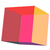
A compass extension for creating 3D cubes of all shapes and sizes... as long as that shape is a cube.
Scared? Confused? Intrigued? Check out the demo page.
Ex-ante
If you think that Boy Scouts use Compass and Girl Scouts have Sass, you might want to click those links first. Plumcube is a Compass extension, so you'll need both Sass and Compass in order to use it. Find your compass, get Sass-y, and you'll be good to go.
Note that the plumcube plugin relies on the 'Bleeding Edge' version of Sass, because 3D CSS animation is the Internet of the future. If you are already a Sass-y individual, be sure to check your currently installed version (sass -v) and upgrade to the pre-release gem (3.3.0.alpha - get it with gem install sass --pre) if necessary.
Get plumcube'n
On the command line
Install the plumcube gem with gem install plumcube.
In config.rb
Add require 'plumcube' to the top of your config.rb file, along with calls to any other compass plugins you may be including in your project.
In the HTML
Each face of your plumcube must be marked up as an unordered list, wrapped up in a few <div> elements to control the different 3D axes. The base markup for the cube is:
<div class="your-cube"> <div class="cube-z"> <div class="cube-y"> <ul class="cube-x"> <li></li> <li></li> <li></li> <li></li> <li></li> <li></li> </ul> </div> </div> </div> Note that the your-cube class can have any name, but the cube-z, cube-y, and cube-x classes need to remain in place in order for your cube to render properly. You can also add any additional classes or unique identifiers to the list items, the unordered list, and/or the container elements.
In the scss
Import compass and plumcube:
@import "compass/css3;" @import "plumcube"; Include the plumcube mixin in the styles of the outermost wrapper element. The plumcube mixin parameters are:
@mixin plumcube($x, $y, $z, $perspective, $origin) /* ==================================================================================== where $x = cube width, in pixels $y = cube length, in pixels $z = cube depth, in pixels $perspective = distance of shape from screen along z-axis (smaller numbers create more shape/perspective distortion) $origin = defines the origin of the 3D perspective (see https://developer.mozilla.org/en-US/docs/Web/CSS/perspective-origin for all possible values) ==================================================================================== */ If you wanted a cube 200px x 200px x 200px, with a perspective of 1200px originating at the center of the cube, your code would look like:
.your-cube { @include plumcube(200, 200, 200, 1200, 50%); /* cube it up */ margin: 100px 26%; } You can then apply other styling to the elements within your cube, including rotating it along one of its axes:
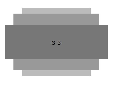
.cube-x { @include transform(rotateX(10deg)); /* rotate the cube 10 degrees along the x-axis */ li { opacity: .5; /* set opacity to see all faces of cube */ &:nth-child(1) { /* front face */ background: #f00; } &:nth-child(2) { /* right face */ background: #ff0; } &:nth-child(3) { /* back face */ background: #ff00ff; } &:nth-child(4) { /* left face */ background: #123456; } &:nth-child(5) { /* top face */ background: #dd0000; } &:nth-child(6) { /* bottom face */ background: #000; } } } Take it for a spin
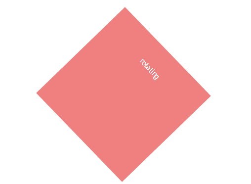
After you recover from that terrible pun, you can include the spincube mixin in your container styles to set the cube on a continuous rotation around one or more of its axes:
@mixin spincube($axis, $speed) /* ==================================================================================== where $axis = axis to spin $speed = time it takes to complete one rotation, in seconds or milliseconds ==================================================================================== */ You need to call the mixin on the container representing the axis that you want to set spinning:
.cube-x { @include spincube(x, 200ms); } .cube-y { @include spincube(y, 5s); } .cube-z { @include spincube(z, 1s); } You can technically spin all 3 axes at once, but the animation looks best when kept simple and limited to one axis. If you want to spin the cube in the opposite direction from the default, add the optional reverse parameter to your include:
.cube-y { @include spincube(y, 5s, reverse); } ##Questions? Comments? Concerns? Hugs?* Please feel free to contact me with any feedback you may have. The plumcube welcomes all.
*Note: Hugs only accepted under the condition that the hug-giver has bathed/showered within the past 24 hours, and is not covered with any contaminants, foreign or otherwise, at the time of hug delivery.


