MultiModal
A typescript/javascript library which supports multiple modals, is mobile friendly and has fancy animations.
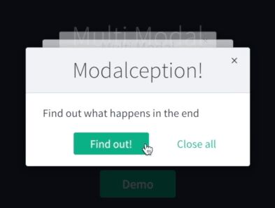
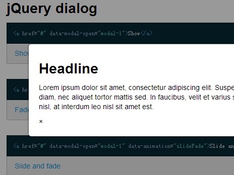
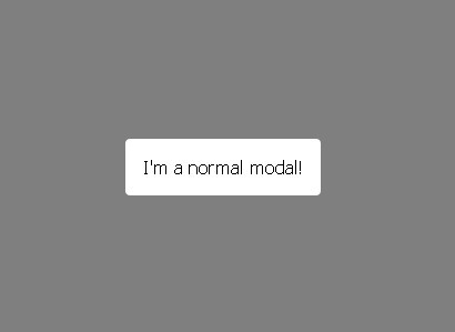
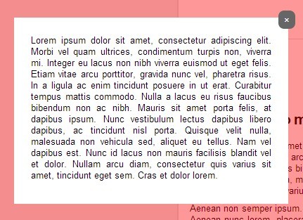
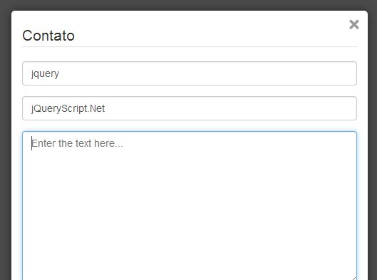
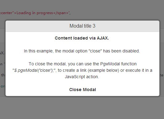
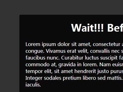
See it in action

Check it out
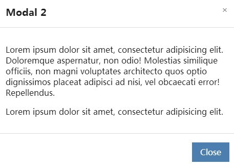
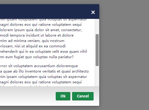
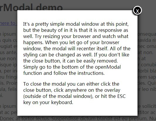
Modalception
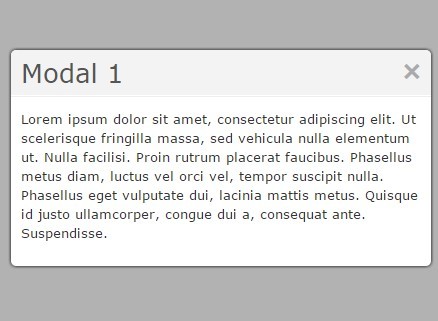
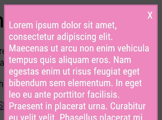
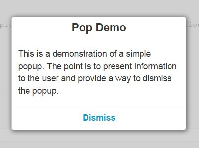
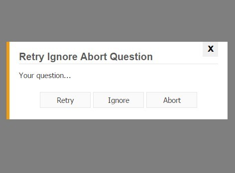
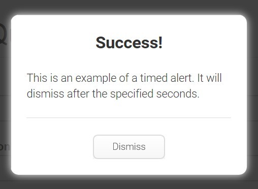
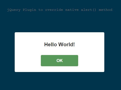
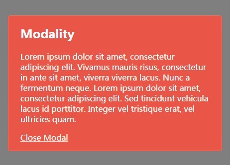
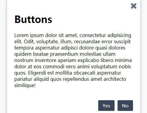
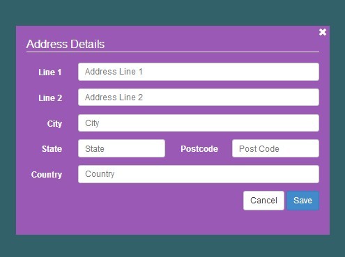
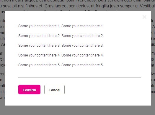
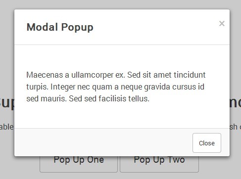
Create as many modals as you want. Useful for confirm modals.
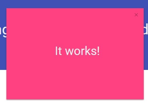
Built with GSAP & JQuery
Ultra high-performance, professional-grade animation for the modern web. Even on mobile.
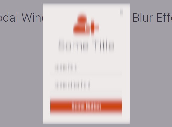
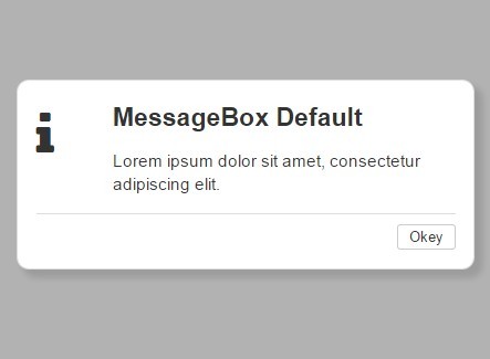
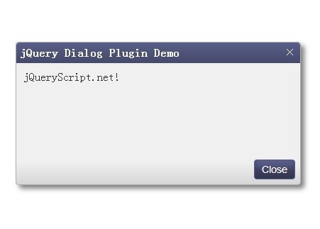
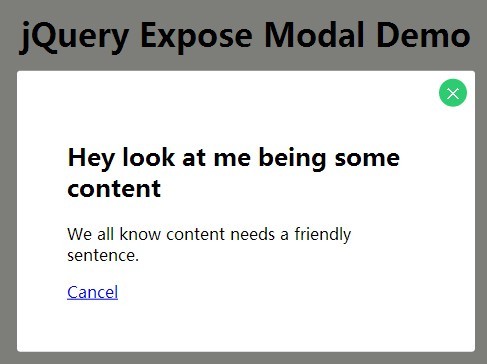
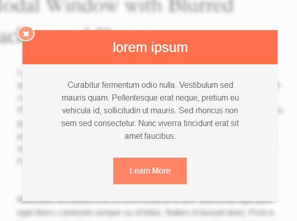
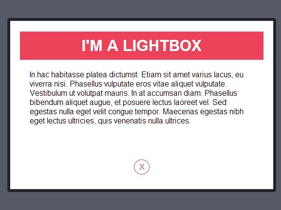
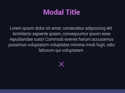
Easily Themeable
Comes with 2 Themes:
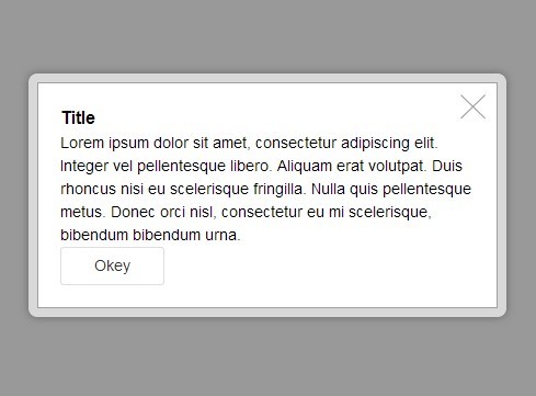
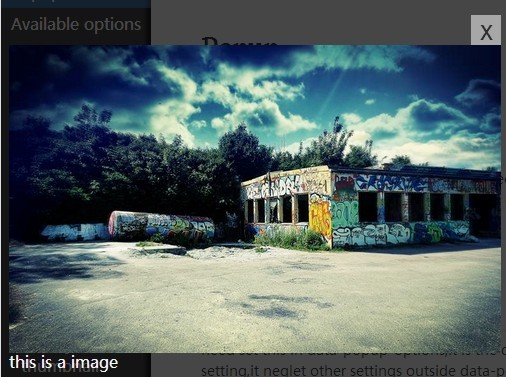
Classic

Modern

Installation
<script src="//ajax.googleapis.com/ajax/libs/jquery/2.2.4/jquery.min.js"></script> <script src="//cdnjs.cloudflare.com/ajax/libs/gsap/1.18.5/TweenMax.min.js"></script> <script src="app-path/multi-modal.min.js"></script> <link href="app-path/multi-modal.css" rel="stylesheet" type="text/css">Usage
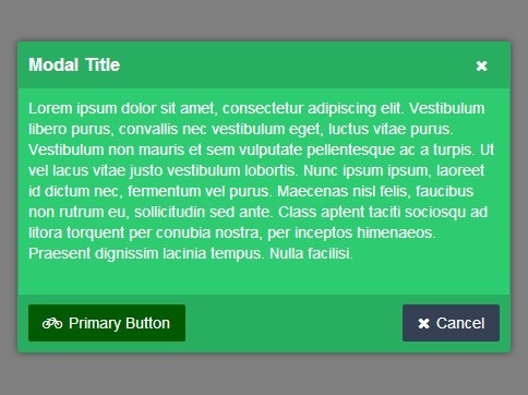
var modal = new MultiModal({ // default options closeButton: true // if you are using the modern theme fullScreen should be true // fullScreen: true }); // Add even handlers $(document).click(function(event) { // mandatory event handlers if ($(event.target).hasClass('js-modal-close')) { modal.close(); } if ($(event.target).hasClass('js-modal-close-all')) { modal.closeAll(); } // custom event handlers if ($(event.target).hasClass('js-modal-toggle')) { modal.new({ title: 'Multi Modal', content: 'Do you like it?', buttons: { primary: { value: 'Yes!', href: '', className: 'button button--primary' }, secondary: { value: 'No', className: 'button button--secondary', closeOnClick: true } } }); } }Remote Support
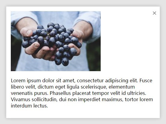
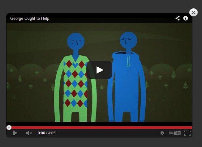
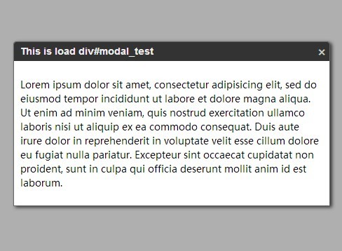
Want to create a modal using a remote file? No problemo, we’ll even animate it for you.
modal.new({ remote: 'modal.html' }); // With data modal.new({ remote: { url: 'modal.html', data: { name: 'John', age: 28 } } });Data properties can be accessed using modal.remote.data.name for instance.
Options
| Parameter | Type | Description |
|---|---|---|
| title | string | The title of the modal |
| content | string | The content of the modal |
| className or classList | string or array | The class of the modal |
| closeButton | boolean or string | Defaults to "mobile". Show a close button. "mobile" will make it only visible for the specified width or smaller of the breakpoint in the .scss config file (default: 767px). There will always be a close button when fullScreen is true. |
| buttons | object | See down below section Button Options |
| fullScreen | boolean | Defaults to false. Determines if the modal will launch in fullscreen mode. Used in the modern theme. |
| allowBackdropClose | boolean | Defaults to true. Will a click on the background close this modal? Set to false when you want to force the user to interact with the buttons. |
| remote | string or object | Pass the url or an object with url and optional data properties. This will override all the other properties, so simply don’t use them if you are using this. |
Button Options
The buttons object consists of two keys: primary (Required) and secondary (Optional). Each have following options:
| Parameter | Type | Description |
|---|---|---|
| value | string | Required. The value of the button |
| href | string | The href of the button |
| className or classList | string or array | The class of the button |
| closeOnClick | boolean | If true clicking on the button will close the modal |


