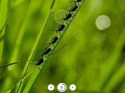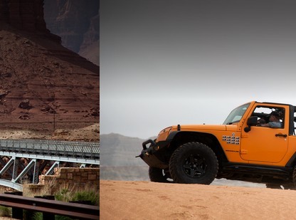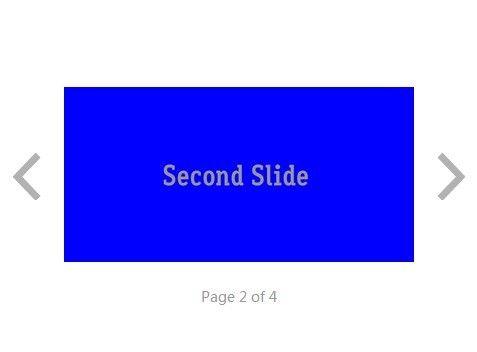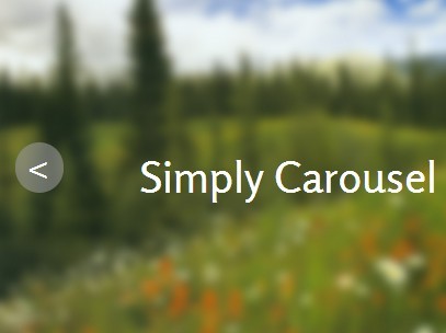
Carousel Slideshow Plugin
Responsive and touch-enabled plugin with full controls built with ES6 JavaScript and jQuery Mobile that enables you to create clean and customizable sliders.
Features:
- Easy to customize
- Any # of slides (edit html only)
- Responsive
- Touch-swipe
- Smooth CSS3 transitions
- Pause on Hover/Out of View
- Infinite sliding
- Different sized images
- Full width and full window support
- Display modal
- Deep linking
- Lazy loading
- Full-screen support
- Video support
- JavaScript breakpoints
- 18kb minified
- W3C compliant
Getting started
1. Get a copy of the plugin
You can fork or download the plugin from GitHub.
2. Load the required files
Inside the page's head tag include the required CSS files.
<link href="https://fonts.googleapis.com/icon?family=Material+Icons" rel="stylesheet"> <link href="css/slider.css" rel="stylesheet" type="text/css">In the page's footer, just before </body>, include the required JavaScript files.
<script src="https://code.jquery.com/jquery-1.11.2.min.js"></script> <script src="https://code.jquery.com/mobile/1.4.5/jquery.mobile-1.4.5.min.js"></script> <script src="js/slider.js"></script>3. Create the HTML markup
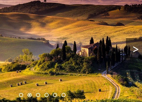
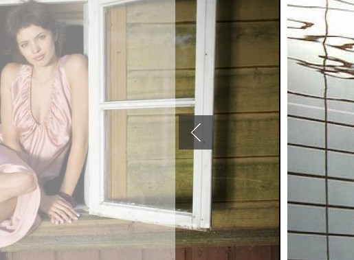
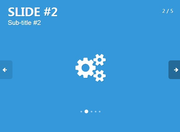
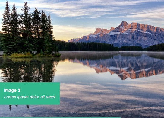
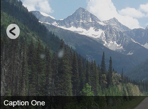
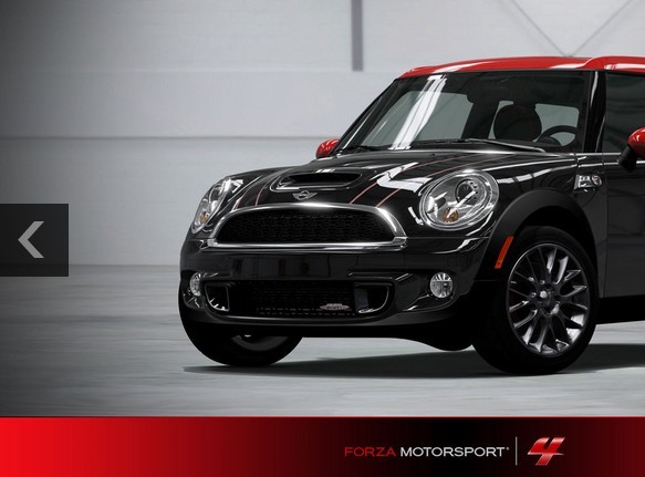
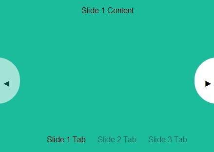
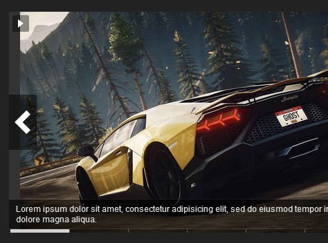
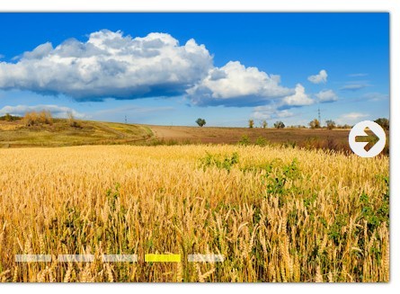
<div class="slider-container"> <div class="slider-carousel"> <div class="slider"> <div class="slide-panel"> <img class="slide-img" src="https://images.pexels.com/photos/66997/pexels-photo-66997.jpeg?auto=compress&cs=tinysrgb&dpr=2&h=650&w=940" alt=""> <div class="slide-box"> <h2 class="slide-text">Slide 1</h2> </div> <div class="slide-overlay"></div> </div> <div class="slide-panel"> <img class="slide-img" src="https://images.pexels.com/photos/4827/nature-forest-trees-fog.jpeg?auto=compress&cs=tinysrgb&dpr=3&h=750&w=1260" alt=""> <div class="slide-box"> <h2 class="slide-text">Slide 2</h2> </div> </div> <div class="slide-panel"> <img class="slide-img" src="https://images.pexels.com/photos/248797/pexels-photo-248797.jpeg?auto=compress&cs=tinysrgb&dpr=2&h=650&w=940" alt=""> <div class="slide-box"> <h2 class="slide-text">Slide 3</h2> </div> </div> <div class="slide-panel"> <img class="slide-img" src="https://images.pexels.com/photos/917494/pexels-photo-917494.jpeg?auto=compress&cs=tinysrgb&dpr=2&h=650&w=940" alt=""> <div class="slide-box"> <h2 class="slide-text">Slide 4</h2> </div> </div> <div class="slide-panel"> <img class="slide-img" src="https://images.pexels.com/photos/33109/fall-autumn-red-season.jpg?auto=compress&cs=tinysrgb&dpr=2&h=650&w=940" alt=""> <div class="slide-box"> <h2 class="slide-text">Slide 5</h2> </div> </div> </div> <div class="slider-controls"> <span class="slider-arrow prev-slide"> <i class="material-icons"> keyboard_arrow_left </i> </span> <span class="slider-arrow next-slide"> <i class="material-icons"> keyboard_arrow_right </i> </span> <div class="slideshow-toggle"> <i class="material-icons play-slideshow"> play_arrow </i> <i class="material-icons pause-slideshow"> pause </i> </div> <ul class="slide-selector"> <li class="slide-selected"></li> <li></li> <li></li> <li></li> <li></li> </ul> </div> </div> </div> <div class="slider-modal"> <span class="slider-close">×</span> <div class="modal-slide"></div> </div>The structure you see in the code above (slider-container > slider-carousel > slider) as well as the class names used are required. For videos add the class slide-video to the video tag.
Detailed usage instructions
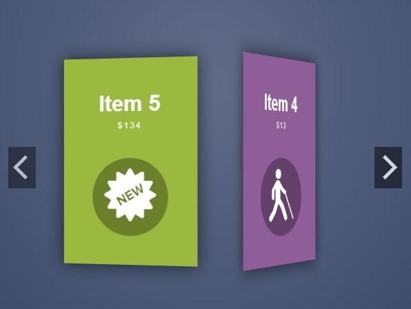
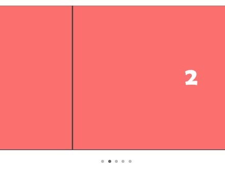
Number of Slides: Add or remove the div tag with class slide-panel.
Autoplay Speed: Change the autoplaySpeed variable in the slider.js file.
Transition Speed: Change the slideChangeSpeed variable in the slider.js file.
Slider Size: Change the slider-container width and height in the slider.css file.
Support
If you found a bug or have a feature suggestion, please submit it in the Issues tracker.
If you need help with implementing the slider in your project, feel free to contact me.
License
The free plugin is available under the MIT license.
Support this project
If you found the plugin useful and would like to help support further development and new projects, please visit the donation link.