
Overview
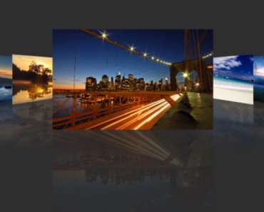
pinch-slider is a touch slider for which can be zoomed or pinched for vue.js.
Install
$ npm install pinch-sliderImport using module
Import components to your project:
require('pinch-slider/dist/pinch-slider.css'); // in ES6 modules import { PinchSlider, AlloyFinger, AlloyFingerVue } from 'pinch-slider'; // in CommonJS const { PinchSlider, AlloyFinger, AlloyFingerVue } = require('pinch-slider'); // in Global variable const { PinchSlider, AlloyFinger, AlloyFingerVue } = PinchSlider;And register components:
Vue.use( AlloyFingerVue, { AlloyFinger: AlloyFinger }); // use AlloyFinger's plugin Vue.component('pinch-slider', PinchSlider);Import using script tag
<link rel="stylesheet" href="../node-modules/pinch-slider/dist/pinch-slider.css" charset="utf-8"> <script src="../node-modules/pinch-slider/dist/pinch-slider.js"></script>const { PinchSlider, AlloyFinger, AlloyFingerVue } = PinchSlider; Vue.use( AlloyFingerVue, { AlloyFinger: AlloyFinger }); // use AlloyFinger's plugin Vue.component('pinchSlider', PinchSlider); new Vue({ el: '.vue-wrapper', data: { imgs: [ { src: 'https://cdn.pixabay.com/photo/2016/11/07/05/13/map-1804891__480.jpg' }, { src: 'https://cdn.pixabay.com/photo/2016/12/09/08/09/texture-1893788__480.jpg' }, {src:'https://cdn.pixabay.com/photo/2016/10/20/18/35/sunrise-1756274__480.jpg'} ], currentIndex: 0, isFull:false }, methods:{ showFull() { this.isFull = true; }, changePageNo(data) { this.currentIndex = data.index; } } });Usage
Work on a Vue instance:
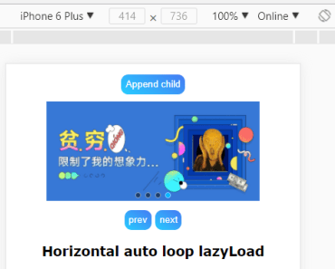
<div class="slider-container"> <pinch-slider :slides="imgs" :enable-pinch="false" :current-index='currentIndex' @on-slide-change="changePageNo" @on-img-click="showFull"> </pinch-slider> </div>.slider-container { width: 100%; height: 500px; overflow: hidden; }Options
Here list Props and events on the component
| Option | Description |
|---|---|
| slides | Array(default: []) image lists to be loaded. |
| enablePinch | Boolean(default: true). |
| currentIndex | Number (default:0) - current image showing |
| srcKey | String (default:'src') - key for the slider object which contains the image. |
| lazyLoad | Boolean (default:false) - if true, the images won't be downloaded until swiped near to them. |
| loadingImgUrl | String (default:'') - if lazyLoad, the loading image shown before the real image downloaded. |
| @on-slide-change | function - trigged when the slider changes, passes current index for the callback |
| @on-img-click | function - trigged when image be clicked, this event cancels bubble |
Develop
$ npm run buildMany thanks to
License
MIT


