This is the version 6 README
Version 6 is still in beta stage, for documentation of the version 5 check new documentation
Overview
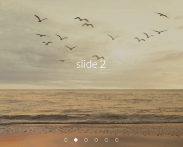
This is an image slider developed with Vuejs 2 which comes with 20 cool transitions out of the box.


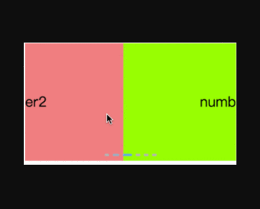
Demo
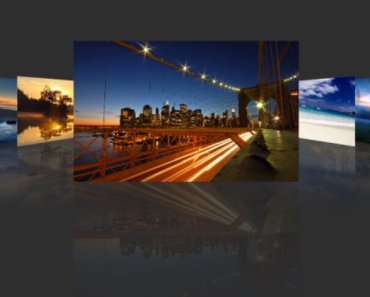
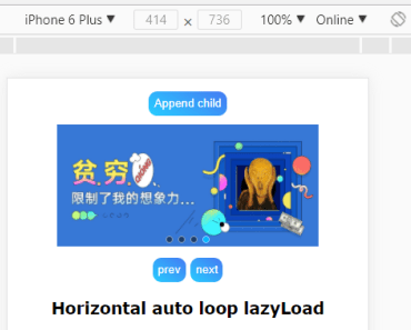
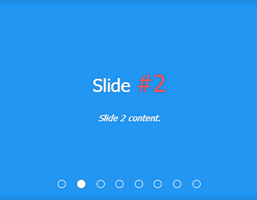
You can view a demo here.
Features
| Feature | Description |
|---|---|
| Responsive | The slider and the images are adapted to container to fill it always |
| Compatibility | Supported by all major browsers |
| Expandable | You can add your custom transitions very easily |
| Customization | Total customizable to suit most needs |
| Gestures | Mobile friendly by gestures |
| Functionality | You can use arrow keys to navigate. Switch to full screen |
| Parallax | It includes a parallax component very easy to set up |
Quickstart
Install and save the package.
npm install --save vue-flux@stable-6Add the component to the template. This one has all the complements, so you can remove the ones you don't want.
<vue-flux :options="vfOptions" :images="vfImages" :transitions="vfTransitions" :captions="vfCaptions" ref="slider"> <template v-slot:preloader> <flux-preloader></flux-preloader> </template> <template v-slot:caption> <flux-caption></flux-caption> </template> <template v-slot:controls> <flux-controls></flux-controls> </template> <template v-slot:pagination> <flux-pagination></flux-pagination> </template> <template v-slot:index> <flux-index></flux-index> </template> </vue-flux> <button @click="$refs.slider.showImage('next')">NEXT</button>Add it to the component, and like before you can remove the complements you don't use.
import VueFlux from 'vue-flux'; import { FluxCaption, FluxControls, FluxIndex, FluxPagination, FluxPreloader } from 'vue-flux/complements'; export default { components: { VueFlux, FluxCaption, FluxControls, FluxIndex, FluxPagination, FluxPreloader, }, data: () => ({ vfOptions: { autoplay: true }, vfImages: [ 'URL1', 'URL2', 'URL3' ], vfTransitions: [ 'fade', 'cube', 'book', 'wave' ], vfCaptions: [ 'Caption for image 1', 'Caption for image 2', 'Caption for image 3', ], }), }Performance
Weight is just 102KB so is pretty light having only the essential CSS. It also does not require a high end computer as animations are performed with CSS3 hardware acceleration.
Included transitions
2D transitions
- Fade: fades from one image to next.
- Kenburn: fades, zoom and moves current image to next.
- Swipe: swipes the image to display next like uncovered with a curtain.
- Slide: slides the image horizontally revealing the next.
- Waterfall: divides the image in bars and drops them down in turns.
- Zip: divides the image in bars and slides them up and down alternately like a zip.
- Blinds 2D: divides the image in vertical bars that blinds and fades out.
- Blocks 1: the image is splited in blocks that shrink and fade out randomly.
- Blocks 2: the image is splited in blocks that shrink and fade out in wave from a corner to the opposite.
- Concentric: a concentric effect is performed by rotating the image converted into circles.
- Warp: a concentric effect is performed by rotating the image converted into circles in alternate direction.
- Camera: from outside to inside the image is being cropped like in a camera lens.
3D transitions
- Cube: turns the image to a side like if place in a cube.
- Book: makes the effect of turning a page to display next image.
- Fall: the image falls in front displaying next image.
- Wave: makes the image 3D and divides it in slices that turn vertically to display the next image.
- Blinds 3D: divides the image in vertical bars that blinds 180 deg to form the next image.
- Round 1: the image is splited in blocks that turn 180 deg horizontally to form next image.
- Round 2: panels start to round vertically revealing the next image in upper arrow form leaving trail.
- Explode: the image starts to explode from the center to outside.
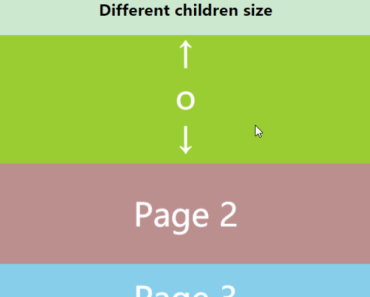
Parallax
As simple as this.
<flux-parallax src="url" height="300px" offset="80%"> <div>CONTENT</div> </flux-parallax>Troubleshooting
If you find yourself running into issues during installation or running the slider, please check our documentation. If still needs help open an issue. We would be happy to discuss how they can be solved.
Documentation
You can view the full documentation at the project's documentation with examples and detailed information.
Changelog
Check the version 6 changelog for update info.
Inspiration
This slider was inspired by Flux Slider.
Contributing
Contributions, questions and comments are all welcome and encouraged.
Do not hesitate to send me your own transitions to add them to the slider.