
vue-easy-slider


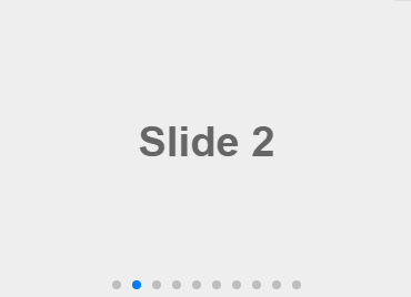
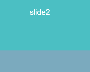
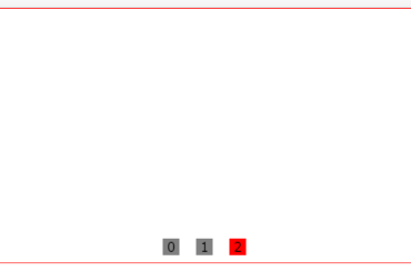
Keep slider simple!
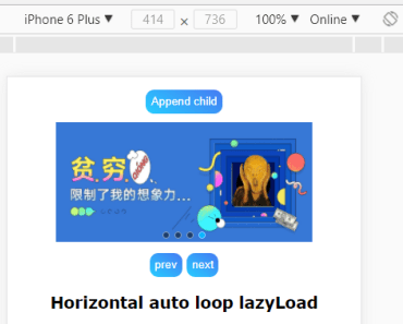
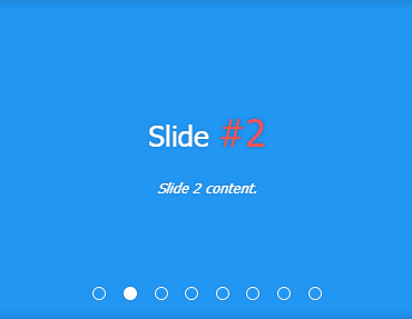
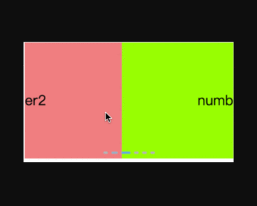
Demo
Install
npm i -S vue-easy-sliderUsage
Plugin install:
import Vue from 'vue' import EasySlider from 'vue-easy-slider' Vue.use(EasySlider)Or work on a Vue instance:
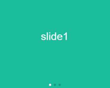
<slider animation="fade"> <slider-item v-for="(i, index) in list" :key="index" :style="i" @click="hello" > <p style="line-height: 280px; font-size: 5rem; text-align: center;">Page{{ index + 1 }}</p> </slider-item> </slider>import { Slider, SliderItem } from 'vue-easy-slider' new Vue({ el: 'body', components: { Slider, SliderItem, }, data() { return { list: [ { backgroundColor: '#3f51b5', width: '100%', height: '100%' }, { backgroundColor: '#eee', width: '100%', height: '100%' }, { backgroundColor: '#f44336', width: '100%', height: '100%' }, ], } }, methods: { hello($event) { console.log(`hello index: ${$event}`) }, }, })Control slider with v-model
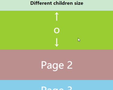
<slider animation="fade" v-model="sliderIndex"> ... </slider> <button @click="moveToIndex(2)">move to page 3</button>... data() { return { // initial index sliderIndex: 1, list: [ { backgroundColor: '#3f51b5', width: '100%', height: '100%' }, { backgroundColor: '#eee', width: '100%', height: '100%' }, { backgroundColor: '#f44336', width: '100%', height: '100%' }, ], } }, methods: { moveToIndex(index) { this.sliderIndex = index }, }, ...Props
Slider:
| name | type | default | description |
|---|---|---|---|
| width | String | auto | Slider width |
| height | String | 300px | Slider height |
| touch | Boolean | true | Enable touch slide |
| animation | 'normal', 'fade' | 'normal' | Change animation |
| autoplay | Boolean | true | Autoplay |
| interval | Number | 3000 | Delay of autoplay ( autoplay option should be true ) |
| speed | Number | 500 | Speed(ms) of animation |
| indicators | 'center', 'left', 'right', false | 'center' | Show indicators on option position or hide indicators |
| control-btn | Boolean | true | Show control button |
| before-next | Function | () => true | Before next guard, sliding to next item when this function return true |
| before-previous | Function | () => true | Before previous guard |
Events
Slider:
| name | description | $event |
|---|---|---|
| change | Fires when the slide change | number // index of slides |
| next | Fires when the button for the next slide was pressed | { original: number, next: number } |
| previous | Fires when the button for the previous slide was pressed | { original: number, next: number } |
Slots
SliderItem:
| name | description |
|---|---|
| default | Item content |
| loading | Loading placeholder |
usage:
<slider> <slider-item> <img src=""> <p></p> <button></button> </slider-item> <div slot="loading">custom loading ...</div> </slider>License
MIT


