Adex Modal Plugin
It's loosing weight! Jquery Plugin!
Introduction
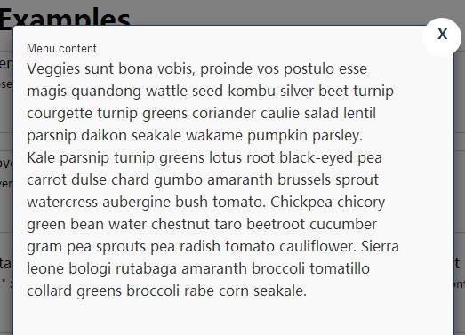
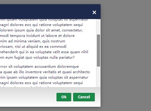
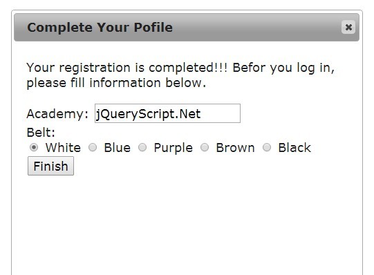
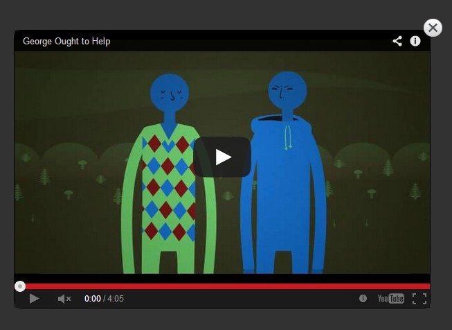
Tired of those fat! tedious!! and useless!!! scripts. Here ADEX MODAL Plugin has come to help you. We have reduced its size upto 4KB!!. Not even that we have also tried to make it more easy to use. No need to access the html! Plugins are created to reduce the work. The plugin just requires you to provide jQuery from which it will automatically generate the HTML, css and jquery scripts for the related modals. All you need to do is just provide a element. A click on this element will show up the modal? Sounds hard?? It's Easy lets see how.
Use it in 3 Steps!
Step 1 : Give some food! (Attach the JS to page)
First of all we need to attach the resources file. The resources file the plugin requires is just a Jquery.js and adexmodal.js or adexmodal.min.js . Just attach both the plugins to the page.
`<script type="text/javascript" src="../jquery.min.js"></script>
<script type="text/javascript" src="../adexmodal.js"></script>`Note: Make sure jQuery is on top.
Step 2 : HAHA It WORKS! (Put jquery code to apply the modal)
Now we have applied the jQuery and adexmodal to the page. Now we need to tell the plugin that when to display modal. That is which element shall user click to display the modal. Look on the following code i will explain each of the term.
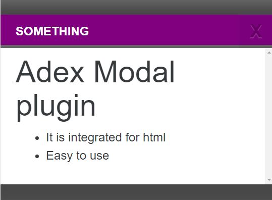
$('elem').adexmodal({ header : 'something', mtype :'default', background : '#000', bg_opacity : '60', //Range it from 0 to 100 content : '<h1>Adex Modal plugin</h1><ul><li>It is integrated for html</li><li>Easy to use</li></ul>', closebtn : 'close', speed: 800, customheader: 'purple' }); That's the whole code you need to create the modal. Let's see what each param indicates in the plugin.
elem : The clickable element by clicking on which we will see the modal.
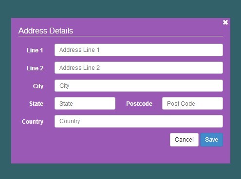
header : The header title of the modal (HTML compatible.)
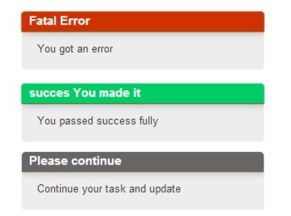
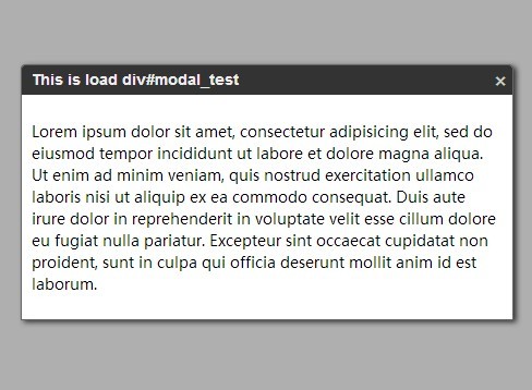
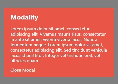
mtype : This is the type of modal you want to show. There are 4 types of themes available in the modal. Those are 1)default 2)success 3)warning 4)error. The themes name are incase sensitive. (keep it small).
background: The background of the cover which appears on the back of the modal. (rgb() compatible.).
bg_opacity: The opacity of the provided background. (Range from 0 to 100).
content: The content of the modal. (HTML compatible).
closebtn : The button **class** (CSS CLASS) to close the modal.
speed: The speed of showing and closing the modal.
customheader: If you want custom header background. (optional param). (compatible with rgb()).
Step 3: Done! Its Easy!
Liked it? or found a bug!! Tell me ;)
