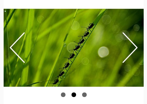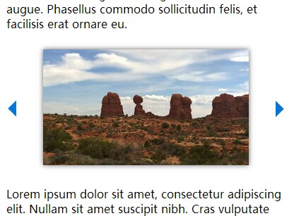
A simple and clean slider
This is the very simple and clean responsive jQuery slider.
The image size is adjusted automatically, so there is no need to resize image files.
LICENSE
All source code is available jointly under the MIT License and the Beerware License. Please see LICENSE.md for details.
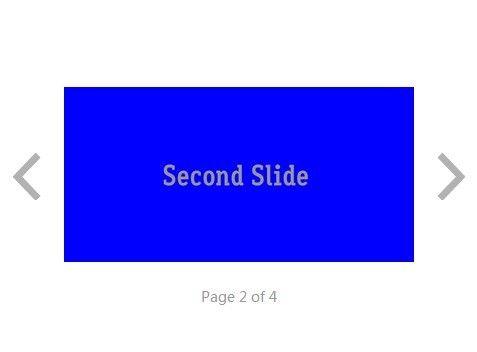
Demo
To see the slider, clone the repo or click a link below.
Requirements
The slider requires the following to run:
- jQuery
Usage
Set css and js files
Please set style.css and script.js in the appropriate place, and import them.
Structure
The slider with the following HTML structure:
slide-windowthe main containerslide-wrappercontains slides and decide widthslideeach slide item of the slideraa linkslide-imagethe div element, which can include slide imageslide-captionthe div element, which can include some text
1. slide-window
The slide-window is the main container. It can contain slide items.
<div class="slide-window"> <div class="slide-wrapper" style="width: 300%;"> <!-- slide items --> </div> </div> 2. slide-wrapper
The slide-wrapper is the 2nd main container. It can decide width:
- width = x * 100(%)
- x is a number of slide items
If there are two slide items, add style="width: 200%;" in slide-wrapper.
<div class="slide-window"> <div class="slide-wrapper" style="width: 200%;"> <div class="slide"> <!-- slide item 1 --> </div> <div class="slide"> <!-- slide item 2 --> </div> </div> </div> 3. slide item
The slide is the slide item, which can include slide-image and slide-caption.
<div class="slide"> <a href="#" target="_blank"> <div class="slide-image" style="background-image: url(#)"> </div> <div class="slide-caption"> <h2>AUTONOMY</h2> <p>Always keep the sun in your heart.</p> </div> </a> </div> Add style="background-image: url(#)" to slide-image. The image size is adjusted automatically.