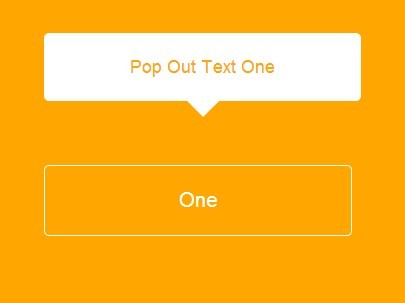
Modern, minimal css tooptip library with accessibility baked in. Just `1kb` minified and gzipped.
Table of Contents
Installation
via npm
npm install microtipvia yarn
yarn add microtipvia CDN
https://unpkg.com/microtip/microtip.css direct download
curl -o microtip https://github.com/ghosh/microtip/blob/master/microtip.css
Setup
in PostCSS
@import 'microtip';in Webpack
import microtip from 'microtip/microtip.css'in SCSS
@import 'microtip/microtip';Make sure, node_modules is included in the includePaths setting. You can then directly import the library into your file.
Usage
Using the tooltip is incredibly simple. Simply add a aria-label and role="tooltip" attribute to the element on which you want the tooltip to appear. The tooltip message is the attribute value aria-label="your message". This along with a position modifier is all you need to get going. Example:-
<button aria-label="Hey tooltip!" data-microtip-position="up" role="tooltip">Position Modifiers
You can change the direction of the tooltip by adding a data-microtip-position attribute. The accepted values of this attribute are:- top, top-left, top-right, bottom, bottom-left, bottom-right, left and right. Example:-
<button aria-label="Hey tooltip!" data-microtip-position="top-left" role="tooltip">Size Modifiers
By default, the tooltip will takeup only the size it requires to show the text. You can specify sizes by adding a data-microtip-size attribute. The accepted values include small, medium, large and fit. Example:-
<button aria-label="This is a decently long text!" data-microtip-position="top-left" data-microtip-size="medium" role="tooltip">Note - fit sets the width of the tooltip to be the same as the width on the element. It only works along with the top and bottom position modifiers.
Customization
Microtip uses css variables, which allows you to customize the behavior of the tooltip as per your needs.
| Variable | Description | Default Value |
|---|---|---|
--microtip-transition-duration | Specifies the duration of the tootltip transition | .18s |
--microtip-transition-delay | The delay on hover before showing the tooltip | 0s |
--microtip-transition-easing | The easing applied while transitioning the tooltip | ease-in-out |
--microtip-font-size | Sets the font size of the text in tooltip | 13px |
--microtip-font-weight | The font weight of the text in tooltip | normal |
--microtip-text-transform | Controls the casing of the text | none |
Example:-
:root { --microtip-transition-duration: 0.5s; --microtip-transition-delay: 1s; --microtip-transition-easing: ease-out; --microtip-font-size: 13px; --microtip-font-weight: bold; --microtip-text-transform: uppercase; }The above code will cause all the tooltips to transition over 0.5s while applying an easing of type ease-out after a delay of 1s. The text will be bold and uppercase and have a font size of 13px.
You could also customize the tooltip for individual instances by using a selector more specific than :root. Example:-
.tooltip { --microtip-transition-duration: 0.2s; --microtip-transition-delay: 0s; --microtip-transition-easing: ease-in-out; }The above code would only affect the tooltips shown on any element with the tooltip class.
For more on css variables see here
Related
- Micromodal - Tiny javascript library for creating accessible modal dialogs
Credits
- Claudio Holanda - Whose work inspired this project
A little project by @i_ghosh


