react-native-md-motion-buttons (iOS / Android)
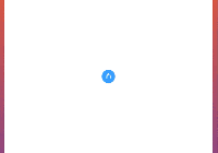
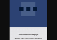
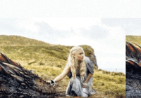
I wanted to re-create this animation with react-native (https://dribbble.com/shots/1945593-Login-Home-Screen)

Installation
npm install react-native-md-motion-buttons --save
Usage
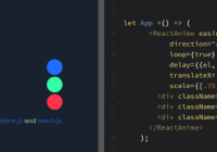
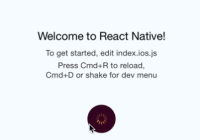
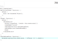
import React, { Component } from 'react'; import { AppRegistry, StyleSheet, Text, View, Button } from 'react-native'; import { Login } from 'react-native-md-motion-buttons'; class Home extends Component { render() { return (<View style={[StyleSheet.absoluteFill, styles.container]}> <Text style={styles.welcome}> New screen </Text> <Button title="Reset" onPress={this.props.logout} /> </View>) } } export default class examples extends Component { render() { const promise = () => new Promise((resolve, reject) => setTimeout(() => resolve(), 2000) ); return ( <Login.View style={styles.container} homeScreen={<Home />}> <Text style={styles.welcome}> Welcome to React Native! </Text> <Text style={styles.instructions}> To get started, edit index.ios.js </Text> <Text style={styles.instructions}> Press Cmd+R to reload,{'\n'} Cmd+D or shake for dev menu </Text> <Login.Button onPress={promise} style={styles.button} color="rgb(255,155,57)" /> </Login.View> ) } }View Props
| Prop | Type | Description |
|---|---|---|
children | ReactElement<any> | React Element(s) to render. Button must be a direct child. |
homeScreen | ReactElement<any> | New screen to render after the animation. <View> expose a logout function as a prop to this Component |
style | StyleSheet<any> | Apply style to the View |
Button Props
| Prop | Type | Description |
|---|---|---|
title | ?String | Button title. Default : 'Login' |
color | ?String | Text color. Default: 'white' |
style | StyleSheet<any> | Apply style to the Button. backgroundColor is required |
onPress | () => Promise> | Handle button click. Must returned a promise |
Roadmap
Next release
- Add ripple effect for button
- Add a Floating Action Button (FAB) which will move to the center (like inVision dribble)


