jQuery.Flipster
Flipster is a CSS3 3D transform-based jQuery plugin built to replicate the familiar 'cover flow' effect, but also supports a variety of styles. Not only is it gorgeous to look at, Flipster is also:
- Responsive: From desktop to mobile, Flipster automatically centers and scales to fit the area provided.
- Lightweight: Javascript and CSS combined are only 5kb gzipped (13kb uncompressed). Only dependency is jQuery.
- Touch/Scrollwheel/Trackpad/Keyboard Friendly Swipe on touch devices, scroll via trackpad or mousewheel, and use your arrow keys to fly through items!
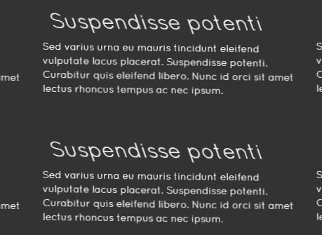
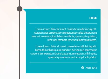
- Flexible: Flip an image gallery or any HTML content. Links and dynamic content work great!
- Customizable: Four built in styles (coverflow, carousel, wheel and flat) with plenty of options to configure Flipster the way you want.
Live demo: http://brokensquare.com/Code/jquery-flipster/demo/
Browser Support
- Chrome (latest)
- Safari & iOS Safari (latest)
- Firefox (latest)
- IE 10+ full support
- IE 8-9 limited support
Basic Usage
Step 1: Include Flipster's CSS, typically in the <head>:
<link rel="stylesheet" href="css/flipster.min.css">Tip: Use the un-minified flipster.css or the LESS files in the src/less folder to make your own Flipster styles!
Step 2: Set up your content:
<div class="my-flipster"> <ul> <li><img src="" /></li> <li><p>Plain ol' <abbr>HTML</abbr>!</p></li> ... </ul> </div>*Tip: Set the itemContainer and itemSelector options to fit your markup. Flipster only requires an outer container and inner container; you aren't restricted to <div>, <ul>, and <li>s. *
Step 3: Include Flipster's Javascript after jQuery (ideally at the bottom of the page before the </body> tag) and initialize Flipster on your element:
<script src="/js/jquery.min.js"></script> <script src="/js/jquery.flipster.min.js"></script> <script> $('.my-flipster').flipster(); </script>Step 4: Start flippin'!
Options
Configure your options when first initializing Flipster. Default values and descriptions are shown below.
$('.my-flipster').flipster({ itemContainer: 'ul', // [string|object] // Selector for the container of the flippin' items. itemSelector: 'li', // [string|object] // Selector for children of `itemContainer` to flip start: 'center', // ['center'|number] // Zero based index of the starting item, or use 'center' to start in the middle fadeIn: 400, // [milliseconds] // Speed of the fade in animation after items have been setup loop: false, // [true|false] // Loop around when the start or end is reached autoplay: false, // [false|milliseconds] // If a positive number, Flipster will automatically advance to next item after that number of milliseconds pauseOnHover: true, // [true|false] // If true, autoplay advancement will pause when Flipster is hovered style: 'coverflow', // [coverflow|carousel|flat|...] // Adds a class (e.g. flipster--coverflow) to the flipster element to switch between display styles // Create your own theme in CSS and use this setting to have Flipster add the custom class spacing: -0.6, // [number] // Space between items relative to each item's width. 0 for no spacing, negative values to overlap click: true, // [true|false] // Clicking an item switches to that item keyboard: true, // [true|false] // Enable left/right arrow navigation scrollwheel: true, // [true|false] // Enable mousewheel/trackpad navigation; up/left = previous, down/right = next touch: true, // [true|false] // Enable swipe navigation for touch devices nav: false, // [true|false|'before'|'after'] // If not false, Flipster will build an unordered list of the items // Values true or 'before' will insert the navigation before the items, 'after' will append the navigation after the items buttons: false, // [true|false|'custom'] // If true, Flipster will insert Previous / Next buttons with SVG arrows // If 'custom', Flipster will not insert the arrows and will instead use the values of `buttonPrev` and `buttonNext` buttonPrev: 'Previous', // [text|html] // Changes the text for the Previous button buttonNext: 'Next', // [text|html] // Changes the text for the Next button onItemSwitch: false // [function] // Callback function when items are switched // Arguments received: [currentItem, previousItem] });Methods
Once an element has been initialized with Flipster, you can call methods to control it:
var myFlipster = $('.my-flipster').flipster(); // It's best to store the element as a variable for easy reference. myFlipster.flipster('next'); // Next item myFlipster.flipster('prev'); // Previous item myFlipster.flipster('jump', 0); // Jump to a specific index myFlipster.flipster('jump', $('.my-item')); // Jump to a specific item myFlipster.flipster('play'); // Resume autoplay myFlipster.flipster('play', 5000); // Set autoplay duration myFlipster.flipster('pause'); // Pause the autoplay until next jump myFlipster.flipster('stop'); // Stop the autoplay entirely myFlipster.flipster('index'); // If items are added or removed, you can tell Flipster to reindex Navigation
Set nav: true in the options and Flipster can build an unordered list of links to each item to let users jump around.
The navigation list will use each item's data-flip-title attribute as the text. If an item does not have a data-flip-title, Flipster will try to grab the title attribute, or will default to the item's index.
<div class="my-flipster"> <ul> <li data-flip-title="Item 1 Title">...</li> <li data-flip-title="Item 2 Title">...</li> ... </ul> </div>Categories
Include data-flip-category attributes on your items, and the navigation list will group items into categories, allowing for basic filtering and quicker navigation.
<div class="my-flipster"> <ul> <li data-flip-title="Item 1 Title" data-flip-category="Category 1">...</li> <li data-flip-title="Item 2 Title" data-flip-category="Category 1">...</li> <li data-flip-title="Item 3 Title" data-flip-category="Category 2">...</li> <li data-flip-title="Item 4 Title" data-flip-category="Category 2">...</li> <li data-flip-title="Item 5 Title">...</li> </ul> </div>Contributing
If you run into a problem or have an idea, make an issue on Github.
See room for improvement? Don't be shy! Fork this repo and I'll be happy to merge pull requests provided they keep Flipster lightweight, simple, and free of dependencies beyond jQuery. Make sure that you run grunt to generate minified files for distribution before making a pull request!
Version History
-
1.1.3 - Nov 10 2017
- Improvements to touch swiping on mobile devices, thanks to @fjmusick
-
1.1.2 - Mar 3 2016
- Bower & package.json fixes
-
1.1.1 - Mar 3 2016
- Fix for maximum callstack errors when not visible. #74 #79
-
1.1.0 - Mar 3 2016
stopmethod added for issues like #75
-
1.0.1 - Nov 1 2015
- Fixed issue #63 where the active nav class was added to all nav items.
-
1.0.0 - Oct 23 2015
- Special thanks to @shshaw for major additions leading to version 1.0!
- Massive rewrite for performance optimization and simplification
- Some option names have changed; be sure to check the documentation to update your code
- Better scrollwheel, keyboard and touch events
- BEM syntax for all Flipster classes
- Added
autoplayoption to automatically advance through items;pauseOnHoveroption will prevent items from switching automatically while hovered - Added
fadeInoption for controlling duration of fade-in animation after Flipster has been setup
-
0.3.4 - July 23 2014
- Some additional options available
- Cleaned up code and normalized whitespace
- Added Grunt support for minifying css and js for distribution
-
0.3.2 - February 4 2014
- Added public access for
jumpmethod and functionality for exposing other methods. (Thanks @JoeWagner!) - A number of bug fixes.
- Added public access for
-
0.3.1 - July 18 2013
- Better demos ( See http://brokensquare.com/Code/jquery-Flipster/demo/ )
-
0.3.0 - July 17 2013
- @shshaw forked from @drien's jQuery.Flipster
- Added new Carousel style! Shows 5 items at a time in a looping carousel
- Added
itemContainer,itemSelector,style, andstartoptions for basic configuration - Added
enableKeyboard,enableMousewheel, andenableTouchoptions to enable/disable features - Added
enableNavandenableNavButtonsoptions to insert controls into the container - Added
onItemSwitchcallback
-
0.2.1 - July 11 2013
- Fixed bug where all keyboard input was being suppressed.
-
0.2.0 - June 27 2013
- Added automatic height adjustment for the container element, which used to just overflow.
- A few minor code improvements.
- Added minified versions of the js and css files.
-
0.1.3 - March 25 2013
- Strong men also cry, strong men also cry.
-
0.1.0 - March 25 2013
- Improvements in fallbacks for old version of IE and basic fixes to make it actually work.
-
0.0.0 - March 22 2013
- LIFE ON THE BLEEDING EDGE BABY
License
The MIT License (MIT)
Copyright (c) 2013-2019 Adrien Delessert
Permission is hereby granted, free of charge, to any person obtaining a copy of this software and associated documentation files (the "Software"), to deal in the Software without restriction, including without limitation the rights to use, copy, modify, merge, publish, distribute, sublicense, and/or sell copies of the Software, and to permit persons to whom the Software is furnished to do so, subject to the following conditions:
The above copyright notice and this permission notice shall be included in all copies or substantial portions of the Software.
THE SOFTWARE IS PROVIDED "AS IS", WITHOUT WARRANTY OF ANY KIND, EXPRESS OR IMPLIED, INCLUDING BUT NOT LIMITED TO THE WARRANTIES OF MERCHANTABILITY, FITNESS FOR A PARTICULAR PURPOSE AND NONINFRINGEMENT. IN NO EVENT SHALL THE AUTHORS OR COPYRIGHT HOLDERS BE LIABLE FOR ANY CLAIM, DAMAGES OR OTHER LIABILITY, WHETHER IN AN ACTION OF CONTRACT, TORT OR OTHERWISE, ARISING FROM, OUT OF OR IN CONNECTION WITH THE SOFTWARE OR THE USE OR OTHER DEALINGS IN THE SOFTWARE.


