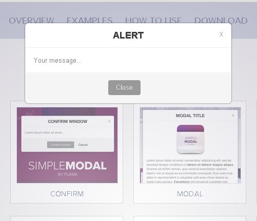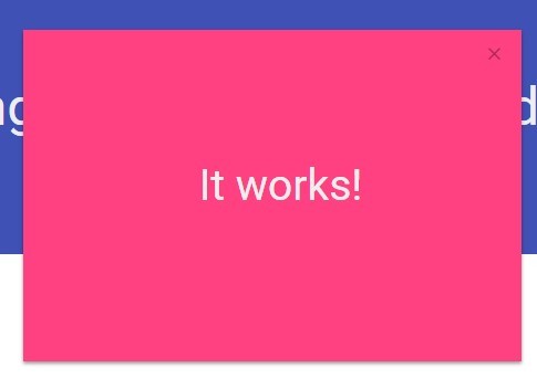
Modelo
Just Another jQuery Modal
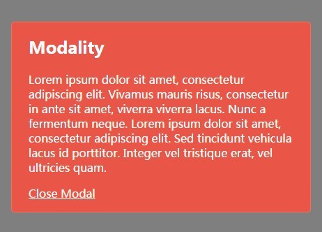
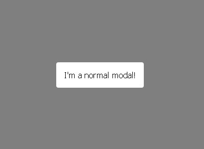
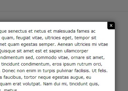
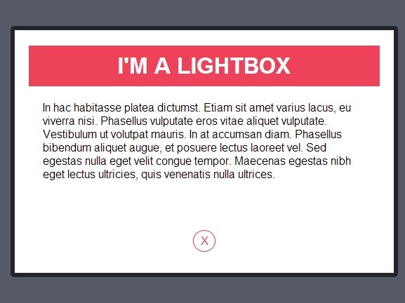
Modelo is a small, lightweight modal created for users who enjoy simplicity. Devoid of any uncessesary styling, Modelo remains highly customizable in terms of look and feel. A few features have been added in order to provide some flexibility over Modelo's behavior, and more may be added as this plugin continues to grow. It's perfect for small apps and projects, so try Modelo today!
Features
- Responsive.
- Easy to setup and use.
- Minimal styles provided by default, making Modelo highly customizable.
- WAI-ARIA guidelines compliant, by W3 standards.
- Click overlay to close modal.
- Press ESC key to close modal.
- Adjustable options, like width, distance from top, and more.
Installation
Required: jQuery 3.3.1
- Download the latest version of jQuery here, or include via CDN.
- Include
modelo.min.cssin your document's<head>. - Add jQuery and
modelo.min.jsright before your closing<body>tag.
<!-- Modelo Style --> <link rel="stylesheet" href="your-folder/modelo.min.css" /> <!-- Include jQuery --> <script src="https://cdnjs.cloudflare.com/ajax/libs/jquery/3.3.1/jquery.min.js"></script> <!-- Modelo Script --> <script src="your-folder/modelo.min.js"></script>Usage
Basic Setup
Below is the required markup in order to use Modelo. Note the usage of role="dialog" and aria-hidden="true" in order to stay compliant with WAI-ARIA accessibility guidelines.
<div class="modal" role="dialog" aria-hidden="true" data-modal> <div class="modal-content"> <!-- ... --> </div> </div>Initialize Modelo
You can initialize Modelo by adding a class or ID to your modal, and then calling modelo().
$('#your-id').modelo();Adding Content
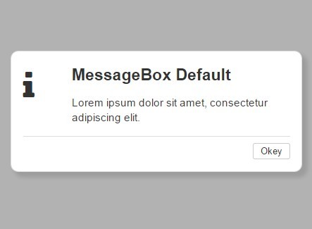
Adding content to your modal is very easy. Modelo comes with 3 predefined classes to help structure your content. They are recommended, but not required:
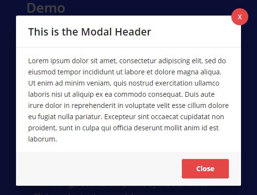
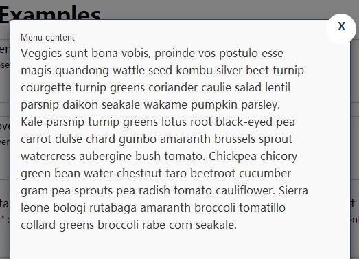
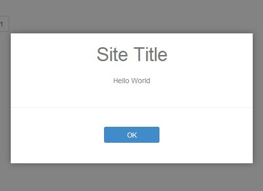
- For modal header content:
<div class="modal-header">which contains a modal title<div class="modal-title">. - For body content:
<div class="modal-body"> - For footer content:
<div class="modal-footer">
Below is the updated modal markup with the content divs added:
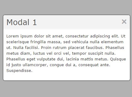
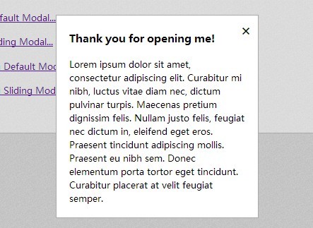
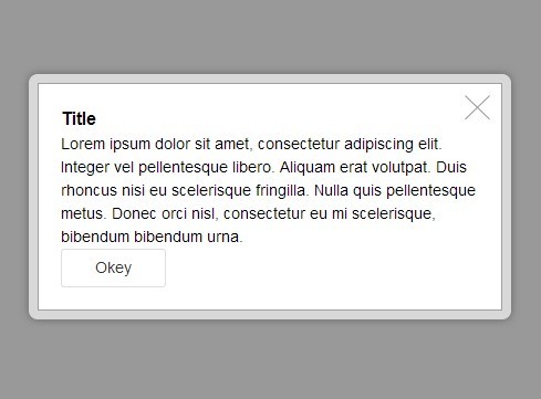
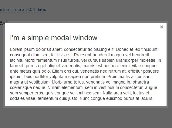
<div class="modal" role="dialog" aria-hidden="true" data-modal> <div class="modal-content"> <div class="modal-header"> <div class="modal-title">Title of Modal</div> </div> <div class="modal-body"> <!-- ... --> </div> <div class="modal-footer"> </div> </div> </div>Opening the Modal
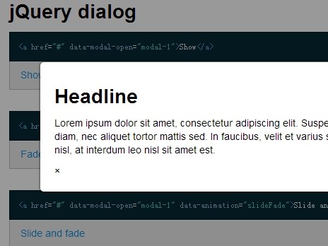
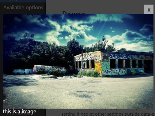
To open the modal, create a button element and add the data-modal="open-modal" attribute. Note the use of aria-label to remain compliant with accessibility standards.
<button role="button" aria-label="open-modal" data-modal="open-modal">Open Modal</button>Closing the Modal
You can close the modal a few different ways, by using a close button, pressing the ESC key, or by clicking the overlay.
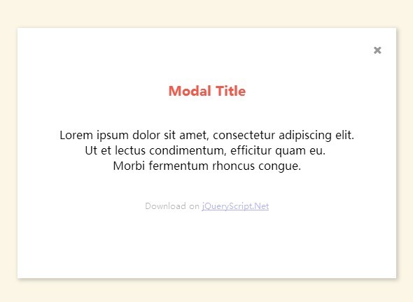
Using an Icon
Create a button element and add the data-modal="close-modal" attribute and give it a class of icon-close for styling. Note the use of aria-label="close-modal" for accessibility.
Recommended placement for this button is in <div class="modal-header">, seen below. Attributes have been removed from the modal div for brevity.
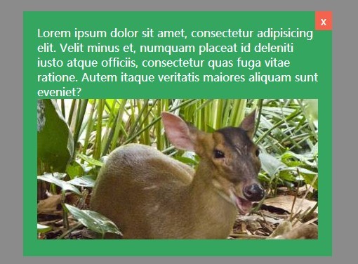
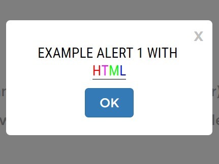
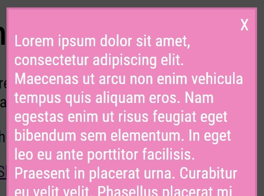
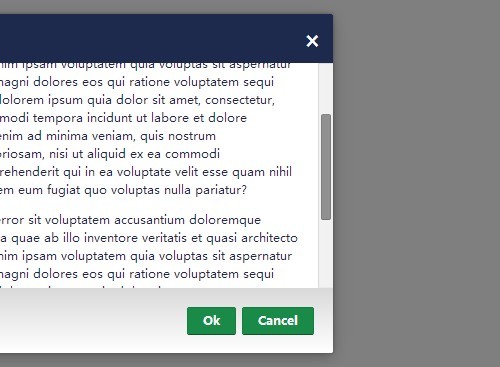
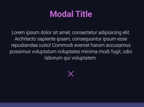
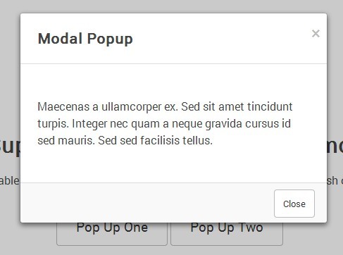
<div class="modal"> <div class="modal-content"> <div class="modal-header"> <button role="button" class="icon-close" aria-label="close-modal" data-modal="close-modal">X</button> <h2 class="modal-title">Title of Modal</h2> </div> <!-- ... --> </div> </div>Using a Close Button
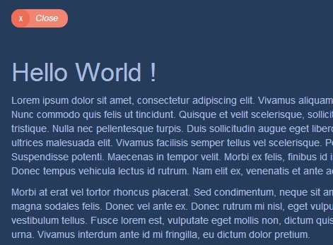
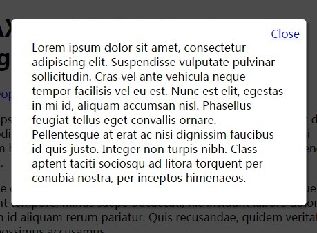
Using a close button is much like using the icon as they use the same markup. However, its class is replaced by the btn-close to indicate a text button. Recommended placement for this button is in the modal-footer.
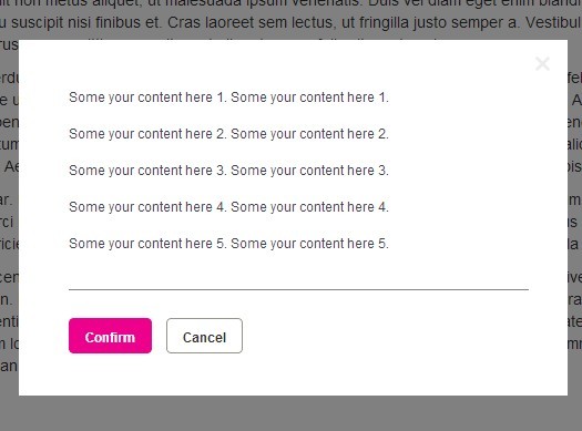
<div class="modal"> <div class="modal-content"> <!-- ... --> <div class="modal-footer"> <button role="button" class="btn-close" aria-label="close-modal" data-modal="close-modal">Close</button> </div> </div> </div>Putting it All Together
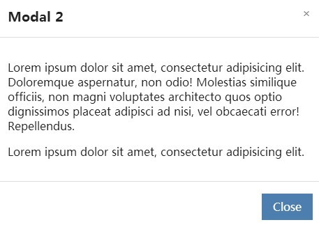
Here is a full example of a modal with the two close buttons, and some textual content:
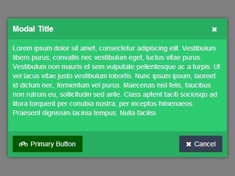
<!-- Button to open the modal. --> <button role="button" aria-label="open-modal" data-modal="open-modal">Open Modal</button> <!-- Simple Modal Markup --> <div class="modal" role="dialog" aria-hidden="true" data-modal> <div class="modal-content"> <div class="modal-header"> <button role="button" class="icon-close" aria-label="close-modal" data-modal="close-modal">X</button> <h2 class="modal-title">Modal Title</h2> </div> <div class="modal-body"> <p>Lorem ipsum dolor sit amet, consectetur adipiscing elit, sed do eiusmod tempor incididunt ut labore et dolore magna aliqua.</p> </div> <div class="modal-footer"> <button role="button" class="btn-close" aria-label="close-modal" data-modal="close-modal">Close</button> </div> </div> </div>Options
Modelo comes with a few configurable options to help customize the user-experience.
| Option | Type | Default | Description |
|---|---|---|---|
| top | integer | 60 | Distance from the top of the window in pixels. |
| maxWidth | integer | 400 | The responsive width of the modal in pixels. |
| centered | boolean | false | Should the modal be centered? False by default. |
| fadeDuration | integer | 600 | How long should the modal take to fade in and out, in milliseconds. |
License
MIT Open Source License
Changelog
1.0
- Released: August 25th, 2018
Initial release


