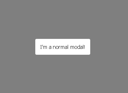
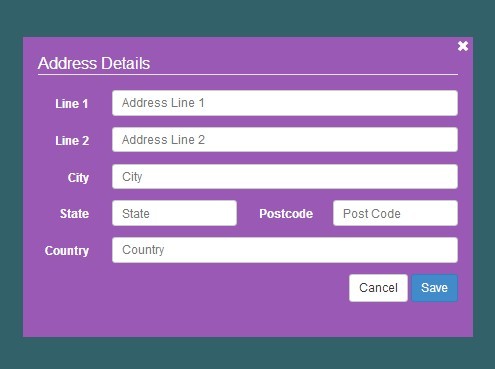
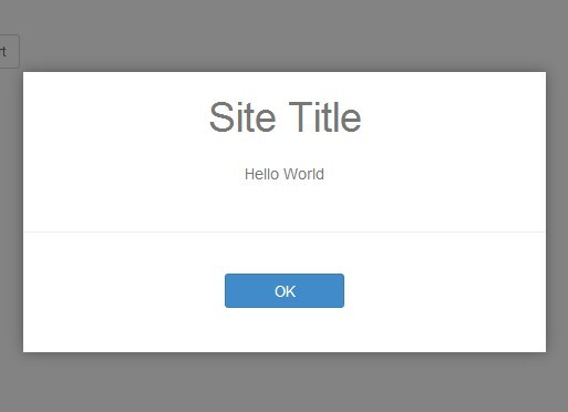
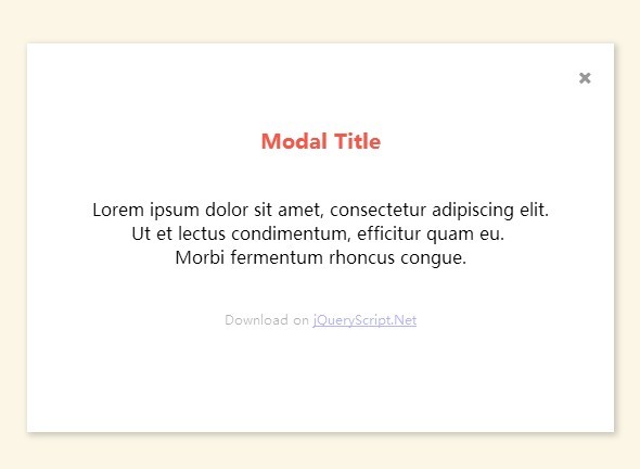
jQuery Quick Modal
Easily add customizable, CSS-driven modal windows to your website
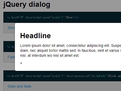
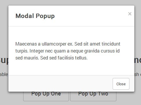
See it in action here: kevinberonilla.com/demos/jquery-quick-modal
Dependencies
jQuery 1.7.0 or higher
Installation
Download the plugin via Bower or manually copy the CSS and JS files to your site, then include them in the <head> tag.
bower install jquery-quick-modal <head> <link rel="stylesheet" type="text/css" href="css/quick-modal.css"> <script src="https://ajax.googleapis.com/ajax/libs/jquery/1.11.3/jquery.min.js"></script> <script src="js/jquery.quick-modal.min.js"></script> </head>Create the Markup
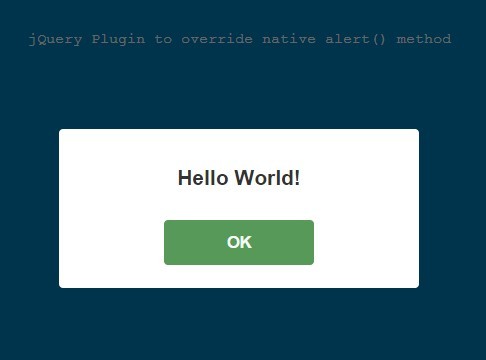
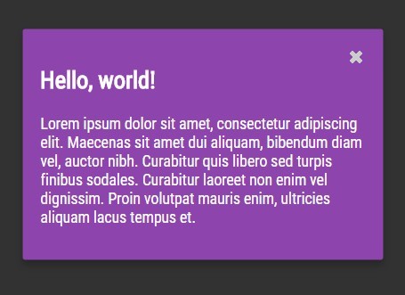
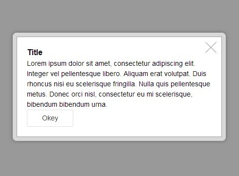
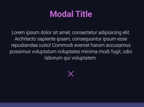
<a href="#" class="open-modal" data-modal-id="my-modal">Click here to open a modal window</a> <div id="my-modal" class="qm-modal"> <h1>Hello, world!</h1> <a href="#" class="qm-close-modal">Close window</a> </div>class="open-modal"
The class for the element which will trigger a modal window on click; can be changed to a selector of your choice when initialized; default class is not styled by CSS
data-modal-id="my-modal"
Specifies the ID of the modal that the link will be bound to; required (throws an error if not present)
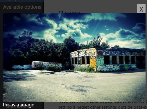
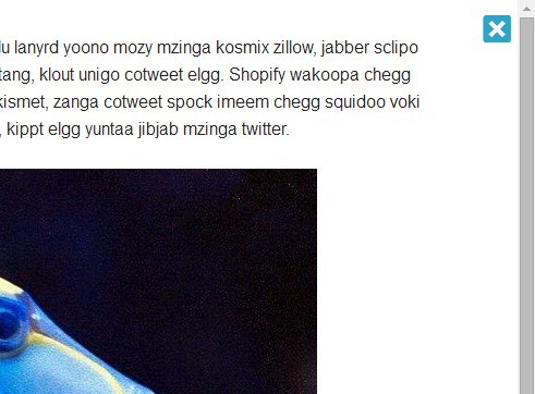
class="qm-modal"
The class for the modal window; has CSS styles that can be edited/overridden
class="qm-close-modal"
The class for the element which will close an opened modal window on click; has CSS styles that can be edited/overridden; can be changed to a selector of your choice when initialized (loses CSS styles when done so)
Call the Script
$(document).ready(function() { $('.open-modal').quickModal(); });$('.open-modal')
The jQuery selector object assigned to trigger modal windows on click
Play with Settings
$(document).ready(function() { $('.open-modal').quickModal({ // Default values below animation: 'fade-zoom', speed: 250, timing: 'ease', closeModalSelector: '.qm-close-modal' enableEsc: true, enableClickAway: true, enableBodyScroll: false, appendBackgroundTo: 'body', prefix: 'qm', onOpen: function() {}, onClose: function() {} }); });animation
The type of animation used for opening and closing modal windows
'fade''fade-up''fade-right''fade-down''fade-left''fade-zoom''fade-zoom-up''fade-zoom-right''fade-zoom-down''fade-zoom-left'
speed
The length of time (in milliseconds) for the animation
timing
The timing function used to animate the modal window
'linear''ease''ease-in''ease-out''ease-in-out''cubic-bezier(n, n, n, n)'
closeModalSelector
The jQuery selector assigned to closing modal windows on click
enableEsc
Boolean for determining whether or not pressing the Esc key will close modals
enableClickAway
Boolean for determining whether or not clicking the modal background will close modals
enableBodyScroll
Boolean for determining whether or not the body behind an open modal window is scrollable
appendBackgroundTo
The jQuery selector to which the modal background will be appended
prefix
String representing the prefix used for all classes and ids (only needed for builds with custom prefixed CSS; does not directly affect closeModalSelector)
onOpen
The callback that fires when the modal is opened
onClose
The callback that fires when the modal is closed
Trigger Modal Windows Manually
$(document).ready(function() { $('#my-modal').quickModal('open'); $('#my-modal').quickModal('open', { animation: 'fade-zoom-down', speed: 500, timing: 'ease-in-out', closeModalSelector: '.close-button' }); $('#my-modal').quickModal('close'); $('#my-modal').quickModal('close', { animation: 'fade-left', speed: 750, timing: 'linear' }); $('#modal-link').quickModal('trigger'); $('#modal-link').quickModal('trigger', { animation: 'fade', timing: 'ease-out' }); });$('#my-modal')
The jQuery selector object for the modal window to be triggered
$('#modal-link')
The jQuery selector object for the element that will trigger its modal window
.quickModal('open')
Open the selected modal window with default settings
.quickModal('open', {...})
Open the selected modal window with the specified settings
.quickModal('close')
Close the selected modal window with previously applied settings
.quickModal('close', {...})
Close the selected modal window with the specified settings
.quickModal('trigger')
Open the target of the selected element with default settings
.quickModal('trigger', {...})
Open the target of the selected element with the specified settings
Events
$(document).ready(function() { $('#my-modal').on('modalopen.qm', myAwesomeFunction); $('#my-modal').on('modalclose', function() { alert('The modal window has been closed!'); myAwesomeFunction(); }); });'modalopen.qm'
The event fired immediately before a modal window is opened
'modalclose.qm'
The event fired immediately after a modal window is closed
Call the Script with AJAX Compatibility
$(document).ready(function() { $('body').on('click', '.open-modal', function() { $(this).quickModal('trigger'); }); });This alternative way of initializing the plugin will ensure that elements that match the selector will always open its associated modal window, regardless of whether or not they were present on page load.
Using Custom Prefixes
Included in the package are Sass source files (with a variable for managing custom prefixed classes and ids) and Gulp build scripts. Be sure to use the prefix option in the plugin to support your custom prefix.

