Simple Modal
A simple jQuery modal for use in personal projects.
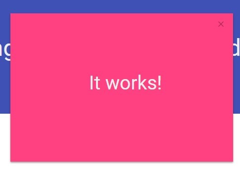
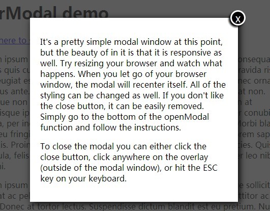
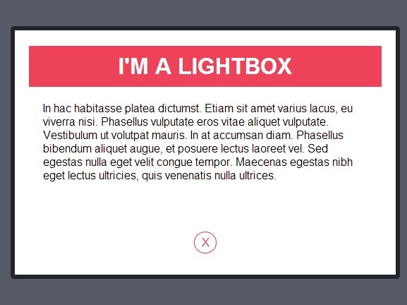
A demo can be seen here.
Description
Simple Modal is a small, lightweight modal, created for use in personal projects. It has been uploaded to GitHub in case anyone else finds this useful. Simple Modal is devoid of unnecessary styling in order to remain highly customizable. However, some default styles are included in a separate file should you find them useful. As this is primarily for personal use, additional features have not currently been added. What you see is what you get. Installation and instructions on use can be seen below.
Installation
- Download the latest version of jQuery here, or include via CDN.
- Include
simple-modal.min.jsandsimple-modal.min.css. - You can optionally include
simple-modal-default.min.cssfor basic styling.
<!-- Include jQuery --> <script src="https://cdnjs.cloudflare.com/ajax/libs/jquery/3.3.1/jquery.min.js"></script> <!-- Simple Modal --> <script src="your-folder/simple-modal.min.js"></script> <link rel="stylesheet" href="your-folder/simple-modal.min.css" /> <!-- Optional Styles --> <link rel="stylesheet" href="your-folder/simple-modal-default.min.css" />How to Use
Basic Setup
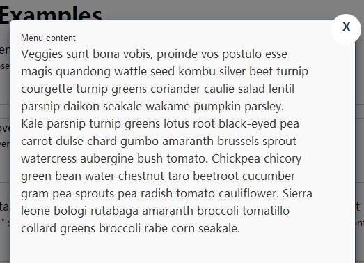
To get started, create a div with the class modal, and add the data-modal attribute. It's worth noting that only ONE modal can be active at a time. There is no support for multiple modals at this time.
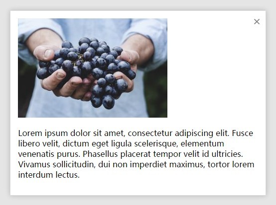
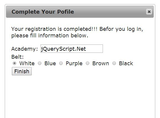
<div class="modal" data-modal> </div>You can add whatever content you want to the modal. However, I would recommend some basic setup for symantic purposes.
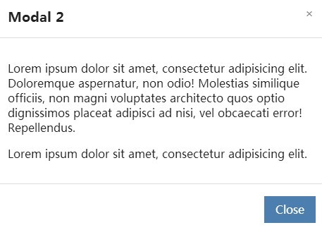
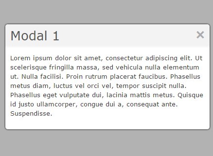
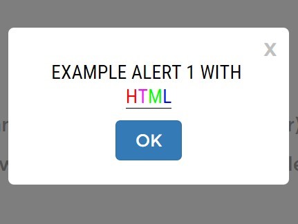
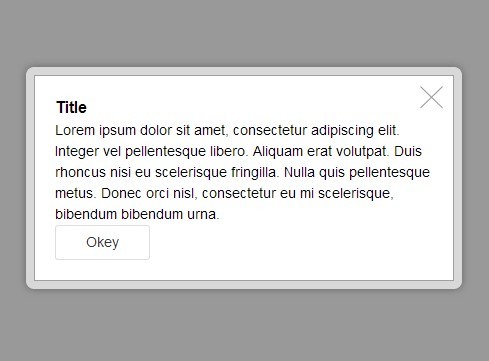
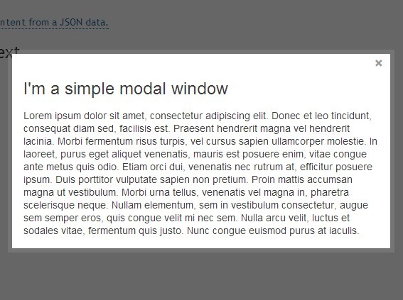
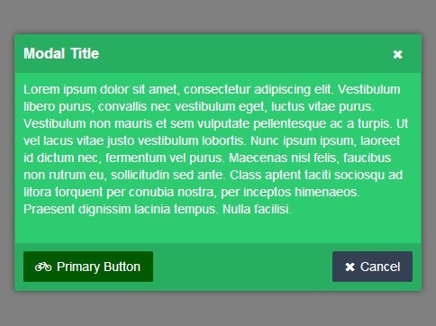
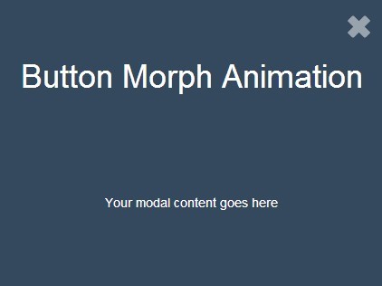
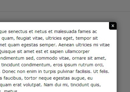
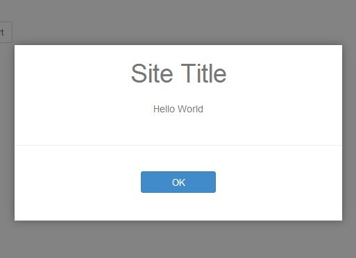
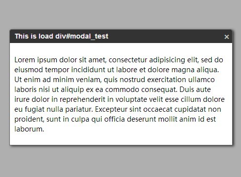
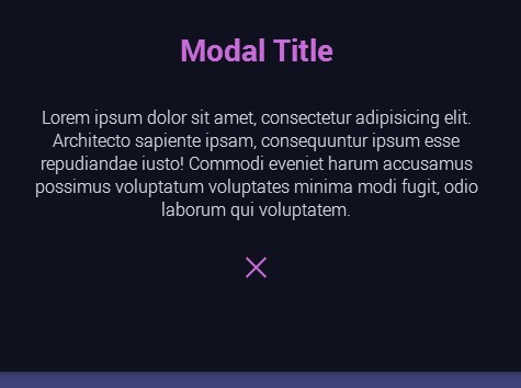
<div class="modal" data-modal> <div class="modal-content"> <div class="modal-header"> <div class="modal-title">Modal Title</div> </div> <div class="modal-body"> <p>Modal content will go here.</p> </div> <div class="modal-footer"> This is the modal footer. </div> </div> </div>Opening the Modal
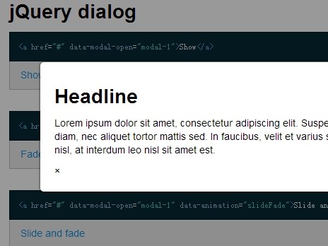
To open the modal, create a button element and add the data-modal="open-modal" attribute.
<button role="button" data-modal="open-modal">Open Modal</button>Closing the Modal
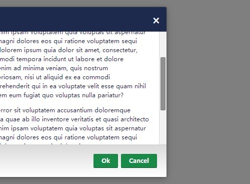
You can close the modal a few different ways:
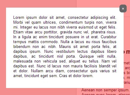
Using a Close Button
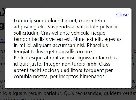
Create a button element and add the data-modal="close-modal" attribute.
<button role="button" data-modal="close-modal">Close Modal</button>The recommended placement for this button is in the modal footer as shown below:
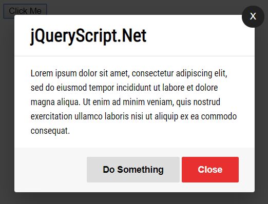
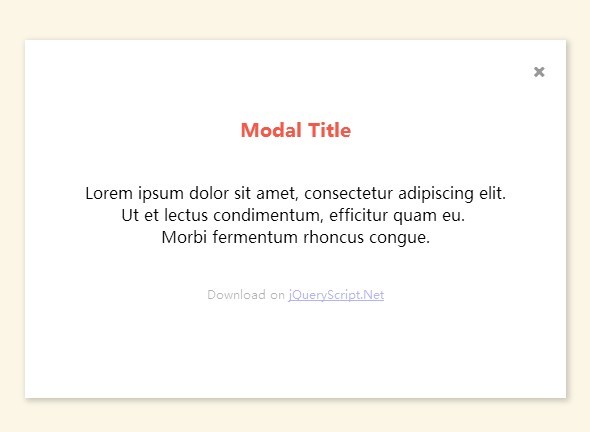
<div class="modal" data-modal> <div class="modal-content"> <div class="modal-header"> <div class="modal-title">Modal Title</div> </div> <div class="modal-body"> <p>Modal content will go here.</p> </div> <div class="modal-footer"> <button role="button" data-modal="close-modal">Close Modal</button> </div> </div> </div>Using an Icon
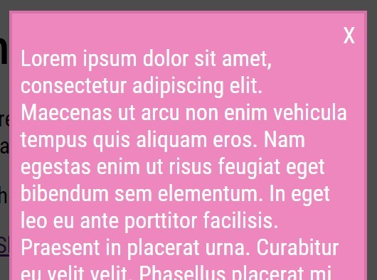
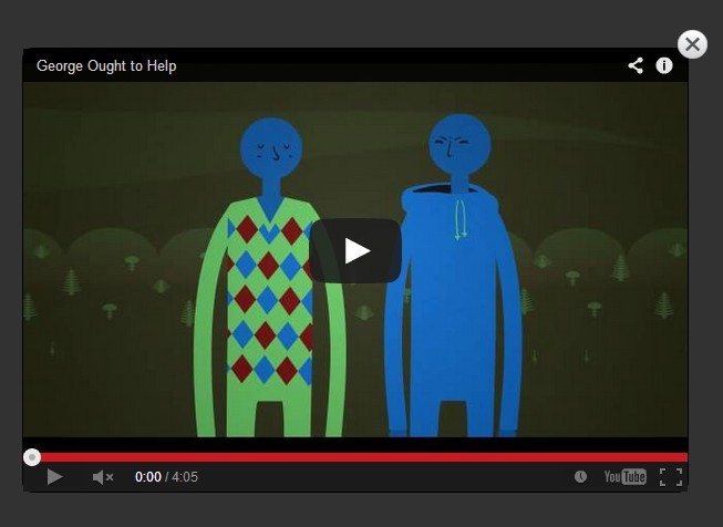
Create a button element and add the data-modal="close-modal" attribute and give it a class of close-icon for some simple styling.
<button role="button" class="close-icon" data-modal="close-modal">X</button>The recommended placement for this button is right above the modal header as shown below:
<div class="modal" data-modal> <div class="modal-content"> <button role="button" class="close-icon" data-modal="close-modal">X</button> <div class="modal-header"> <div class="modal-title">Modal Title</div> </div> <div class="modal-body"> <p>Modal content will go here.</p> </div> <div class="modal-footer"> This is the modal footer. </div> </div> </div>Additional Methods
- Click on the modal overlay.
- Press the
ESCkey to exit.
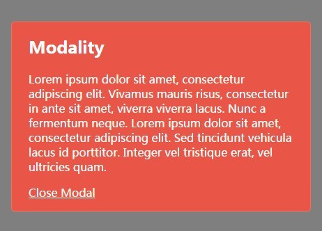
Putting it All Together
Here is a full example of a modal with the two close buttons, and some textual content:
<!-- Button to open the modal. --> <button role="button" data-modal="open-modal">Open Modal</button> <!-- Simple Modal Markup --> <div class="modal" data-modal> <div class="modal-content"> <button role="button" class="close-icon" data-modal="close-modal">X</button> <div class="modal-header"> <div class="modal-title">Modal Title</div> </div> <div class="modal-body"> <p>Lorem ipsum dolor sit amet, consectetur adipiscing elit, sed do eiusmod tempor incididunt ut labore et dolore magna aliqua.</p> </div> <div class="modal-footer"> <button role="button" data-modal="close-modal">Close</button> </div> </div> </div>License
MIT Open Source License
Changelog
1.0
- Released: August 25th, 2018
Initial release


