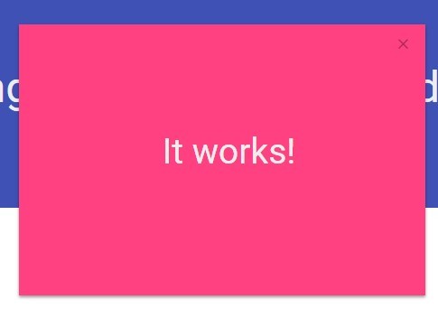
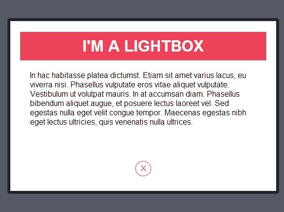
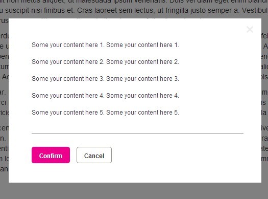
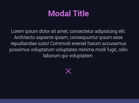
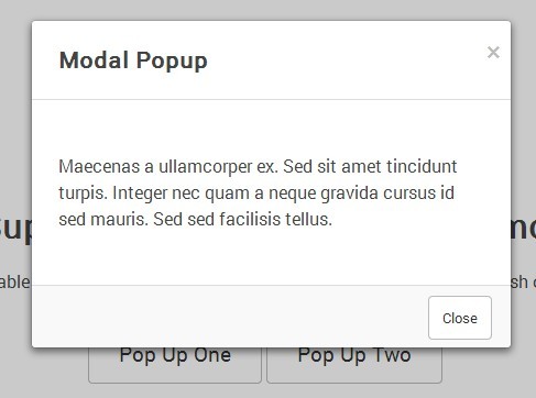
#MiMo - Minimal Modal MinimalModal is the best jQuery modal for responsive dialog windows we could build. MinimalModal is available under the GPLv3 license. Please try a few modals on http://mimo.30.nl
Why use this modal?
- Easy to use and customize
- Lightweight js (<3kb minified)
- Responsive and mobile friendly
- Multiple modals on one page
- Works on IE8+
Basic use
1. Include files.
Download MinimalModal and include the js and css in your page. Supports jQuery from version 1.7 and up.
<script src="https://ajax.googleapis.com/ajax/libs/jquery/1.11.2/jquery.min.js"></script> <script src="jquery.mimo.min.js"></script> <link rel="stylesheet" href="jquery.mimo.min.css" />2. Set up your modal(s).
Select the element that will launch your modal. This can be any element you desire, for example: button, a, div. The 'data-mimo' attribute is used to set the id of your modal and is used to set options. You can use multiple modals on your page using different id's.
<button data-mimo="modal:my_modal;">Open modal</button>Define your modal by setting an element with your modals id. Your content can be placed inside the element.
<div id="my_modal" class="mimo_modal">My modal content</div>3. Done!
Your modal should be up and running. You can use advanced options and write custom css if you would like.
#Options These are the options you can set with 'data-mimo'. For more information, please see 'Advanced use'
| Option | Default | Description |
|---|---|---|
| modal | none(required) | The ID of the target modal |
| top | 100 | Modal top offset in pixels(ignored on smaller screens) |
| width | 520 | Modal width in pixels(ignored on smaller screens) |
| overlay | #000000 | Overlay hex color |
| opacity | 0.3 | Overlay opacity(0-1) |
| close | mimo_close | Class for a custom close button |
| skin | none | Add a class to the modal |
#Advanced use
Modal top offset and width.
With the 'data-mimo' attribute you can set the modals offset from the top of the screen and the width of the modal. Top offset and width will be ignored if there is not enough space on the screen to render the modal(ie on smartphones).
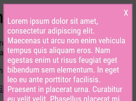
<button data-mimo="modal:my_modal;top:80;width:640;">Open modal</button>Overlay color and opacity.
Overlay color and opacity can also be set using the 'data-mimo' attribute.
<button data-mimo="modal:my_modal;opacity:0.4;color:#333333;">Open modal</button>Skins/custom classes.
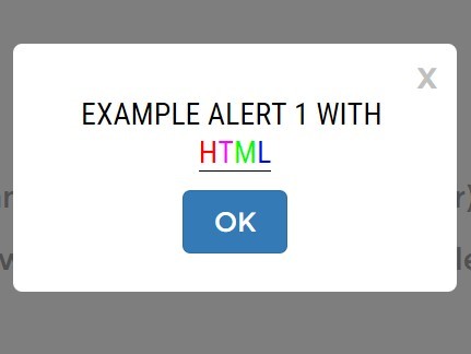
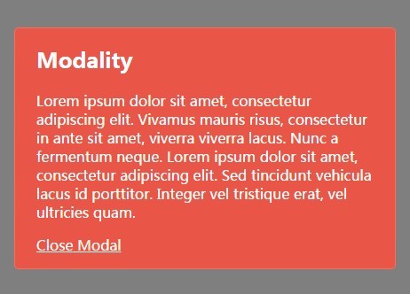
We have added a few skins to get you started. They are 'mimo_classic' and 'mimo_clear'. You can add those with the 'skin' option or define your own class to be added to the modal.
<button data-mimo="modal:my_modal;skin: mimo_classic;">Open modal</button>Custom close button.
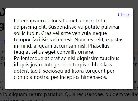
A custom close button can be added by defining a class name for the close button in the 'data-mimo' attribute and an element with that class can be included in the modal. The default close button will not be rendered on the screen.
<button data-mimo="modal:my_modal;close: my_close_button;">Open modal</button>Now you can add an element with the close action:
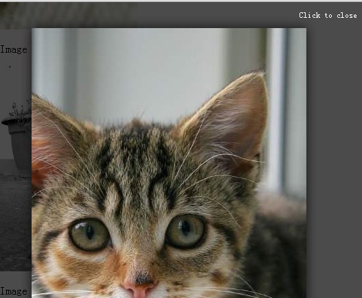
<div id="my_modal">My modal content<button class="my_close_button">Close</button></div>Image lazy load
We don't like resources being loaded if they are not displayed in the viewport. So we included an attribute 'data-mimo-src' for optional lazy loading of images inside the modal.
<div id="my_modal" class="mimo_modal"><img data-mimo-src="my_image.jpg" alt=""/></div>Target multiple.
If you would like to set all the options for multiple modals on a page at once(for example the modals top offset).
<script> $('[data-mimo]').mimo({ top:80; }); </script>


