react-native-transition
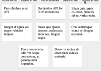
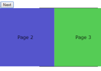
A fully customizable view transition library for react-native. The library could be used to transition entire screens or small parts within a View.
The library has been designed to use customizable transition styles, that could be easily created and plugged into the application. Checkout the Custom Transitions section to learn more about creating transitions.
Check out a demo application available at Transition Demo.

Caution
The react-native library below 0.43 throws onLayout event on Android for every change in the child UI elements (even when changes are made through setNativeProps) even when the parent's layout is unaffected. This problem is specially observable while using drag & drop libraries, wherein this even is called a lot, affecting the performance. So use caution while using this library on React Native versions below 0.43.
Installation
$ npm install --save react-native-transition
Usage
-
Import
createTransitionand transition styles from the library
import { createTransition, FlipX } from 'react-native-transition'; -
Create a transition component with optional styles
const Transition = createTransition(FlipX); -
Render the initial view within the
Transitioncomponent
<Transition> <View>...<View> </Transition> -
Use the show method from component to perform transition
onPress = (e) => { Transition.show(<View> ... </View>); }
Example
import React, { Component } from 'react'; import { View, Text } from 'react-native'; import { createTransition, FlipX } from 'react-native-transition'; const Transition = createTransition(FlipX); class YourView extends Component { this.switch = () => { Transition.show( <View style={{ flex: 1, alignItems: 'center' }}> <Text>This is another view</Text> </View> ); } render() { return ( <Transition> <View style={{ flex: 1, alignItems: 'center' }}> <Text>This the initial View</Text> <Button title="Press to Switch" onPress={this.switch} /> </View> </Transition> ); } }For a more complete example, checkout Demo.js and Window.js from react-native-transition-demo.
createTransition([style], [animation])
Creates a Transition component used for providing transitionable view.
Arguments
-
style(object): A transition style definition object. Stock transition styles -Fade,FlipX,FlipY,SlideLeft,SlideRight,SlideUp,SlideDownare available with the libraries. By defaultFadetransition is used. -
animation(function): Animation used for performing the transition. It could be one of theAnimated.timing,Animated.springorAnimated.decayprovided by react-native animation library.
Transition component
The Transition component should have one and only one element as a child. This child element is rendered before any transition takes place. Once the transition has occured, this initial child would not be mounted.
Methods
show(element, [style], [animation]) The show method triggers the transition with the provided element appearing through transition.
This method is available both as static as well as instance method of the component. In most of the cases, the static method could be used, while for some advanced use cases where the Transition component is placed on inner views and are being transitioned on automatic intervals, instance method could be used for a much individual instance access through refs.
getBounds() Retreive the bounding size of the Transition componet. It returns an object with { width, height }. The bounding size is not available until the component has been attached.
Arguments
element (Element): The element that needs to be rendered via transition.
style (object): Override the transition style for this specific transition.
animation (function): Override the transition animation for this specific transition.
Returns A unique id that represents the transition of this particular element which could be used to track the completion of the transition.
Note: In case an element is added faster than being transitioned in. The visual transition will be skipped for the intermediate elements. The
onTransitionedcallback however will be called for all the elements even those skipped in the order that they were supposed to be shown
Props
onTransitioned: A function which is called for every item that has been shown with the transition. The function is called with the uniqueId returned by show method.
onLayout: A function which is called when the transition layout is available with the bounds. Every time the layout changes, this method is invoked.
Any other props passed to the Transition component is passed as config parameter to the animation function. If you are using a Animated.timing animation, you could pass duration or easing props and so on.
Custom Transitions
The transition library comes with stock transitions which are limited, but can be easily extended by creating your own custom transitions. However, you must have knowledge of how animation works in react-native.
A transition object should have two properties - out and in. The out property creates the style required for the view that is transitioning out and the in property creates the same for the incoming view. Both the in and out properties should be function call that returns a new style object for the respective container view. The function has following parameters:
value (
Animated.Value)
An animated value that runs from0to1during the transition. The various style attributes take interpolated values from this value. Go through the react-native Animation docs for details on using interpolation.bounds ({ width, height })
Some animation styles need to know the size of the view being transitioned.props The props that was passed to the
Transitioncomponent.
Supporting Native Transitions
Since react native v0.40+, the native animation support has been provided. The transitions can now define, useNativeDriver property with boolean true to support native animation. Take caution, as all styles are not supported for native animation. Only opacity, backgroundColor and transform properties are supported for now. If the useNativeDriver is enabled on transition styles that changes any other properties, an exception would be thrown. Fade, FlipX, FlipY are the stock styles that now support native animations.
Example transition - Slide
const Slide = { out: (value, bounds) => ({ left: value.interpolate({ inputValue: [0, 1], outputValue: [0, -bounds.width], }), width: bounds.width, }), in: (value, bounds) => ({ left: value.interpolate({ inputValue: [0, 1], outputValue: [bounds.width, 0], }), width: bounds.width, }), };Example transition - Brooom
const Brooom = { out: (value, bounds) => ({ left: value.interpolate({ inputRange: [0, 1], outputRange: [0, -bounds.width], }), width: bounds.width, transform: [{ skewX: value.interpolate({ inputRange: [0, 0.1, 0.9, 1], outputRange: ["0deg", "-20deg", "-20deg", "0deg"], }), }], }), in: (value, bounds) => ({ left: value.interpolate({ inputRange: [0, 1], outputRange: [bounds.width, 0], }), width: bounds.width, transform: [{ skewX: value.interpolate({ inputRange: [0, 0.1, 0.9, 1], outputRange: ["0deg", "-20deg", "-20deg", "0deg"], }), }], }), };
