ReactCardFlip
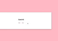
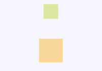
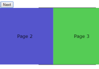
React Card Flip is allows you to use the card flipping animation. Credit for the CSS goes to David Walsh.
Demo & Examples
Live demo: Demo
To build the examples locally with npm, run:
npm install npm run build-example && npm run start To build the examples locally with yarn, run:
yarn install yarn build-example && yarn start Then localhost:8080 should open in a browser. If not you can go to that directly.
Installation
To use react-card-flip, install it from NPM with npm using the command:
npm install --save react-card-flip To use react-card-flip, install it from NPM with yarn using the command:
yarn add --dev react-card-flip You can also use the standalone build by including lib/react-card-flip.js in your page. If you use this, make sure you have already included React, and it is available as a global variable.
Usage
To use this component, first import ReactCardFlip:
import ReactCardFlip from 'react-card-flip';and then provide it with two child components with keys marked front and back so that the component can tell which component should be in the front and which component should be in the back.
This component only allows for manual card flip so make sure to include a tag that has an onClick handler for each side of the card.
The animation itself will be controlled by the prop isFlipped. Use this to control whether to show the front or the back of the card.
class App extends React.Component { constructor() { super(); this.state = { isFlipped: false }; this.handleClick = this.handleClick.bind(this); } handleClick(e) { e.preventDefault(); this.setState(prevState => ({ isFlipped: !prevState.isFlipped })); } render() { return ( <ReactCardFlip isFlipped={this.state.isFlipped} flipDirection="vertical"> <YOUR_FRONT_CCOMPONENT key="front"> This is the front of the card. <button onClick={this.handleClick}>Click to flip</button> </YOUR_FRONT_CCOMPONENT> <YOUR_BACK_COMPONENT key="back"> This is the back of the card. <button onClick={this.handleClick}>Click to flip</button> </YOUR_BACK_COMPONENT> </ReactCardFlip> ) } }YOUR_FRONT_CCOMPONENT and YOUR_BACK_COMPONENT here are meant to be the two components that you plan to use for the card, one for the front of the card and one for the back of the card.
The most important part is providing the key props with the values front and back to your two components so that ReactCardFlip can differentiate between the two components. key="front" tells ReactCardFlip to use that component as the front of the card. Similarly, key="back" tells ReactCardFlip to use that component as the back of the card.
Properties
| Props | Type | Description | Default |
|---|---|---|---|
| cardZIndex | string | z-Index for the flip card. Used to help solve context stack issues while using multiple flip cards. | auto |
| containerStyle | object | Extra css styling that can be applied to the container. | {} |
| isFlipped | bool | False to show the front of the card, true to show the back | undefined |
| flipSpeedBackToFront | number | The speed of the flip animation when the card flips from back to front, the higher the number the slower the flip animation | 0.6 |
| flipSpeedFrontToBack | number | The speed of the flip animation when the card flips from front to back, the higher the number the slower the flip animation | 0.6 |
| infinite | bool | False to rotate in opposite directions on both sides of the card, true to rotate in the same direction | false |
| flipDirection | string | Direction of the card flip (options are: 'horizontal' or 'vertical' ) | horizontal |
Development (src, lib and the build process)
NOTE: The source code for the component is in src. A transpiled CommonJS version (generated with Babel) is available in lib for use with node.js, browserify and webpack. A UMD bundle is also built to lib, which can be included without the need for any build system.
To build, watch and serve the examples (which will also watch the component source), run npm run build-example && npm run start.
Testing
To run tests for this project run one of the following commands:
npm run test- Runs tests then exitsnpm run test:watch- Runs tests in watch modenpm run test:coverage- Runs tests and creates a coverage report
Contributing
Fork this repo, add your proposed features and make a pull request. I will review as soon as possible.
License
This project is licensed under the terms of the MIT license. Check LICENSE.txt for more information.

