React Flop Card
Yet another React flip card component. Animation was done with React-Motion instead of CSS transition.
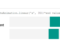
import { FlipCard } from 'react-flop-card'; // in your render <FlipCard flipped={ true } onClick={ onClick } onMouseOut={ onMouseOut } onMouseOver={ onMouseOver } frontChild={ frontChild } backChild={ backChild } width={ 100 } height={ 100 } style={ { frontStyle, backStyle, wrapperStyle } }/>Install
npm install --save react-flop-card
Demo
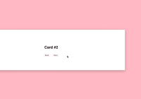
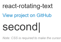
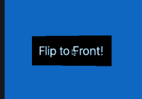
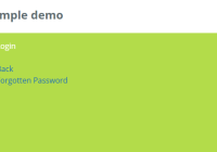
http://pckhoi.github.io/react-flop-card-demo.html
Code from the above demo:
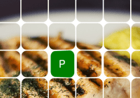
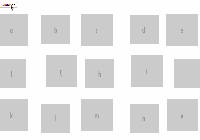
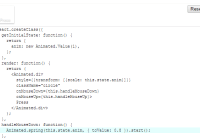
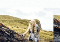
import React, { Component } from 'react'; import { FlipCard } from 'react-flop-card'; export default class Demo extends Component { constructor(props) { super(props); this.state = { flippedKey: null }; this.cards = Array.apply(null, {length: 64}).map((val, ind) => ({ key: String(ind), style: { front: this.getFrontStyle(ind), back: backStyle, wrapper: wrapperStyle }, frontChild: (<noscript/>), backChild: (<p style={ letterStyle }>{ randomLetter() }</p>), onMouseOver: () => { this.setState({ flippedKey: String(ind) }); }, onMouseOut: () => { this.setState({ flippedKey: null }); } })); } getFrontStyle(ind) { const y = (ind - ind % 8) / 8 * -104; const x = ind % 8 * -104 -300; const backgroundStyle = `url("img/food-dinner-lemon-rice.jpg") ${x}px ${y}px/auto`; return { background: backgroundStyle, borderRadius: '20px' }; } render() { return ( <div style={ containerStyle }> { this.cards.map(({ key, frontChild, backChild, onMouseOver, onMouseOut, style }) => ( <FlipCard key={ key } flipped={ this.state.flippedKey === key } onMouseOut={ onMouseOut } onMouseOver={ onMouseOver } frontChild={ frontChild } backChild={ backChild } width={ 100 } height={ 100 } style={ style }/> )) } </div> ); } } const backStyle = { backgroundColor: 'green', borderRadius: '20px' }; const letterStyle = { color: 'white', fontSize: '40px', margin: '28px 0', textAlign: 'center', fontFamily: 'sans-serif' }; const containerStyle = { fontSize: 0, width: '832px', margin: '0 auto' }; const wrapperStyle = { display: 'inline-block', margin: '2px' }; function randomLetter() { const possible = 'ABCDEFGHIJKLMNOPQRSTUVWXYZ'; return possible.charAt( Math.floor(Math.random() * possible.length) ); }API
exports
FlipCardRotateCard
<FlipCard/>
Usage
<FlipCard flipped={ true } onClick={ onClick } onMouseOut={ onMouseOut } onMouseOver={ onMouseOver } frontChild={ frontChild } backChild={ backChild } width={ 100 } height={ 100 } style={ { front, back, wrapper } }/>Props
All props are optional.
- flipped: boolean
Control whether the card will show (or animate toward) front side or back side.
- onClick: function
Trigger when clicked on.
- onMouseOut: function
Trigger when no longer hovered.
- onMouseOver: function
Trigger when hovered.
- frontChild: React element
The element to display in the front of card.
- backChild: React element
The element to display in the back of card.
- width: number or string
If width is given as number, it will be automatically converted to px. If you want to use units other than px, supply a string instead. If not given then width will not be set (no default value).
- height: number
Same as width.
- style: object
- style.front: object - style that apply to wrapper of
frontChild. - style.back: object - style that apply to wrapper of
backChild. - style.wrapper: object - style that apply to outer wrapper.
- style.front: object - style that apply to wrapper of
<RotateCard/>
This is a low level component with no animation. The plus side is that you can easily control it's rotate angle with degree prop.
Usage
<RotateCard degree={ 180 } onClick={ onClick } onMouseOut={ onMouseOut } onMouseOver={ onMouseOver } frontChild={ frontChild } backChild={ backChild } width={ 100 } height={ 100 } style={ { front, back, wrapper } }/>Props
Same as FlipCard except it doesn't have flipped prop. Instead it has degree prop.
- degree: number
degree={ 0 }is the same asflipped={ false }whereasdegree={ 180 }is the same asflipped={ true }.
License
MIT


