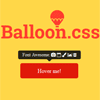
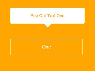
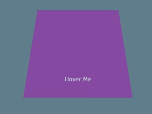
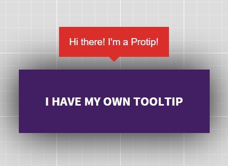
Balloon.css: Simple tooltips made of pure CSS.
Simple tooltips made of pure CSS
Balloon.css lets you add tooltips to elements without JavaScript and in just a few lines of CSS.
It weights ~1.1kb minified (Brotli).

Demo & Playground
You can play with Balloon.css here: https://jsfiddle.net/kuzmd942/
You also can check more examples at the website: https://kazzkiq.github.io/balloon.css/
Usage
Installation
Using npm:
npm install balloon-css You can then import the CSS file directly into your JS (using Webpack, etc):
// Your index.js file, etc. import 'balloon-css';or import the source file if using SASS/SCSS:
/* Your main.scss file, etc. */ @import "~balloon-css/src/balloon"CDN version:
If you don't want to use npm, there is a CDN option:
<!-- This link will always fetch the latest version of Balloon.css --> <link rel="stylesheet" href="https://unpkg.com/balloon-css/balloon.min.css">Manually: Simply download balloon.min.css from this repo and add it to your HTML. e.g.
<link rel="stylesheet" href="path/to/balloon.min.css">Positioning
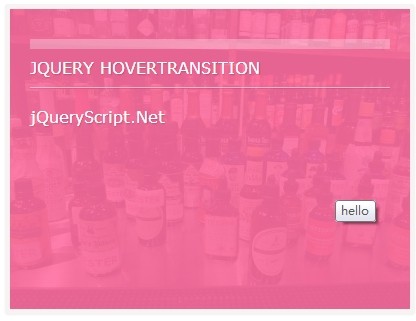
For positioning, use data-balloon-pos attribute with one of the values: up, down, left, right, up-left, up-right, down-left or down-right:
<button aria-label="Whats up!" data-balloon-pos="up">Hover me!</button> <button aria-label="Whats up!" data-balloon-pos="left">Hover me!</button> <button aria-label="Whats up!" data-balloon-pos="right">Hover me!</button> <button aria-label="Whats up!" data-balloon-pos="down">Hover me!</button> <button aria-label="Whats up!" data-balloon-pos="up-left">Hover me!</button> <button aria-label="Whats up!" data-balloon-pos="up-right">Hover me!</button> <button aria-label="Whats up!" data-balloon-pos="down-left">Hover me!</button> <button aria-label="Whats up!" data-balloon-pos="down-right">Hover me!</button>Showing tooltips programatically
If you want to show tooltips even when user interaction isn't happening, you can simply use the data-balloon-visible attribute:
<button aria-label="Whats up!" data-balloon-pos="up" id="show-tip">Hover me!</button> <script> const btn = document.getElementById('show-tip') btn.setAttribute('data-balloon-visible', '') </script>Disabling animation
If for some reason you do not want animations in your tooltips, you can use the data-balloon-blunt attribute for that.
<button data-balloon-blunt aria-label="No animation!" data-balloon-pos="up">No animation!</button>Customizing Tooltips
Balloon.css exposes three CSS variables to make it easier to customize tooltips: --balloon-color, --balloon-font-size and --balloon-move. This way you can use custom CSS to make your own tooltip styles:
/* Add this to your CSS */ .tooltip-red { --balloon-color: red; } .tooltip-big-text { --balloon-font-size: 20px; } .tooltip-slide { --balloon-move: 30px; }If you want to customize tooltips globally, use the :root selector:
/* All tooltips would now be blue */ :root { --balloon-color: blue; }Glyphs and Icon Fonts
You can also add any HTML special character to your tooltips, or even use third-party Icon fonts:
<button aria-label="HTML special characters: ☻ ✂ ♜" data-balloon-pos="up">Hover me!</button> <button aria-label="Emojis: 😀 😬 😁 😂 😃 😄 😅 😆" data-balloon-pos="up">Hover me!</button>Example using Font Awesome:
<button class="fa" aria-label="Font Awesome:     " data-balloon-pos="up">Hover me!</button>Contributing
Balloon.css is mantained in SASS and LESS. To contribute with bugfixes and enchancements you must follow this steps:
- Clone repo. E.g.
git clone https://github.com/kazzkiq/balloon.css.git - Run
npm install - Edit SASS file and run
npm run buildto generate the production CSS files. - Make sure to test the production files over the website (branch
gh-pages) before submitting a Pull Request.
Note 1: Remember to update the SASS file instead of the generated ones (balloon.css and balloon.min.css are generated on every build from SASS file).
Credits
Made by Claudio Holanda (@kazzkiq)


