xModal
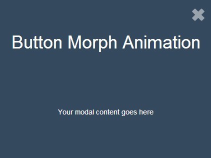
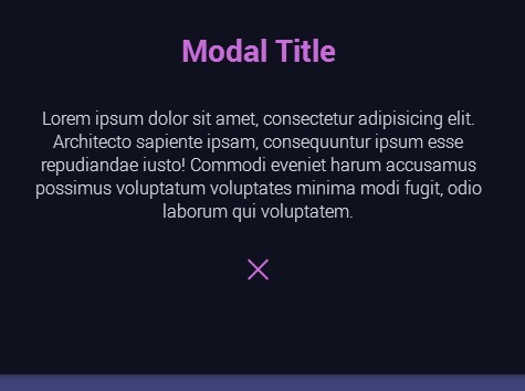
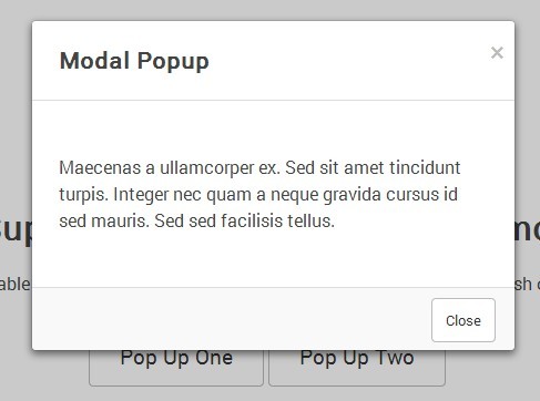
A modal plugin with lot's of common options available and also uses CSS animations to take care of the transitions. Also can be easily used in conjunction with the amazing magic css animation library to apply those effects if you like. jQuery Modal Plugin (4kb minified)
View Demo
Installation:
Include the following in the HTML.
<link rel="stylesheet" href="xmodal.css" /> <script src="jquery.xmodal.js"></script>API Methods:
Method Details:
- Instantiate
- Parameters
Instantiate:
With no parameters, xModal will be instantiated with the default configuration options. For advanced configuration, any number of options may be passed as an object literal. See Parameters.
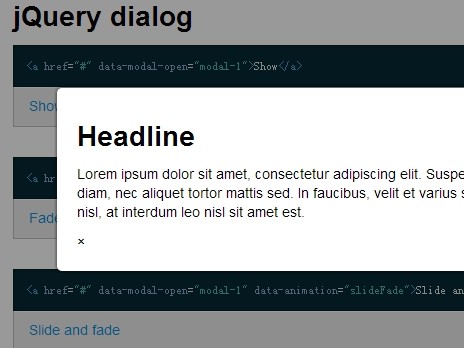
To load a modal when clicking on an element that has "openModal" as the class name:
$('.openModal').xModal();To load an inline modal:
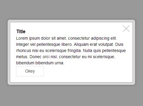
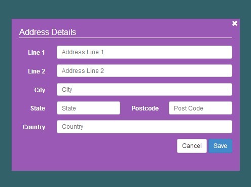
<a class="openModal" href="#xModal-Inline">Open Inline Modal</a> <div id="xModal-Inline" class="modal-wrapper"> <div class="modal-container"> <div class="modal-inner-container"> <p>Modal Content</p> </div> </div> </div>Load via script:
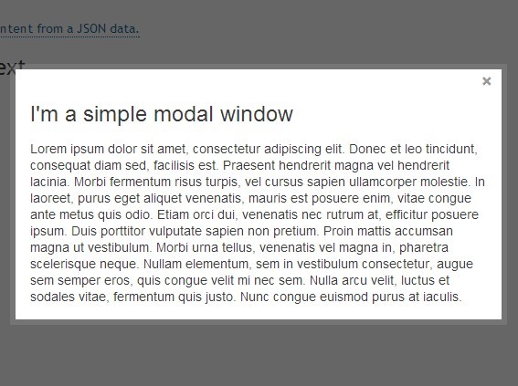
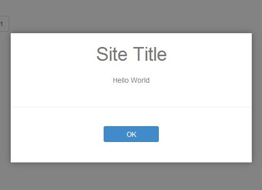
$.xModal({ headline:"Headline", description:"Description", width:"25%", href:"ajax.html", effect:"vanish" });Load HTML:
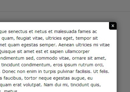
$.xModal({ html : "<p>In a Paragraph</p>" });Load image:
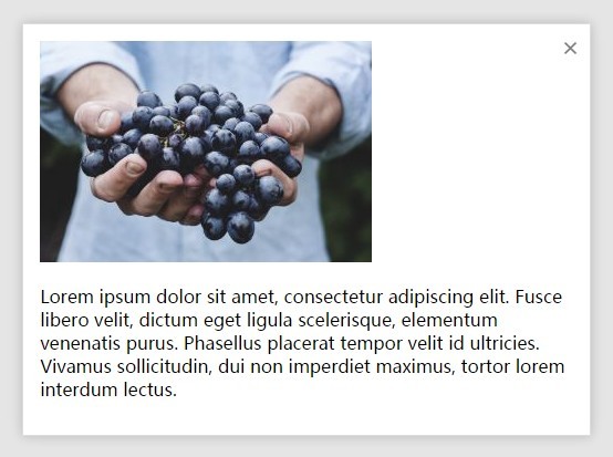
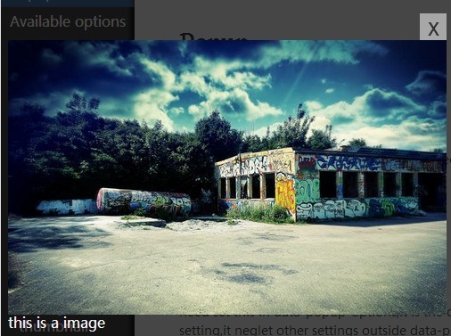
$.xModal({ img : "http://lorempixel.com/400/200" });Parameters:
$.xModal({ headline: "Headline", description: "Description", width: "75%", href: "filepath", effectIn: "puffIn", effectOut: "puffOut", html: "", onLoadingStart:"", onLoadingDone:"", onCloseStart:"", onCloseDone:"" }); Defaults:
- width: 75%
- effectIn: puffIn
- effectOut: puffOut
Effects
These are the CSS effects that get applied when opening and closing modals. This works great with the awesome effects supplied from the magic css animation library.
Effect Usage:
Just supply a CSS class to get applied when opening the modal (effectIn) as well as a class that will get applied when closing (effectOut).
The effects work great with css libraries such as the magic css animation library. All you need to do is supply "effectIn" and "effectOut" classnames and the plugin applies them when opening and closing the modals. If no "effectIn" or "effectOut" is supplied, then the default effect used is "puffIn" and "puffOut".
Example:
$('.element').xModal({ headline:"boing", effectIn:"boingInUp", effectOut:"boingOutDown" });There are two parameters for using effects:
- effectIn: Applied when opening the modal.
- effectOut: Applied when closing the modal.
Browser Support
| Browsers | Version |
|---|---|
| Chrome | 31+ |
| Firefox | 31+ |
| Safari | 7+ |
| iOS Safari | 7+ |
| Android | 4.1+ |
| Android Chrome | 42+ |
| IE | 9+ |
Benefits:
- Follows SUIT CSS naming conventions.
- Works easily in conjunction with the magic css animation library.
What's Next?
- Isolate magic css library
- Make default styling more generic
- Make it so that you dont need as many child classnames (ex: inline)
- Loading icon
- $('element').on('xModelEnd', function(e, state){ console.log(state.totalShow+' elements match the current filter'); });
Down the road...
- Make it so that you can't scroll down the body of the page, only within the modal.
- Make a few themes
- Multiple Modals
- Other effects
- Have image fit width of modal
- Add gallery functionality (have arrows/bullets show)


