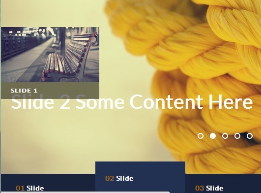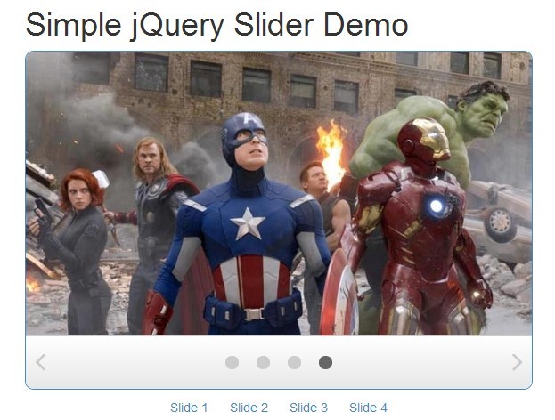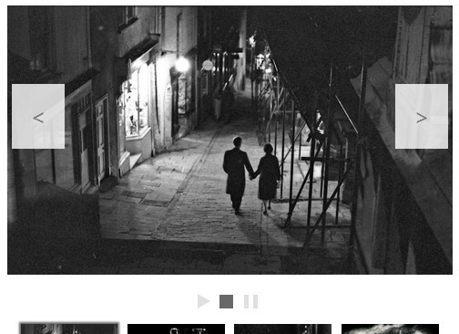
#Skidder
A flexible jQuery slideshow plug-in that supports centering, swiping and responsive scaling.
##Features
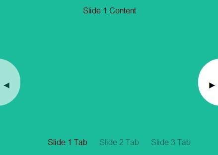
- optional paging
- optional cycling
- optional centering
- optional image scaling, also on resize
- iOS-like swiping on touch devices
- works with: Chrome, Firefox, Safari, IE8+ ...
##Usage
###Setup
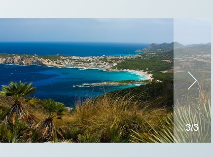
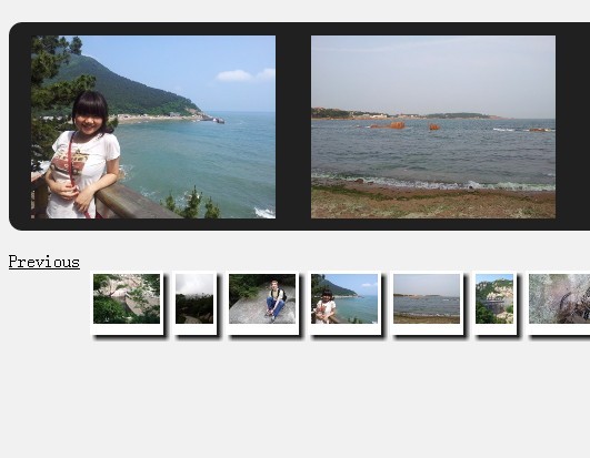
<link rel="stylesheet" href="../src/jquery.skidder.css"> ... <div class="slideshow" style="display: none;"> <div class="slide"><img src="1.jpg"></div> <div class="slide"><img src="2.jpg"></div> <div class="slide"><img src="3.jpg"></div> </div> ... <script type="text/javascript" src="https://ajax.googleapis.com/ajax/libs/jquery/1.11.2/jquery.min.js"></script> <script src="../src/jquery.skidder.js"></script> <script> $('.slideshow').skidder(); </script>The slide divs can take an optional data-href attribute for links on mobile.
Make sure that images are loaded before initialising the plug-in, or the slideshow might not get sized correctly. You can use imagesloaded.js for this purpose - load it, then call like this:
$('.slideshow').each( function() { var $slideshow = $(this); $slideshow.imagesLoaded( function() { $slideshow.skidder(); }); });All controls are hidden for slideshows with only one image, but Skidder will still scale the image properly.
###Resizing
Bind this call to your resize, orientationchange, whatever event:
$('.slideshow').skidder('resize');It is highly recommended to debounce this to save some trees, e.g. with Paul Irish's smartresize, which you can use like this:
$(window).smartresize(function(){ $('.slideshow').skidder('resize'); });###Transitions
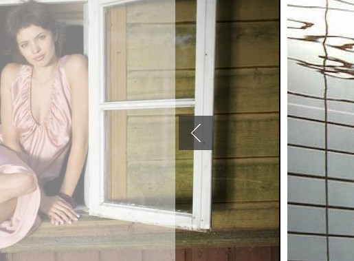
Skidder supports two modes of animating the slide transition ("animationType" option): CSS and jQuery animate. Using CSS mode is recommended for performance reasons. CSS obviously requires that the browser support CSS transitions, if not, Skidder will switch to 'animate' mode. Both modes require requestAnimationFrame, which is polyfilled for older browsers.
Skidder offers two types of transitions ("transition" option): slide and fade. Fade always animates using CSS. Regardless of the transition selected, touch devices will always use the 'slide' transition, unless swiping is set to false. Note that for now the fade transition requires images of equal size.
###Viewport and Scaling
Skidder has a number of options to deal with various image sizes, desired viewport layout, and responsivness:
- 'scaleSlides' determines if slides are displayed as they are (styled only via css), or if the are scaled programmatically (via inline css properties) to fit certain dimensions. If you just need a simple slideshow with equally sized images you can turn off scaling altogether and handle responsiveness via css if needed. If you have to deal with various image formats or mix image- and non-image slides, scaling will help you out. It uses the following options:
- 'scaleTo' can be either "smallest", or an array consisting of two numbers [x, y]. "smallest" will scale all your images to the height of your smallest (ie. least tall) image, as well as set the slideshow's height accordingly. Take note that adding one 5px tall image to a slideshow will render the entire slideshow 5px tall. an array of two numbers (e.g. [16, 9]) will determine the aspect ratio of the slide show, ie. its height relative to its given width. images will be scaled to fill the viewport, ie. for wider images left and right edges will be hidden, top and bottom edges for taller images.
- there are times when you need to keep the bottom and top edges of tall images. that's what "preservePortrait' is for: if set, any image less wide than the specified ration will be sized to fit.
- 'maxWidth' and 'maxHeight' are here to limit the dimension of the slide show. If set to "none" or 0, no limitation is applied in that direction.
Scaling always manipulates the first image in the slide element. If you want to include more images in a slide (for overlays etc), make sure to place them after the primary image tag.
If you are using image-less divs without scaling, you will have to set the height of the slides with css, or
###Lazy Loading
###Styling
Default styles are included in jquery.skidder.css - change at will. For non-scaling non-image slides (i.e. slides without an explicit img tag), make sure they have initial dimensions, e.g. through provided width and height css properties. For scaling non-image slides set intiSlideWidth and intiSlideheight instead.
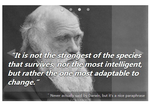
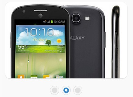
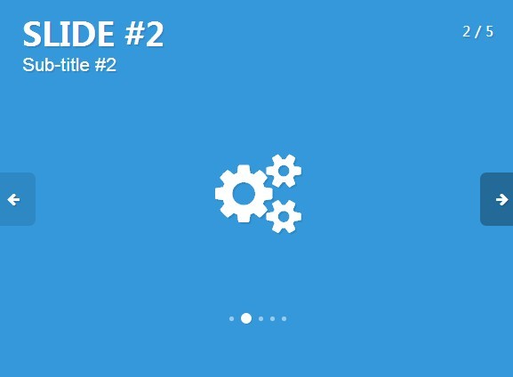
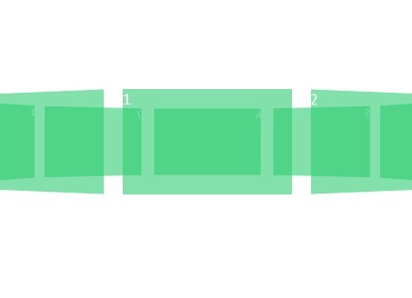
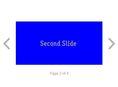
###Options | Option | Description | | ------------- | ------------- | | slideClass | Class of the slide element. Please include leading ".". Default: ".slide" | | animationType | skidder supports css animations and jquery animate ones. Possible values 'animate', 'css' Default: 'animate' | | lazyLoad | Default: false | | lazyLoadAutoInit | Default: true | | lazyLoadWindow | Default: 1 | | scaleSlides | Scales slides (via css) to uniform values, depending on maxWidth, maxHeight, and scaleTo settings Requires images! Default: true | | scaleTo | Defines the scaling mode of scaleSlides. At the moments there are two modes: Scale to smallest, and ratio (responsive) mode. Possible values: "smallest" - height of the least tall image determines height of slideshow. [x, y] – an array of two number defining a ratio for the slide show. Default: "smallest" | | maxWidth | Limit width of slideshow to this value. Set to 0 or "none" to not limit. Default: 800 | | maxHeight | Limit height of slideshow to this value. Set to 0 or "none" to not limit. Default: 500 | | preservePortrait | Only for ratio mode: Determines wether images that are less wide than the current ratio will fill the viewport, having their top and bottom cropped ("false"), or fit the viewport, leaving room to the sides ("true"). Default: false | | paging | If true, Skidder looks for an element pagingWrapper containing element pagingElement to use for paging. if one or both of them are missing, it creates them. Note: paging false is ignored on touch devices (but you can hide it via css) Default: true | | pagingWrapper | custom class name for creating or finding the pager wrapping div Default: '.skidder-pager' | | pagingElement | custom class name for creating or finding the pager dots Default: '.skidder-pager-dot' | | swiping | Enable swiping on touch device. Default: true Note: If enabled touch devices will always use the 'slide' transition | | leftaligned | Set to true if you don't want your slideshow centered. (true = buggy!) Default: false | | cycle | Set to false if you don't want your slideshow to wrap around (false = buggy!). Default: true | | jumpback | In non-cycling mode jumpback will display a 'return to first slide' arrow at the last slide. Default: false | | speed | Transition speed. Default: 400 | | autoplay | Default: false | | autoplayResume | Resume autoplay after interaction Default: false | | interval | Autoplay interval Default: 4000 | | transition | 'slide' or 'fade' Default: 'slide' Note: If swiping is enabled, touch devices will always use the 'slide' transition | | directionClasses | adds classes 'left-from-active' and 'right-from-active' to slides after transition is complete. useful for triggering e.g css transitions on particular slide elements. costs a little performance so leave inactive if not needed. Default: false | | afterSliding | function called after changing slides | | afterInit | function called after Skidder is initialised | | afterResize | function called after Skidder resize is triggered and complete |
##Roadmap
lazy loading- outerPaging option (find paging element in next sibling element to slideshow)
use requestAnimationFrame or optional pure css transitions to improve performance- test and debug leftalign (align to viewport or maxSlideWidth?)/ non-cycle (disable event handlers for first and last slide) / jumpback options
- adapt swipehandler to nocycle
make click cancel autoplay- DRY click/swipe/autoplay events
- fold (optional) smartresize into skidder
proper swiping- better bottom-align paging
- adapt speed to slide width
disable controls, paging and autoplay for less than 2 imagescallback functions- stepsize option for larger jumps (best responsive)
- option for custom easing functions
- allow to move multiple slides in one swipe
- <=IE9 does not support CSS transitions: css mode should fall back to animate for these browsers
polyfill rAF- test with scaling no-image slides that contain a not-scaling image, possibly:
| noScaleClass | Set this on images contained within the slide div that you don't want to be scaled. Please include leading ".". Default: ".skidder-no-scale" |
###Limitations
at the moment it's not possible to mix img and non-img slidesslides containing image tags other than the background image will break scaling- fade transition requires images of equal size (TODO: rewrite center function)
##Credits and license
###Author Georg Lauteren for null2 georg.null2.net twitter.com/_gl03 requestAnimationFrame polyfill by Erik Möller. fixes from Paul Irish and Tino Zijdel
###License Licensed under the MIT License
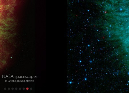
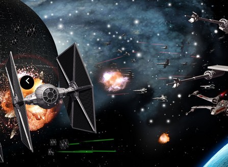
###Sites that use Skidder