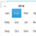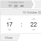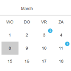
Angular Material DateTimePicker


An Angular Material based, an Android style date-time picker. Some basic functionalities are:
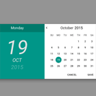
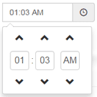
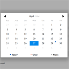
- Double click to select date or time
- Swipe left to go to next month or Swipe right to go to previous month.
- Disable the set of continous or non-continous date sets.
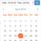
- Jump to current day
- Highlight Week days (Business Days)
- Display week number (in header)
- Weekdays as per browser language
Updates
| Date | Author | Description |
|---|---|---|
| 2016-11-21 | AmittK | Extended version of angular-material-datetimepicker |
| 2017-04-14 | AmittK | Changes to the display structure of date and month |
| 2017-07-26 | AmittK | Jump to today date is introduced |
| 2017-07-28 | AmittK | Highlight only week-days (working business days) |
| 2017-07-30 | AmittK | Displaying the week number in header, UI updated |
| 2017-07-30 | AmittK | UI updated with icons and tooltips |
Dependencies
Depends on the following library:
- Angular Material & it's dependencies
- Angular Touch
- MomentJS
Installing via Bower
bower install extended-datetimepicker Installing via Npm
npm install extended-datetimepicker Live Example
Click [here] (http://rawgit.com/amittkSharma/extended-datetimepicker/master/index.html) to visualize live examples.
Usage
Add the plugin module as a dependency to your AngularJS module:
angular.module('myAwesomeModule', [ //other dependencies ignored 'ngMaterialDatePicker' ]);This plugin exposes a directive which should be used as an attribute for an input element. The directive is mdc-datetime-picker. An example of this is given below:
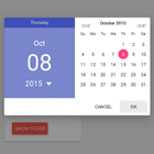
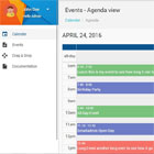
<md-input-container flex-gt-md="30"> <label>Timepicker Only</label> <input mdc-datetime-picker date="false" time="true" type="text" id="time" short-time="true" placeholder="Time" min-date="minDate" format="hh:mm a" ng-model="time"> </md-input-container>Directive Attributes
The directive accepts several attributes which are described below:
| Name | Type | Description |
|---|---|---|
| ng-model | (String|Date|Moment) | Initial Date or model to assign the date to |
| format | String | MomentJS Format,defaults to HH:mm for time picker only, YYYY-MM-DD for date picker only and YYYY-MM-DD HH:mm for both timepicker and date picker |
| short-time | Boolean | true => Display 12 hours AM|PM |
| min-date | (String|Date|Moment) | Minimum selectable date |
| max-date | (String|Date|Moment) | Maximum selectable date |
| date | Boolean | true => Has Datepicker (default: true) |
| time | Boolean | true => Has Timepicker (default: true) |
| cancel-text | String | Text for the cancel button (default: Cancel) |
| ok-text | String | Text for the OK button (default: OK) |
| disable-dates | Date[] | Dates to be disabled or not selectable by user. |
| week-days | Boolean | true => Highlight only working days (default: false). |