folding-arrow
jQuery plug-in for inserting arrow icons for foldable list items, sections, burger menu icons etc. as inline SVG with CSS support. This especially includes the possibility of state transformations animated by CSS transitions.
Motivation
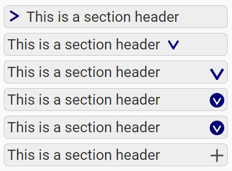
Have a look at the demo page, and you'll most certainly recognize the demonstrated icons, like triangle icons used to indicate whether a (sub)section is visible or collapsed/folded. One of the most common uses of such icons is in hierarchical lists to show list items with sub-lists and the state of the latter's visibility. For a collapsed sublist, the icon is usually an arrow to the right, whereas the arrow points down if the sublist's unfolded.
Since the actual look of the icon is not the major content of the HTML document, but simply a presentation style, a common way to achieve this is to simply add a class to the foldable list item which represents the logical state (open/visible or closed/collapsed/folded). The icon itself (being presentation) could simply be added by CSS, e.g. with rules like this:
li::before{ content: url(arrowRight.svg) } li.open::before{ content: url(arrowDown.svg) }Then the JavaScript which shows/unfolds the list item's content simply has to add the class open to the li node, and the script code which hides/shows the item's content has to remove that class again.
This CSS-only way with external image files has, however, some disadvantages. Especially the sizing / scaling of the image might be tricky (e.g. content can't be sized by CSS but has have a fixed size and can't depend dynamically on the font size). And when opening or closing the sublist, the image simply gets replaced, i.e. the arrow flips without animation. These were the main reasons for the development of this plug-in:
This plug-in dynamically inserts an inline-SVG image into the HTML. Other than externally loaded and embedded SVG documents, inline-SVG is a part of the HTML document and may be styled by the HTML document's CSS. I.e. you may common define styles for the HTML list markup and for the included list icons at one central place.
- You may (actually have to) use CSS to size the icon and to define its properties like stroke, line width, fill color etc.
- You may style the image and the text (list item, section heading etc.) accordingly, even add dynamic styles like a hover effect to both of them (see demos).
- And of course, CSS transitions allow for a smooth, animated state transition like a rotating triangle, a flipping arrow sign or a plus being smoothly transformed into a minus (see demos).
But the plug-in doesn't stop there: It's configurable, so you can even define the actual SVG image (in JavaScript). Some typical images are provided as presets (including a transition). You can simply use these presets, modify them or create some custom images from scratch.
Please note: This plug-in concentrates on drawing the SVG icon (which may be animated with CSS transitions). The actual content-folding is not part of this plug-in. The demo page uses simple calls to jQuery's built-in slideDown() and slideUp() functions, but the demo code still has to do at least two things on each click event: fold or unfold the content and toggle the CSS state class (like open in the example above) of the list item or heading in order to change the icon. And if you want Internet Explorer- or MS Edge support, the event handler even has to perform a third step by calling an additional plug-in function for transforming the icon (since these MS browsers don't support CSS transformations on SVG).
I'm considering publishing another jQuery plug-in with the focus on showing and hiding sections and automatically toggling a state class of a corresponding "header" element, to make that job even easier. Both plug-ins may then be combined for very simple (un-)folding of sections or list items.
Getting started
Let's, for the start, assume, you have a simple unordered list (<ul>) and want to use folding-arrows (right- or downpointing triangles by default) instead of normal list bullets for every list item (<li>) of that list (not including sublists inside its list items).
What do you have to do at least—in the simplest case?
- Fit the unordered list with the class
folding-arrows[^1]:<ul class="folding-arrows"> <li>... <ul>...</ul> <!-- sub list --> </li> ... </ul>
- Include the Script file as well as jQuery inside your HTML's
<head>:<script type="text/javascript" src="https://code.jquery.com/jquery-3.2.1.min.js"></script> <script type="text/javascript" src="dist/jquery-folding-arrow-icon-min.js"></script>
- Include the default stylesheet that came along with the plug-in[^3]:
<link rel="stylesheet" type="text/css" href="dist/jquery-folding-arrow-icon.css">
- Write some custom JavaScript code to apply the plug-in: Write a query selecting all list items which should be fitted with the folding arrow icon. In this case, we select every list item of any unordered list of class
folding-arrows, see above. To prepend the icon to the selected list items, call theprependFoldingArrowIconplug-in—in this simple case without arguments, which implies all options are left on default values:$("ul.folding-arrows > li").prependFoldingArrowIcon();
- The included CSS file (see step 3) already contains default styles for lists of class
folding-arrows. Especially, it turns off the default bullets and indents the first line more to the left such that the inline SVG icon (being part of the content of the first line) is arranged to the left of the actual text content and—at least with default options—the actual content of the line following the icon and its separator[^5] aligns perfectly with the left margin of the following lines.
But the CSS does not define default visual styles for the icon, nor does the plug-in. The latter simply draws a path forming a triangle, but you have to style that path on your own by adding CSS rules for thestrokeandfillproperties, like e.g.:.folding-arrow-icon path { stroke: none; fill: silver; }
- Now you have a folding-arrow icon able to indicate whether the contents of the list item are visible or not. But you still have to add JavaScript handlers to capture events (like a click on the icon or on a link in the list item) which should actually toggle the state (fold or unfold content). This event handler has to do three things:
- Actually show or hide the content, and
- add or remove the class
showingto resp. from the<li>item in order to flip the state of the indicator. - After adding/removing the
showingclass to/from the<li>item, the handler should also call another jQuery plug-in function provided by this library:$(…).transformFoldingArrowIcon().
This is not actually mandatory, but it's needed for compatibility with Microsoft's browsers (Internet Explorer as well as Edge): Both don't support SVG transitions defined via CSS, they only understand transition attributes inside the SVG's DOM itself! ThetransformFoldingArrowIconplug-in function therefore adds or removes a transition (by default a rotation by 90°) to/from the SVG's DOM—dependent, by default, on the presence or absence of theshowingclass on the list item. It also supports adding a title to the image (e.g. showing as a pop-up when the mouse hovers over it) depending on theshowingstate, but by default, no title is added. (As already said in the introduction, I'm considering publishing a further jQuery plug-in which will simplify this sixth step.)
See the demo page for working examples. You may create a copy of the demo page as a playground for your own experiments.
Of course the plug-in is quite flexible and customizable. For one, it isn't limited to be applied to list items, see demo page. It also doesn't force you to stick to constraints like the use of the specific class folding-arrows and such. Those are simply defaults, and if you don't want to stick to these defaults, you'll have to do more customization. Especially the included CSS file applies default styles to elements equipped with default classes, and if you want to use other class names, you can't simply use the default CSS file. Feel free to make a copy of the CSS and customize that to your needs. You should not edit the included stylesheet, since future updates of the plug-in might then overwrite and thus reset your local changes—also that would break the demo page.
[^1]: Of course you're not obliged to use exaclty that class name, that's just a default. But if you use another name, you can't use the included CSS file jquery-folding-arrow-icon.css in its original form (see step 3). You should then make a copy of that file and change that accordingly.
[^3]: This CSS file contains rules for a) formatting the unordered list in such a way that the in-line SVG icons are aligned like list bullets (for any ul.folding-arrows, see step 1) and b) it contains default transformation and transition rules for rotating the originally right-pointing triangle by 90 degrees when the class showing gets added to a li (see step 6).
[^5]: The separator is a string inserted between the inline SVG icon and the original list item's content. It can be explicitly set in the plug-in's options. The included CSS file assumes the separator to be exactly 0.5em wide, which is the case for the default separator ( ).
Customization
CSS
First of all, you have to write some own CSS code to style the looks of the generated icons (stroke, stroke-width and fill), see [Getting Started][], step 5.
Further CSS customization can be done by replacing the included jquery-folding-arrow-icon.css file by a modified/customized stylesheet of your own. You may write a new stylesheet from scratch, make a copy of said CSS file and modify that or make a copy of the included less source, modify that and convert that into CSS by a less compiler.
It's not recommended to modify the original less or css files, at least not outside of a fork of the original project, since your changes might be overwritten when downloading updates of this package.
Presets
As demonstrated above in [Getting Started][], you may call the plug-in functions without parameters and you get default icons with default options.
Actually, there are several alternative sets of default options available, mainly configuring different icons or transformations.
Currently, the following presets are included:
arrow-right: The is actually the default that is chosen if no options are configured at all: Right-pointing triangle rotating by 90 degrees when unfolding.arrow-up-down: The same triangle icon, but pointing either up or down, with a vertical flip transformation/transition.plus: Plus-icon with rotation by 45 degrees (i.e. transformation into an X icon) when unfolding.plus-minus: The same plus-icon, but transformed into a minus when unfolding by shrinking the vertical line.burger: A typical menu icon of three stacked horizontal lines, transformed into an X icon when unfolding.
Two more presets exist which don't contain transformations and are not meant to be transformed at all, but are intended to define some static list bullets for use in an unordered list of which only some entries are foldable (and should be equipped with a transformable icon like defined by the presets above), while others remain static. Acutally, for this case you might simply stick to standard HTML bullets, but if you want a more consistent look and want to style those list bullets, too, you may create them with this very same plug-in. These two presets for static bullets are:
dash: A simple dash icon (should probably not be combined with theplus-minuspreset, since expanded list items with a minus icon would not be easy to tell apart from static list items with dash icon, but is very well suited for combination with arrow presets, especially if the arrow is only outlined and not closed, i.e. a chevron).disc: A small circle icon (via CSS you define wheter to draw a circle outline or a filled dot).
All these presets are demonstrated in the included demo page.
A preset is simply called by passing the option preset with the name of the preset as argument (string literal), e.g.:
$("ul.folding-arrows > li").prependFoldingArrowIcon({ preset: "plus-minus" });If you plan to use the transformFoldingArrowIcon plug-in function (upon each state change) for IE-/Edge compatibility, then you should also once call the setupFoldingArrowIconTransformation function (usually directly after the prepend-/append-function) with exactly the same preset argument:
$("ul.folding-arrows > li").prependFoldingArrowIcon({ preset: "plus-minus" }).setupFoldingArrowIconTransformation({ preset: "plus-minus" });Plug-in options
The main prepend- and appendFoldingArrowIcon plug-in functions may be customized with some options defined in $.fn.appendFoldingArrowIcon.DEFAULTS alias $.fn.prependFoldingArrowIcon.DEFAULTS (by default both variables refer to the same object of default properties).
You may globally (for your project) modify these defaults by changing that DEFAULTS object. Or you may pass an object of individual options to the plug-in function call like e.g.:
$("ul.folding-arrows > li").prependFoldingArrowIcon({ closePath: false, viewboxMargin: 2 });All options that you don't include into that argument object will remain on default setting. This can also be combined with the preset option, in which case any given option overrides the default defined by that preset, and any not included option remains on the preset's default, e.g.:
$("ul.folding-arrows > li").prependFoldingArrowIcon({ preset: "arrow-up-down", viewboxMargin: 2 });The same goes for the setupFoldingArrowIconTransformation plug-in function.
Options for append|prependFoldingArrowIcon
A list of the supported options (along with their default values) can be found in the source code:
/** * Default options for the plug-in functions appendFoldingArrowIcon and * prependFoldingArrowIcon. * Some of these options also apply to setupFoldingArrowIconTransformation. * You may globally alter these defaults or override individual options via * the argument of the aforementioned plug-in functions. */ $.fn.appendFoldingArrowIcon.DEFAULTS = $.fn.prependFoldingArrowIcon.DEFAULTS = $.extend({}, { /** * Option svgClass: The generated inline SVG element will be equipped * with a class attribute, and this option defines its value. * This class can be used to select the SVG icons, which is especially * needed for applying CSS styles. */ svgClass: "folding-arrow-icon", /** * Option containerClass: This class name will be added to the class attribute * of the container element (parent element of the inserted SVG node), * i.e. any element of the jquery resultset on which the * append-/prependFoldingArrowIcon() plug-in has been applied. * When used in unordered lists, the containers are the <li> elements. * This class can also be used for CSS formatting, especially in combination * with the 'showing' class defining the state toggle, see included CSS file: */ containerClass: "folding-arrow", /** * Option separator: This string is inserted between the SVG icon and the * container node's original content. So, when you call prependFoldingArrowIcon, * the SVG followed by this separator string are prepended to the node's content, * when you call appendFoldingArrowIcon, the separator string followed by the * SVG icon are appended to the node's content. * The default separator is an ensp, i.e. a space character of exactly * 1en = 0.5em width. The included default stylesheet for unordererd lists * relies on this width! */ separator: " ", /** * Options viewboxRadius and viewboxMargin: * The generated SVG will be equipped with a viewBox attribut which defines a * the visible square region of the SVG's coordinate system centered around the * point (0, 0). * Let r be the sum of both options: r := viewboxRadius + viewboxMargin. * Then the CSS will have the following viewBox: "-r -r 2*r 2*r". * The individual values are not used by the plug-in, only the sum of both is * evaluated. The only reason why there are _two_ options is for better * readability: The use of these two values is intended as follows: * viewboxRadius should describe half the width and height of the actual icon, * such that any coordinate used to describe the graph (i.e. point of a path, * edge of a polygon, endpoint of a line etc.) should be contained in the square * (-viewboxRadius, -viewboxRadius) / (viewboxRadius, viewboxRadius). * The option viewboxMargin can then be used to define the width of a margin * around the actual icon. A margin may be essential, if you don't just create * a filled graph without stroke, but if you have a stroke greater than zero: * If graph points touch the edge of the viewboxRadius square, the stroke will * then extend into the margin and would be clipped without one. * Also, during rotation transitions the transition paths of some of the * graph's points may easily leave the main graph region defined by the * viewboxRadius. * The default values define a 10-by-10-pixel area for the graph and a 1px margin * around that. Whenever you use the graph option to define your own graph and * you don't want to describe your graph with coordinate of this 10x10 area, * you have to override the viewboxRadius option accordingly to your graph's area. * The viewboxMargin option should be increased if you plan to use larger * stroke-width values in CSS. */ viewboxRadius: 5, viewboxMargin: 1, /** * Option graph: Defines the actual graph. (The default graph is not initialized * at this place, but is copied from the preset "arrow-right".) * A graph has to be an array of node definitions. * A node definition (element of the graph array) is an object with two properties * 'element' and 'attributes': * Property 'element' has to be a string defining an SVG element name (e.g. "line", * "circle" or "path"). * Property 'attributes' has to be an object of key-value-pairs of type string * defining the attributes of the SVG element. * Example: * `graph: [{element: "circle", attributes: {"cx": "0", "cy": "0", "r": "3"}}]` * defines a graph consisting of just one SVG element, namely a circle around the * point (0,0), which is the center of the viewBox, and with a radius of 3. */ graph: undefined, /** * Option closePath: * If the graph option contains at least one `path` element which is not yet closed, * i.e. its start point and its end point differ, then this option defines whether * a "z" is appended to the path (which is a flag defining the path should be * closed by a line connecting start and end point). * The default graph is actually not a closed triangle, but a path shaped like * a grater than sign. Thus, while you use the default graph, and if you draw * a stroke (via CSS) this option controls whether that stroke is a closed triangle * or "just a chevron". * If the graph does not contain any unclosed path element, the option has no * effect. */ closePath: true, /** * Option preset: * If you don't specify the graph neither the preset option, a default graph * (right-pointing triangle) will be used. You may override that by specifying * the graph option and thus defining your own graph. * But you may also simply load alternative graphs in the form of so-called * presets. A preset is simply a bundle of options which can be loaded all at * once by setting this 'preset' option. You may load the included presets as * well as create and use your own onces. * The value of this option has to be either... * - a string: the name of a preset or... * - an instance of class PresetCopy, obtained by calling the function * $.fn.prependFoldingArrowIcon.copyOfPreset(presetName) and modifying * that copy via its instance methods. * (For an example, see demo page, section "Combine preset with circle"). */ preset: undefined }, $.fn.prependFoldingArrowIcon.PRESETS["arrow-right"]);Options for setupFoldingArrowIconTransformation
/** * Default options for the plug-in function transformFoldingArrowIcon. * If you want to override these options, use the jQuery plug-in function * setupFoldingArrowIconTransformation() with an object enumarating the options * you want to override. This setup has to be called just once, and the * transformFoldingArrowIcon() function will then always use this setup. */ $.fn.transformFoldingArrowIcon.DEFAULTS = $.extend({ /** * Option ifIsSelector: * The transformFoldingArrowIcon function will add or remove a transition to * the selected nodes, depending on their state. This state is determined by * `jqr.is(opts.ifIsSelector)`: If the node matches the jQuery selector defined * by this string, the transformation is added, otherwise it's removed. * This is also used to switch titles, if defined. */ ifIsSelector: ".showing", /** * Option transformations: Defines the transformation(s) the plug-in function * transformFoldingArrowIcon should apply to (or remove from) the SVG. * The value of this option has to be an array of single transformations. * A single transformation (element of that array) has to be an object of * key-value-pairs of type string. Each key is to be a selector and its value * a transformation rule. * The default is: [{"> g": "rotate(90)"}], which means: * A single transformation will be added to the SVG, more specifically * a transformation attribute will be added to the SVG's child node of type * `g`(SVG group), and the content of that attribute will be "rotate(90)". * To understand that, it's important to know that all graph elements defined * by the `graph` option (see above) will be grouped by a single `g` element, * this this transformation rule means: Rotate the whole graph by 90 degrees. * Of course you may also define transitions for individual child nodes of that * group, see presets "burger" or "plus-minus". */ transformations: [ { "> g": "rotate(90)" } ], /** * Option titleShowing: Defines a title to be added to the graph when the * ifIsSelector is matching (unfolded state). That title may be displayed by * the browser whenever the mouse cursor hovers over the icon. */ titleShowing: undefined, /** * Option titleHidden: Defines a title to be added to the graph when the * ifIsSelector is not matching. */ titleHidden: undefined }, $.fn.prependFoldingArrowIcon.DEFAULTS);