ARIA DIALOG
About
HTML, CSS and JS UI-component for user-friendly and accessible dialogs: WAI ARIA 1.1 compliant. Go to demo page or check on npm.
- User-friendly and accessible
- Support for modal dialogs and alert dialogs.
- Developed following BEM methodology
- JS plugin size: 4KB (minified)
- Compatible with UMD
Dependencies
jQuery
Developed and tested with jQuery 3.2.1
Cross-browser tests
- Google Chrome 57 / macOS Sierra 10
- iPhone 5s Safari for iOS 10.3.2
- Google Chrome 60, Edge, Firefox / Windows 10
Settings / Options
| Name | Default | Type | Description |
|---|---|---|---|
| dialogIdPrefix | dialog-- | string | Prefix used to generate the id of a dialog, if not set in the markup |
| windowClass | dialog__window | string | Class of a dialog window (The class is used from the plugin to select the element) |
| containerClass | dialog__container | string | Class of a dialog container (The class is used from the plugin to select the element) |
| headingClass | dialog__heading | string | Class of a dialog heading (The class is used from the plugin to select the element) |
| openClass | dialog_open | string | Class added to an open dialog |
| windowOpenClass | dialog__window_open | string | Class added to a dialog window, when the dialog is open |
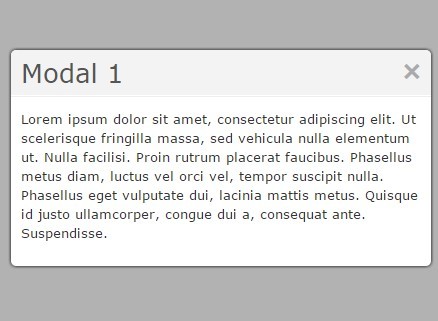
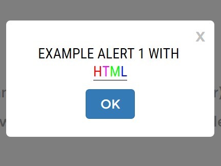
| dialogType | modal | token | Set type of dialog: modal or alert. For more informations see https://www.w3.org/TR/wai-aria-practices-1.1/#alertdialog and https://www.w3.org/TR/wai-aria-practices-1.1/#dialog_modal. (Support for non-modal dialog is planned for future versions of the plugin). |
| closeWithEsc | true | bool | Close dialog when esc key is pressed (recommended value is true) |
| closeOnBgClick | true | bool | Close dialog if user clicks on dialog's background |
| fadeSpeed | 100 | int (>= 0) | Duration of fade-in and fade-out animations. |
| cssTransitions | false | bool | Use css transitions to show/hide dialog instead of jQuery fade animations. Read section 'Using CSS transitions' for more infos |
| setFocusOn | 'button:first-child' | string (selector) | The jQuery selector of the element to set focus on, when the dialog is open. Required |
Installation
Download the package from GitHub and get the compiled files from the dist folder.
The plugin is also available on npm:
npm install t-aria-dialog Usage
- Include the JS script aria-dialog.js - or the minified production script aria-dialog.min.js - in the head or the body of your HTML file.
- Include the CSS file aria-dialog.css in the head of your HTML file or include the SCSS files in your project.
- Initialise the widget within an inline script tag, or in an external JS file.
HTML
Use following HTML markup to implement a dialog:
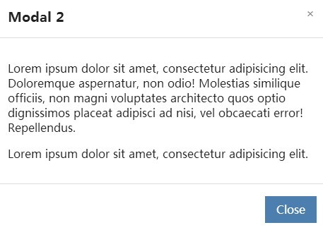
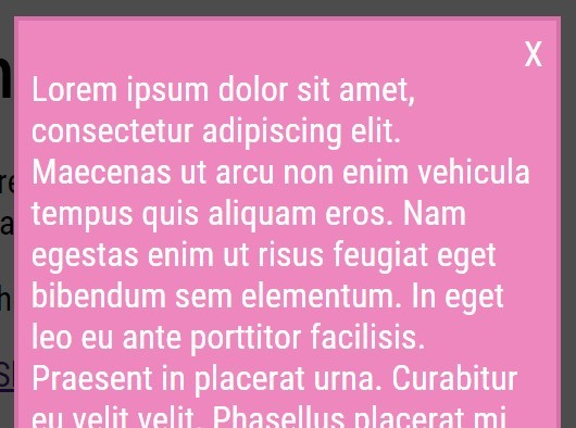
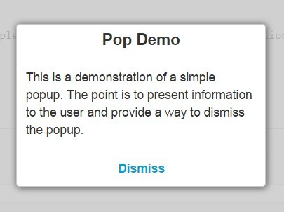
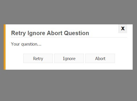
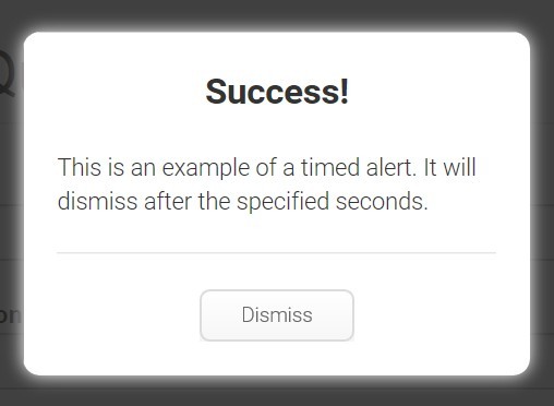
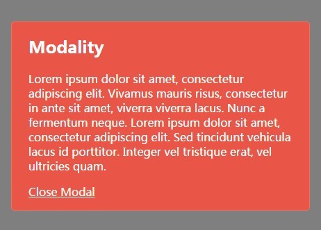
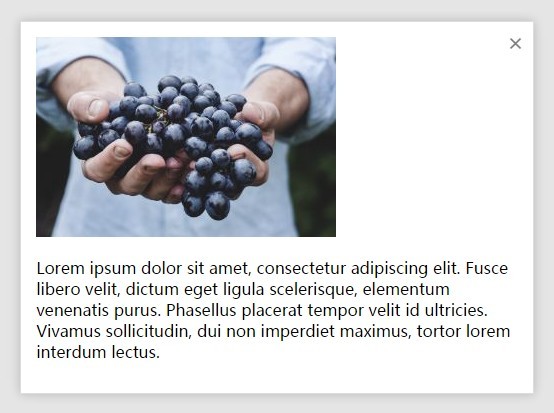
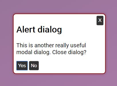
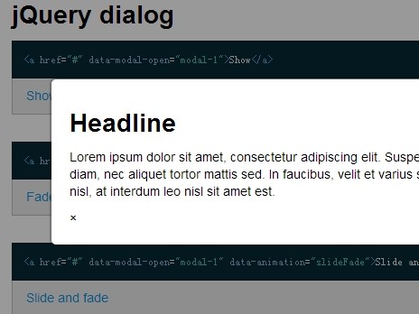
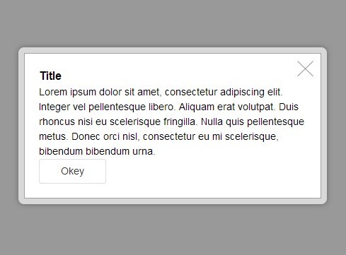
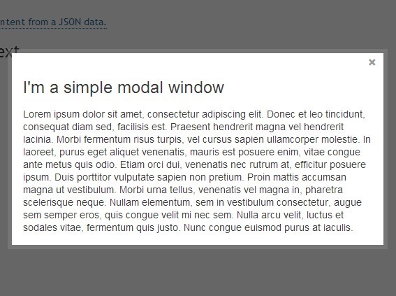
<!-- Dialog with visible heading --> <div class="dialog" id="dialog-1"> <section class="dialog__window"> <div class="dialog__container"> <header class="dialog__header"> <h2 class="dialog__heading">Modal dialog</h2> <button class="dialog__dismiss-btn" id="dismiss-btn-2">X</button> </header> <div class="dialog__body"> <p>This is a useful modal dialog. Close dialog?</p> <div class="dialog__options"> <button class="dialog__option-btn" type="button" id="btn-yes-2">Yes</button> <button class="dialog__option-btn" type="button" id="btn-no-2">No</button> </div> </div> </div> </section> </div> <!-- OR --> <!-- Dialog without visible heading (uses aria-label instead) --> <div class="dialog" id="dialog-2"> <section class="dialog__window" aria-label="Dialog heading"> <div class="dialog__container"> <header class="dialog__header"> <h2 class="dialog__heading">Modal dialog</h2> <button class="dialog__dismiss-btn" id="dismiss-btn-2">X</button> </header> <div class="dialog__body"> <p>This is a useful modal dialog. Close dialog?</p> <div class="dialog__options"> <button class="dialog__option-btn" type="button" id="btn-yes-2">Yes</button> <button class="dialog__option-btn" type="button" id="btn-no-2">No</button> </div> </div> </div> </section> </div> JS: Initialise
Initialise the plugin as follows:
$('.dialog').ariaDialog({ option1: value1, option2: value2 });Methods
The plugin supports following methods: show, hide.
Open:
To open a dialog call ariaDialog and pass 'show' as parameter:
$('#my-dialog').ariaDialog('show');Hide:
To close a dialog call ariaDialog and pass 'hide' as parameter:
$('#my-dialog').ariaDialog('hide');Custom events
This plugin triggers following events:
- ariaDialog.initialised after the dialog is initialised
- ariaDialog.show when a dialog is shown
- ariaDialog.hide when a dialog is closed
The custom events are triggered on window and return the dialog data object as argument.
//add event listener $(window).on('ariaDialog.show', function(event, dialog){ //perform an action dialog.element.addClass('my-custom-class') });Using CSS transitions
By default the plugin is configured to use JS to show/hide dialogs. Setting the option cssTransitions to 'true' will disable the JS animations. This will make possible to implement show/hide animations directly in the css. In fact, the plugin toggles the classes passed along with the options dialogOpenClass and windowOpenClass when the dialog is toggled.
Planned features
- Support for non-modal dialogs.
LICENSE
This project is licensed under the terms of the MIT license.
See LICENSE.md for detailed informations.


