jquery.customSelect
A simple jQuery UI widget to pretty up select elements. There is a full suite of unit tests available in test/, written with Jasmine. You can see an example and run the tests on the plugin's website.
It works by setting the values back in your original select, so you can call the standard jQuery val methods, bind to the change event, etc right on the native element. This is just a presentation layer. It does have its own events too, however.
HTML structure required
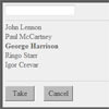
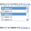
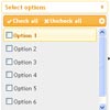
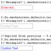
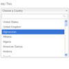
<select id="singleSelect"> <option value="cola">A glass of cola</option> <option selected value="lemonade">A class of lemonade</option> <option value="tea">A cup of tea</option> </select> That's it! It also supports multi-select inputs, in which case it'll use checkboxes rather than radio inputs.
To make it go, all you need to do is:
$('#singleSelect').customSelect(); Sample CSS has been provided for you in src/jquery.customSelect.css. There's lots of classes so it shouldn't be too tricky for you to get it to look how you want.
Options
- windowFormatter (default: noop) called with the display value before the 'window' is set, allowing you to modify or format it.
These options only apply to standard single selects
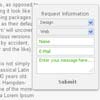
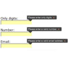
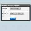
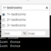
- customRange (default: false) show min-max inputs to allow a user to enter a custom numeric range
- customRanges (default: empty) an object with two keys, min and max, which are the starting values for the custom box.
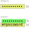
- customValue (default: false) show a single custom input box allowing the user to enter a custom value. If you pass a non-falsy non-boolean value (ie. a string) this will be used as the starting custom value.
- customValuePlaceholder (default: custom value) the placeholder text displayed in the custom value input
- customRangeHelper a function that a valid custom range is passed through. Is expected to return an array with two values, the first is the 'data' value, the second is the 'friendly' value that is displayed in the 'window'. It has a sane default.
- reverseRangeHelper a function that takes a custom value in string form, and splits it in to its min/max values. You only need to implement this if you change the customRangeHelper from its default.
These options only relate to multiple selects
- placeholder (default: Please select some items): if you're using a multiple select and no options are selected, this is the text that is shown
- defaultValue (default: null) if all options in a multiselect are unchecked, select this option.
Methods
These are the methods on the widget, call them like so
$('#yourSelect').customSelect(methodName) - getVal: fetch the widget's value (it's a string for a single select, or an array for a multi select). You should probably just call .val() directly on your native browser select.
- friendlyVal: return the display value (or array of values) that the user actually selects from, rather than the value="" attribute
- reload: if you want to add or remove items in the widget, manipulate the native browser select then call this method. It'll refresh the items that appear in the dropdown.
- setCustomRangeError(string): lets you set a validation error in your customrangechange event handlers
- destroy: remove the pretty widget, unbind events and show the original select
- disable: disable the widget, close the popup if it is open, do not allow it to be opened
- enable: allow interaction with the widget after disabling it
Events
As noted above, you can also bind to the standard events on the select.
- change: fired whenever the user changes any of the inputs in the dropdown, is called with the original browser event, and a hash containing the input radio/checkbox and value of said item.
- focus: fired when the dropdown is opened
- blur: fired when the dropdown loses focus (and is closed)
- disabled: fired when the widget is disabled
- enabled: fired when the widget is enabled
- rangechange: fired when the user attempts to set a custom range. This range is passed to your handler in the 2nd argument under the min/max keys. If you return false, the submission won't be accepted. You can use setCustomRangeError to set an error for the user.
- customvaluechange: fired when the user attempts to set a custom value. This value is passed to your handler in the 2nd argument under the value key. If you return false, the submission won't be accepted. You can use setCustomRangeError to set an error for the user.


