vue-virtual-scroller


Blazing fast scrolling of any amount of data | Live demo | Video demo
Sponsors
Gold
Silver

Bronze
Table of contents
Installation
npm install --save vue-virtual-scroller vue-virtual-scroller now uses vue-observe-visibility to automatically refresh itself when shown to prevent display glitches. This means you need to include the Intersection Observer polyfill needed by vue-observe-visibility for this to work in old browsers (like Internet Explorer).
Default import
Install all the components:
import Vue from 'vue' import VueVirtualScroller from 'vue-virtual-scroller' Vue.use(VueVirtualScroller)Use specific components:
import Vue from 'vue' import { RecycleScroller } from 'vue-virtual-scroller' Vue.component('RecycleScroller', RecycleScroller)import 'vue-virtual-scroller/dist/vue-virtual-scroller.css'Browser
<link rel="stylesheet" href="vue-virtual-scroller/dist/vue-virtual-scroller.css"/> <script src="vue.js"></script> <script src="vue-virtual-scroller/dist/vue-virtual-scroller.min.js"></script>If Vue is detected, the plugin will be installed automatically. If not, install the component:
Vue.use(VueVirtualScroller)Or register it with a custom name:
Vue.component('RecycleScroller', VueVirtualScroller.RecycleScroller)Usage
There are several components provided by vue-virtual-scroller:
RecycleScroller is a component that only renders the visible items in your list. It also re-uses components and dom elements to be as efficient and performant as possible.
DynamicScroller is a component that wraps the RecycleScroller component and extends its features to include dynamic size management. The main use case for this is when you do not know the size of the items in advance. The Dynamic Scroller automatically "discovers" item dimensions as it renders new items during scrolling.
DynamicScrollerItem must wrap each item in a DynamicScroller to handle size computations.
IdState is a mixin that ease the local state management in reused components inside a RecycleScroller.
RecycleScroller
RecycleScroller is a virtual scroller that only renders the visible items. As the user scrolls, RecycleScroller reuses all components and DOM nodes to maintain optimal performance.
Basic usage
Use the scoped slot to render each item in the list:
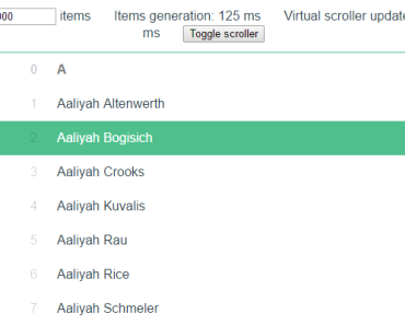
<template> <RecycleScroller class="scroller" :items="list" :item-size="32" key-field="id" v-slot="{ item }" > <div class="user"> {{ item.name }} </div> </RecycleScroller> </template> <script> export default { props: { list: Array, }, } </script> <style scoped> .scroller { height: 100%; } .user { height: 32%; padding: 0 12px; display: flex; align-items: center; } </style>Important notes
⚠️ You need to set the size of the virtual-scroller element and the items elements (for example, with CSS). Unless you are using variable size mode, all items should have the same height (or width in horizontal mode) to prevent display glitches.⚠️ If the items are objects, the scroller needs to be able to identify them. By default it will look for anidfield on the items. This can be configured with thekeyFieldprop if you are using another field name.- It is not recommended to use functional components inside RecycleScroller since the components are reused (so it will actually be slower).
- The list item components must be reactive to the
itemprop being updated without being re-created (use computed props or watchers to properly react to props changes!). - You don't need to set
keyon list content (but you should on all nested<img>elements to prevent load glitches). - The browsers have a size limitation on DOM elements, it means that currently the virtual scroller can't display more than ~500k items depending on the browser.
- Since DOM elements are reused for items, it's recommended to define hover styles using the provided
hoverclass instead of the:hoverstate selector (e.g..vue-recycle-scroller__item-view.hoveror.hover .some-element-inside-the-item-view).
How does it work?
- The RecycleScroller creates pools of views to render visible items to the user.
- A view holds a rendered item, and is reused inside its pool.
- For each type of item, a new pool is created so that the same components (and DOM trees) are reused for the same type.
- Views can be deactivated if they go off-screen, and can be reused anytime for a newly visible item.
Here is what the internals of RecycleScroller look like in vertical mode:
<RecycleScroller> <!-- Wrapper element with a pre-calculated total height --> <wrapper :style="{ height: computedTotalHeight + 'px' }" > <!-- Each view is translated to the computed position --> <view v-for="view of pool" :style="{ transform: 'translateY(' + view.computedTop + 'px)' }" > <!-- Your elements will be rendered here --> <slot :item="view.item" :index="view.nr.index" :active="view.nr.used" /> </view> </wrapper> </RecycleScroller>When the user scrolls inside RecycleScroller, the views are mostly just moved around to fill the new visible space, and the default slot properties updated. That way we get the minimum amount of components/elements creation and destruction and we use the full power of Vue virtual-dom diff algorithm to optimize DOM operations!
Props
items: list of items you want to display in the scroller.direction(default:'vertical'): scrolling direction, either'vertical'or'horizontal'.itemSize(default:null): display height (or width in horizontal mode) of the items in pixels used to calculate the scroll size and position. If it is set tonull(the default value), it will use variable size mode.minItemSize: minimum size used if the height (or width in horizontal mode) of a item is unknown.sizeField(default:'size'): field used to get the item's size in variable size mode.typeField(default:'type'): field used to differentiate different kinds of components in the list. For each distinct type, a pool of recycled items will be created.keyField(default:'id'): field used to identify items and optimize managing rendered views.pageMode(default:false): enable Page mode.prerender(default:0): render a fixed number of items for Server-Side Rendering (SSR).buffer(default:200): amount of pixel to add to edges of the scrolling visible area to start rendering items further away.emitUpdate(default:false): emit a'update'event each time the virtual scroller content is updated (can impact performance).
Events
resize: emitted when the size of the scroller changes.visible: emitted when the scroller considers itself to be visible in the page.hidden: emitted when the scroller is hidden in the page.update (startIndex, endIndex): emitted each time the views are updated, only ifemitUpdateprop istrue
Default scoped slot props
item: item being rendered in a view.index: reflects each item's position in theitemsarrayactive: whether or not the view is active. An active view is considered visible and being positioned byRecycleScroller. An inactive view is not considered visible and is hidden from the user. Any rendering-related computations should be skipped if the view is inactive.
Other Slots
<main> <slot name="before"></slot> <wrapper> <!-- Reused view pools here --> </wrapper> <slot name="after"></slot> </main>Example:
<RecycleScroller class="scroller" :items="list" :item-size="32" > <template #before> Hey! I'm a message displayed before the items! </template> <template v-slot="{ item }"> <div class="user"> {{ item.name }} </div> </template> </RecycleScroller>Page mode
The page mode expands the virtual-scroller and uses the page viewport to compute which items are visible. That way, you can use it in a big page with HTML elements before or after (like a header and a footer). Set the page-mode prop to true:
<header> <menu></menu> </header> <RecycleScroller page-mode> <!-- ... --> </RecycleScroller> <footer> Copyright 2017 - Cat </footer>Variable size mode
If the itemSize prop is not set or is set to null, the virtual scroller will switch to variable size mode. You then need to expose a number field on the item objects with the size of the item element.
Use the sizeField prop (default is 'size') to set the field used by the scroller to get the size for each item.
Example:
const items = [ { id: 1, label: 'Title', size: 64, }, { id: 2, label: 'Foo', size: 32, }, { id: 3, label: 'Bar', size: 32, }, ]Buffer
You can set the buffer prop (in pixels) on the virtual-scroller to extend the viewport considered when determining the visible items. For example, if you set a buffer of 1000 pixels, the virtual-scroller will start rendering items that are 1000 pixels below the bottom of the scroller visible area, and will keep the items that are 1000 pixels above the top of the visible area.
The default value is 200.
<RecycleScroller :buffer="200" />Server-Side Rendering
The prerender props can be set as the number of items to render on the server inside the virtual scroller:
<RecycleScroller :items="items" :item-size="42" :prerender="10" >DynamicScroller
This works just like the RecycleScroller, but it can render items with unknown sizes!
Basic usage
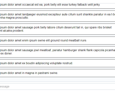
<template> <DynamicScroller :items="items" :min-item-size="54" class="scroller" > <template v-slot="{ item, index, active }"> <DynamicScrollerItem :item="item" :active="active" :size-dependencies="[ item.message, ]" :data-index="index" > <div class="avatar"> <img :src="item.avatar" :key="item.avatar" alt="avatar" class="image" > </div> <div class="text">{{ item.message }}</div> </DynamicScrollerItem> </template> </DynamicScroller> </template> <script> export default { props: { items: Array, }, } </script> <style scoped> .scroller { height: 100%; } </style>Important notes
minItemSizeis required for the initial render of items.DynamicScrollerwon't detect size changes on its own, but you can put values that can affect the item size withsize-dependencieson DynamicScrollerItem.- You don't need to have a
sizefield on the items.
Props
Extends all the RecycleScroller props.
- It's not recommended to change
sizeFieldprop since all the size management is done internally.
Events
Extends all the RecycleScroller events.
Default scoped slot props
Extends all the RecycleScroller scoped slot props.
Other slots
Extends all the RecycleScroller other slots.
DynamicScrollerItem
The component that should wrap all the items in a DynamicScroller.
Props
item(required): the item rendered in the scroller.active(required): is the holding view active in RecycleScroller. Will prevent unnecessary size recomputation.sizeDependencies: values that can affect the size of the item. This prop will be watched and if one value changes, the size will be recomputed. Recommended instead ofwatchData.watchData(default:false): deeply watchitemfor changes to re-calculate the size (not recommended, can impact performance).tag(default:'div'): element used to render the component.emitResize(default:false): emit theresizeevent each time the size is recomputed (can impact performance).
Events
resize: emitted each time the size is recomputed, only ifemitResizeprop istrue.
IdState
This is convenience mixin that can replace data in components being rendered in a RecycleScroller.
Why is this useful?
Since the components in RecycleScroller are reused, you can't directly use the Vue standard data properties: otherwise they will be shared with different items in the list!
IdState will instead provide an idState object which is equivalent to $data, but it's linked to a single item with its identifier (you can change which field with idProp param).
Example
In this example, we use the id of the item to have a "scoped" state to the item:
<template> <div class="question"> <p>{{ item.question }}</p> <button @click="idState.replyOpen = !idState.replyOpen">Reply</button> <textarea v-if="idState.replyOpen" v-model="idState.replyText" placeholder="Type your reply" /> </div> </template> <script> import { IdState } from 'vue-virtual-scroller' export default { mixins: [ IdState({ // You can customize this idProp: vm => vm.item.id, }), ], props: { // Item in the list item: Object, }, // This replaces data () { ... } idState () { return { replyOpen: false, replyText: '', } }, } </script>Parameters
idProp(default:vm => vm.item.id): field name on the component (for example:'id') or function returning the id.